Part One: Workshop-Summer Pre-college Advanced Studio, Graphic Design, MIAD
In this workshop, I remade a logo, designed a book cover, sign painted, and photographed letters in every day sights.
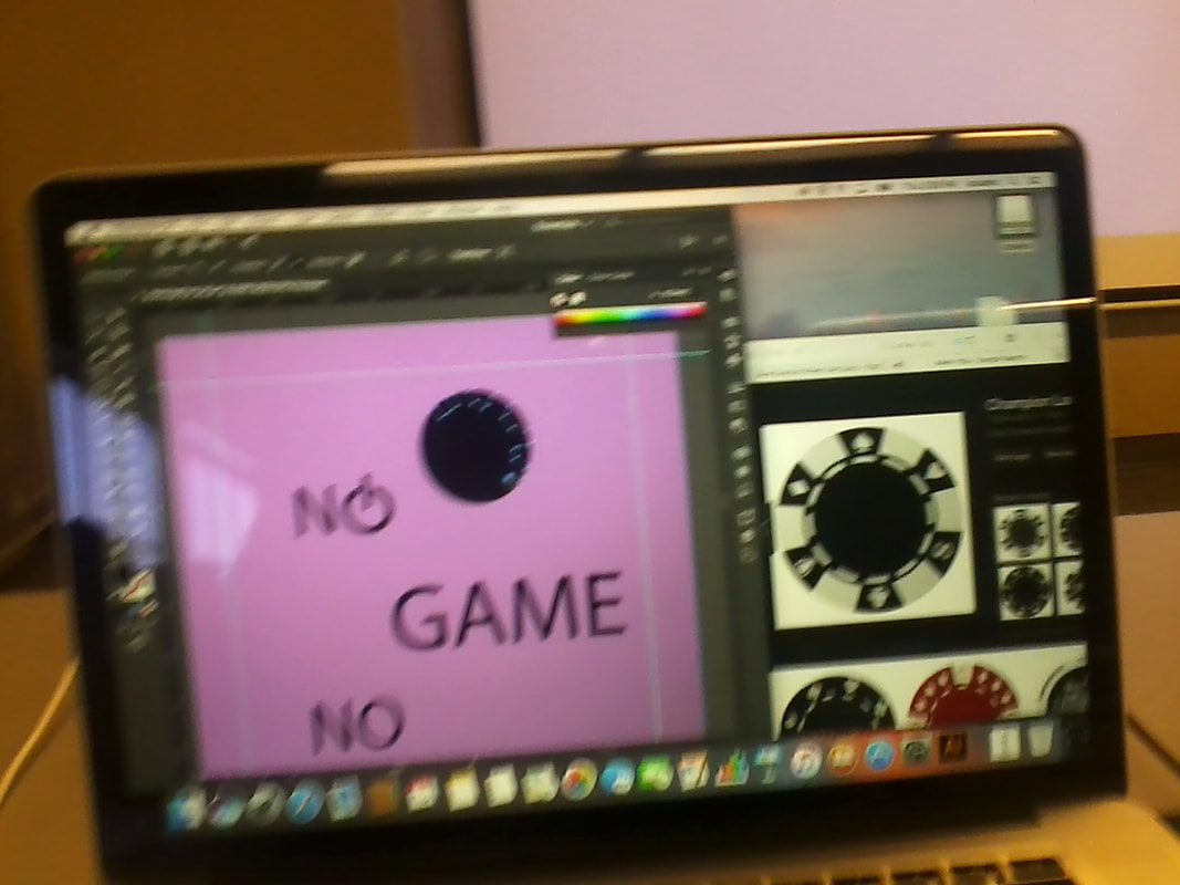
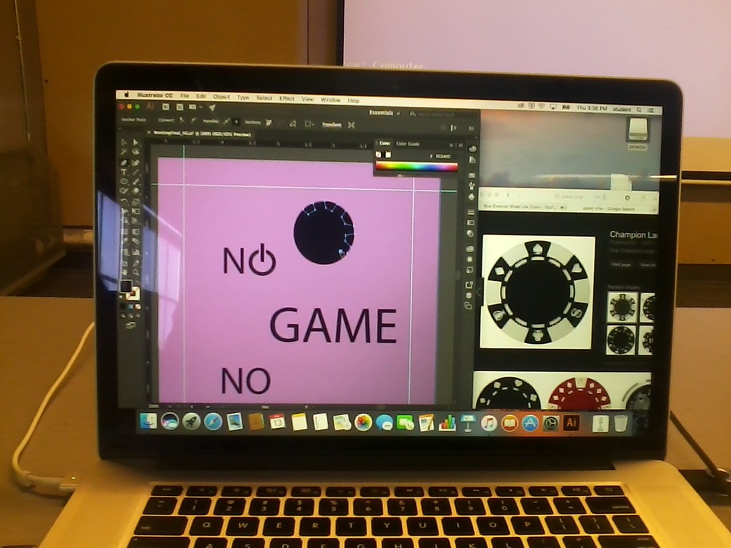
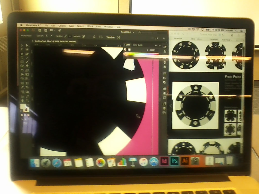
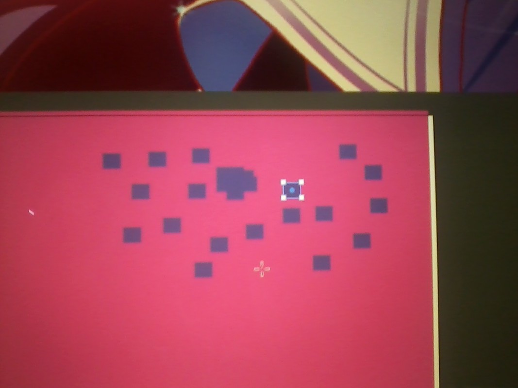
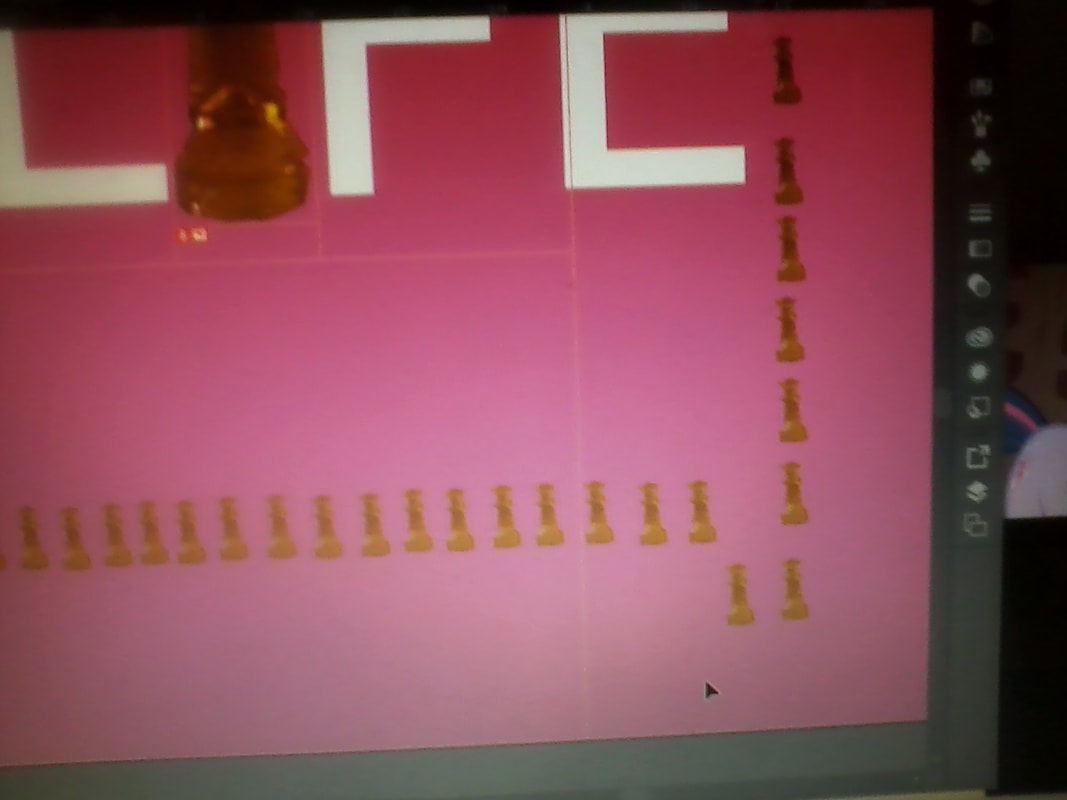
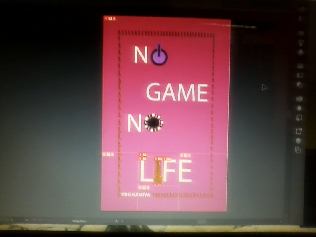
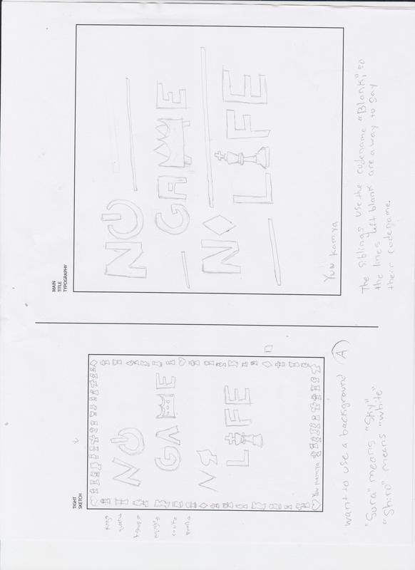
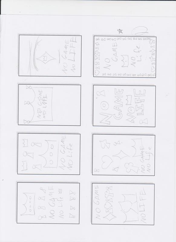
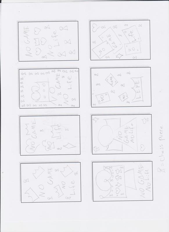
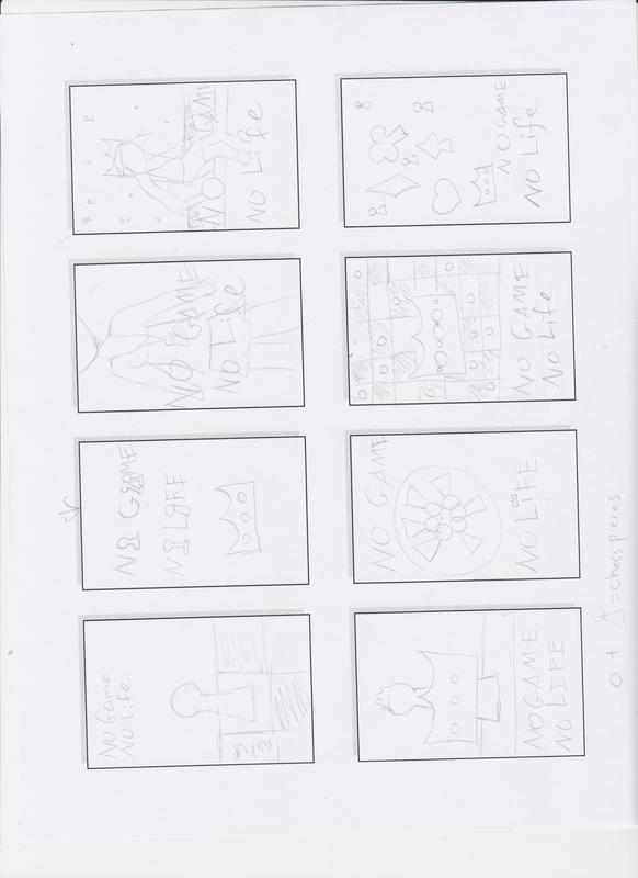
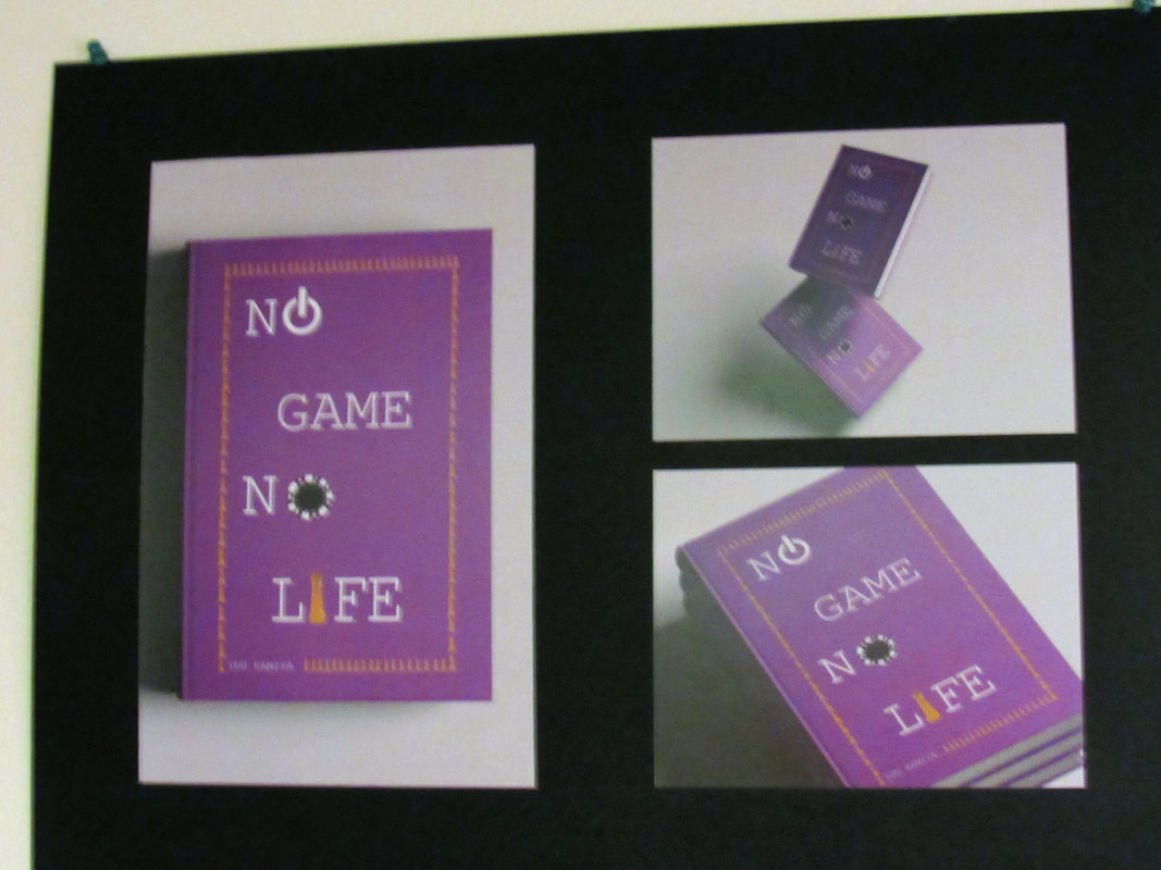
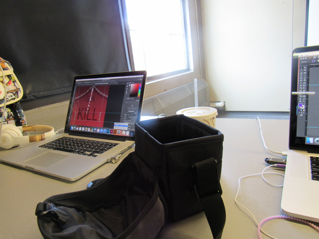
These are the basic process photos. During the redesigning of a book cover. I had to redesign as a novel cover, but I had chosen a manga series called No Game No Life. The series is associated most with chess pieces, so I worked with the king chess piece. I created a poker chip from scratch, and a power button. I took a photo of the king piece of a glass chess piece I have. I cropped it, and kept copying and pasting it into a border. I neatened the border later on. Originally, I wanted a cover with a cloud of the light and brilliant colors the series is known for. It wasn't working for me, so I went to the border idea.
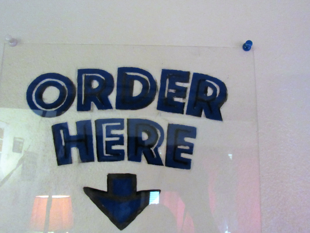
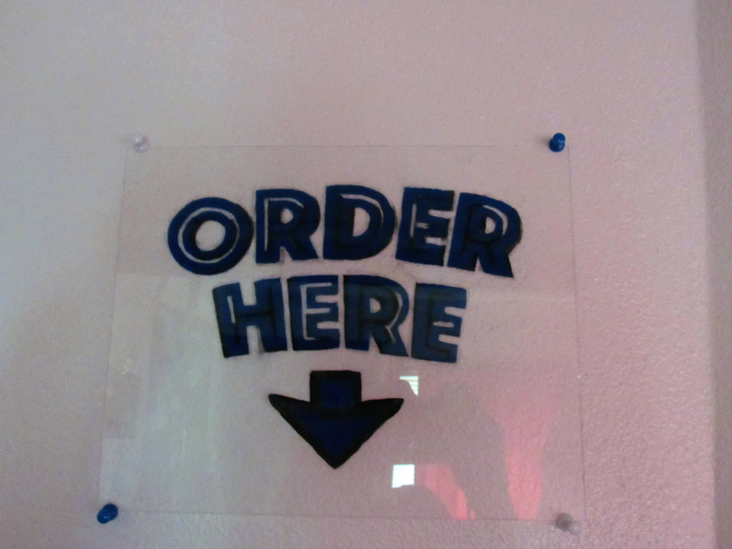
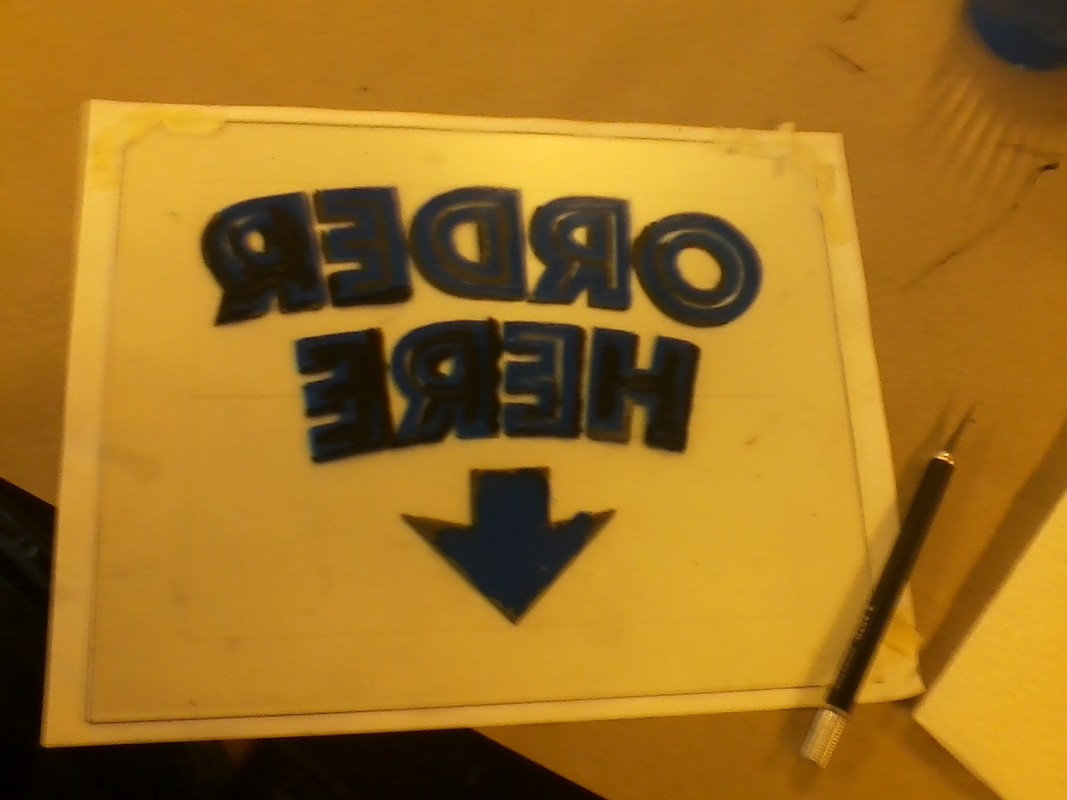
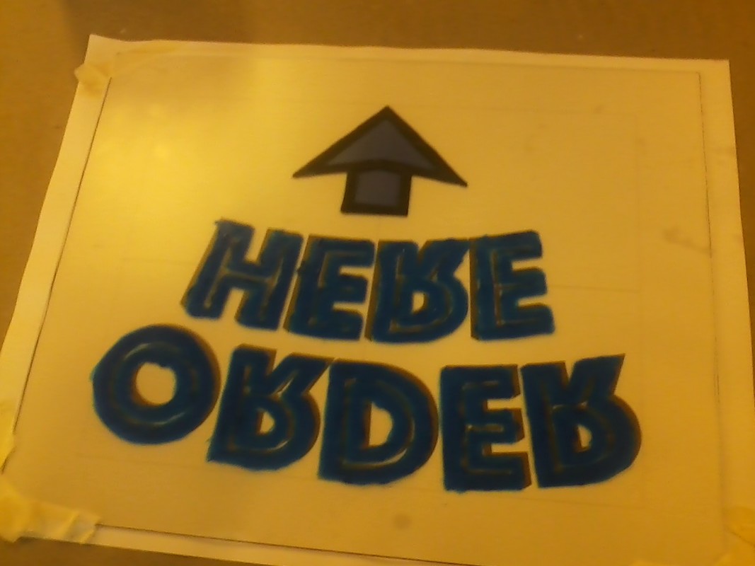
I sketched out a basic design on paper, made a digital version identical to it, printed out the design in color, taped it to a piece of Plexiglas and painted on the text with acrylic paint. I used an x-acto knife to clean the dried corners until finished. The paint was tricky at first because the first layer laid down is the one in front when it's done, so making a mistake on the first layer would be vital, versus a mistake on the last layer, which is not as visible, since it's the backmost color seen from the front. The light on the letters kept coming through, so I used white paint to block the light and kept layering on the blue, scraped away bits of paint to make the letters seem more 3D.
I sketched out a basic design on paper, made a digital version identical to it, printed out the design in color, taped it to a piece of Plexiglas and painted on the text with acrylic paint. I used an x-acto knife to clean the dried corners until finished. The paint was tricky at first because the first layer laid down is the one in front when it's done, so making a mistake on the first layer would be vital, versus a mistake on the last layer, which is not as visible, since it's the backmost color seen from the front. The light on the letters kept coming through, so I used white paint to block the light and kept layering on the blue, scraped away bits of paint to make the letters seem more 3D.
Favorite project:
|
|
|
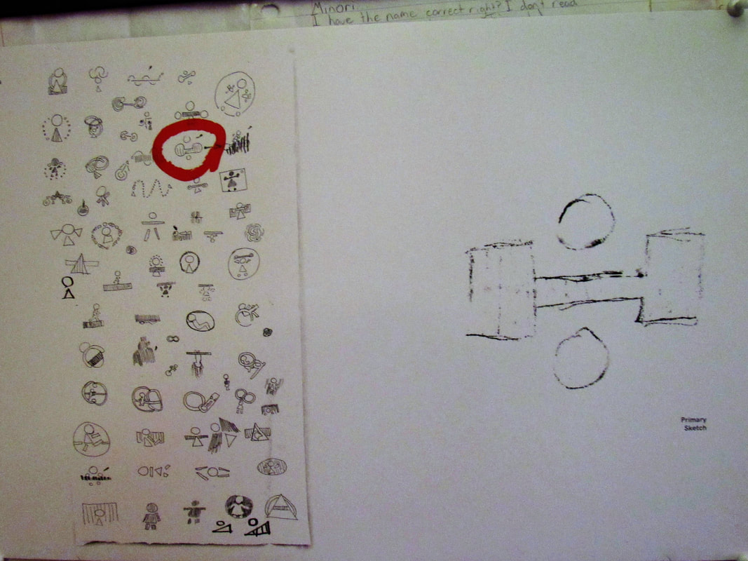
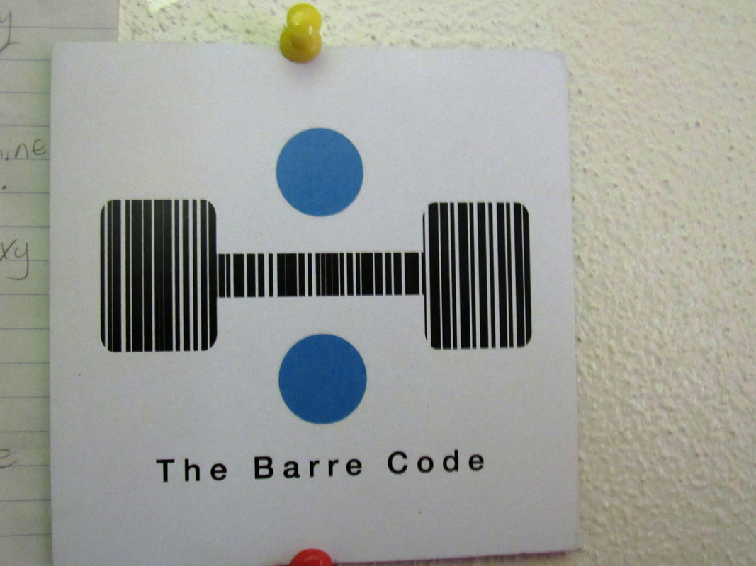
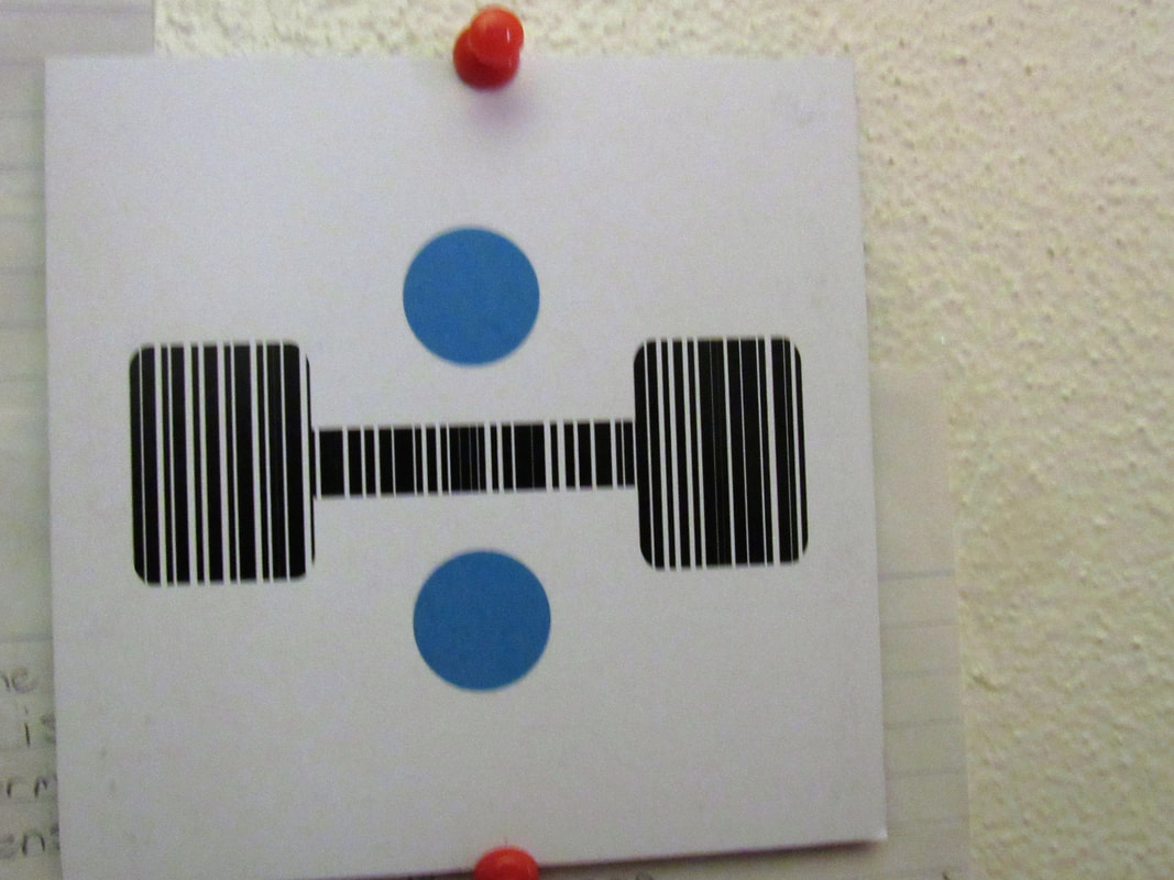
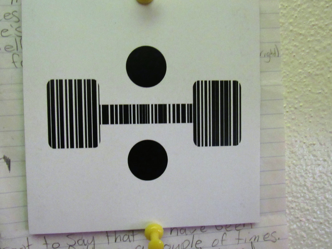
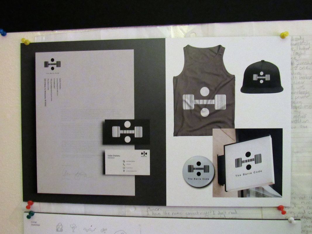
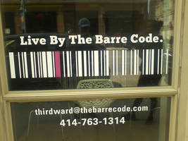
I loved this project. We went around the neighborhood and looked at nearby companies. We chose ones we thought needed a new logo. I chose the Barre Code. I couldn't tell anything about the store-if they were a store, a bar, or whatever-and as it turns out, they were an exercise company.
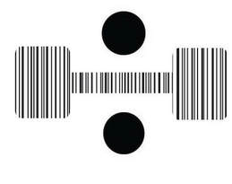
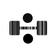
I sketched out a lot of images for a new logo, and decided on one during the critique. I then made it digital. I wanted to keep the bar code aspect while showing the exercise element of the company. This was the result. The bar code was made from scratch with random lines of different thickness. To test it, I shrank it down to see if it was still recognizable at the size of a dime (the size on business cads).
I sketched out a lot of images for a new logo, and decided on one during the critique. I then made it digital. I wanted to keep the bar code aspect while showing the exercise element of the company. This was the result. The bar code was made from scratch with random lines of different thickness. To test it, I shrank it down to see if it was still recognizable at the size of a dime (the size on business cads).
Part Two: Photography project
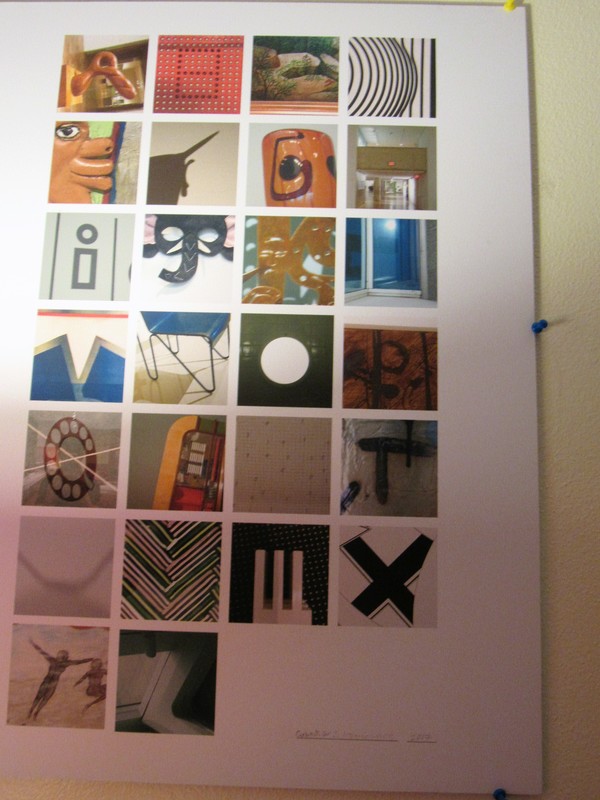
Favorite 25 shots:


Experiments:


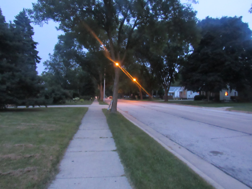

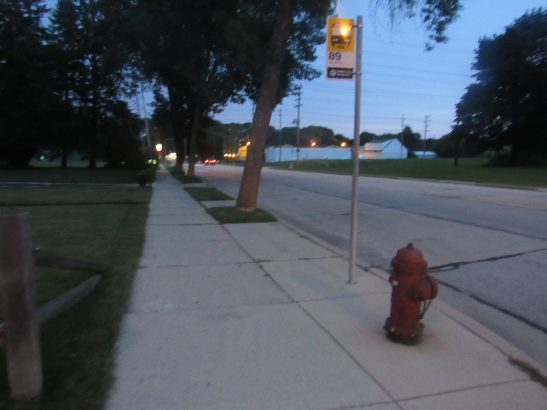


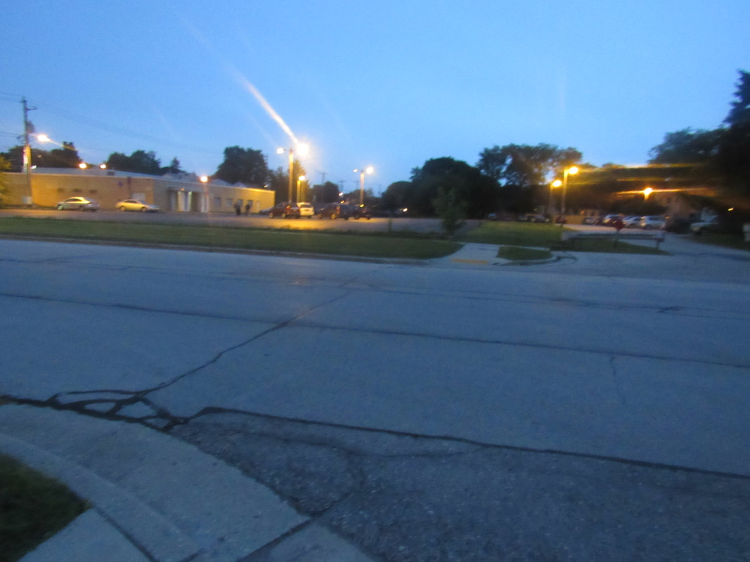

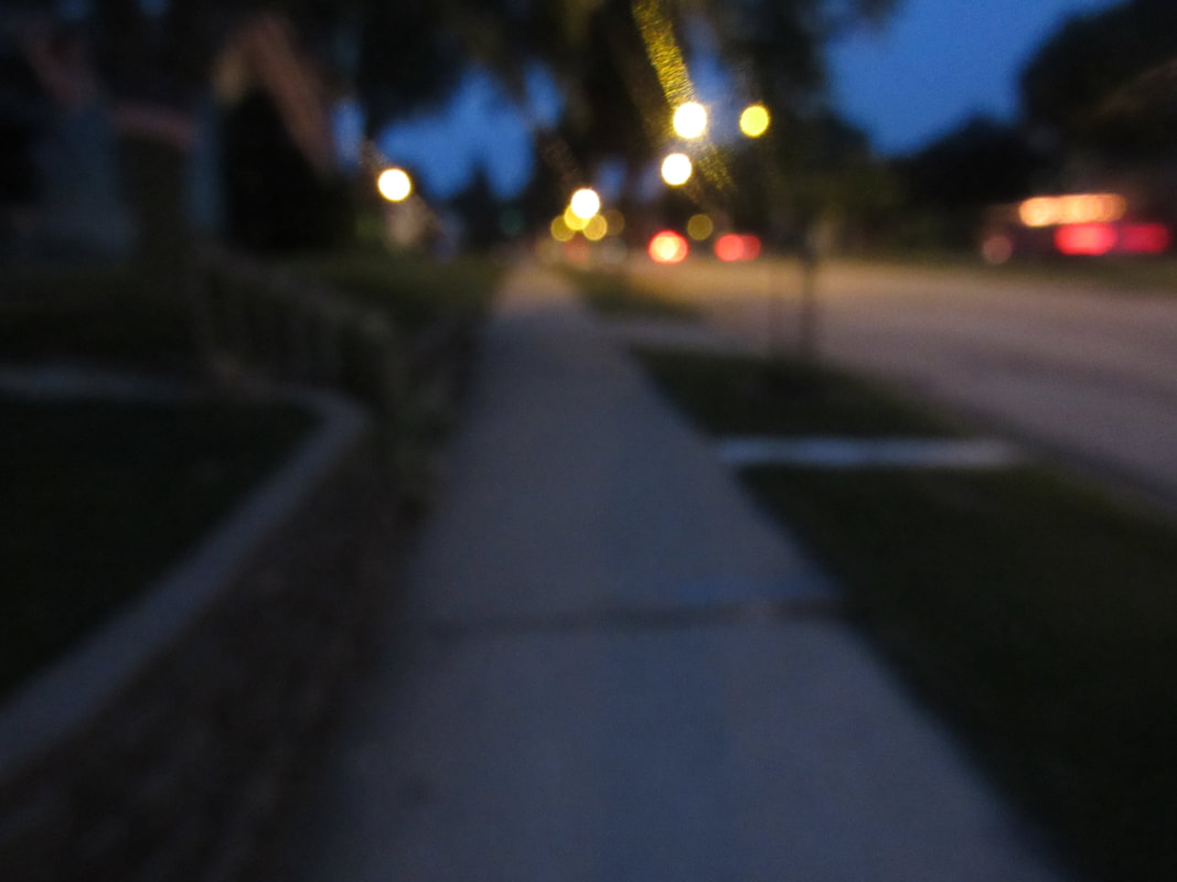
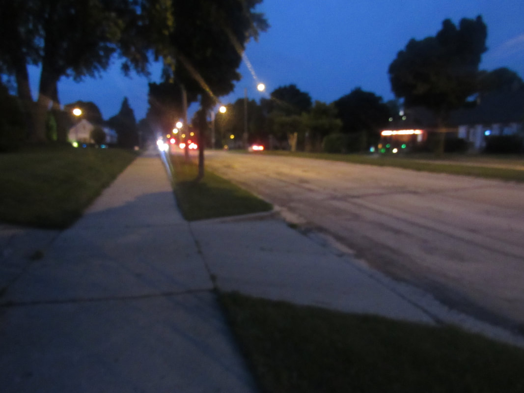
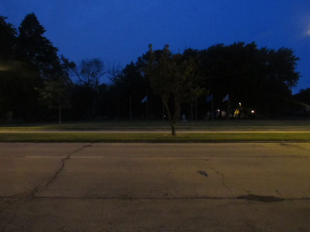

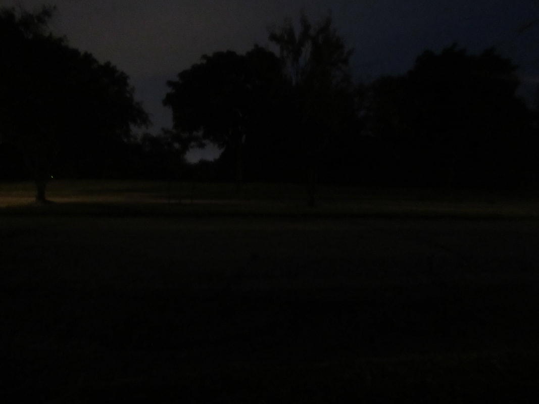


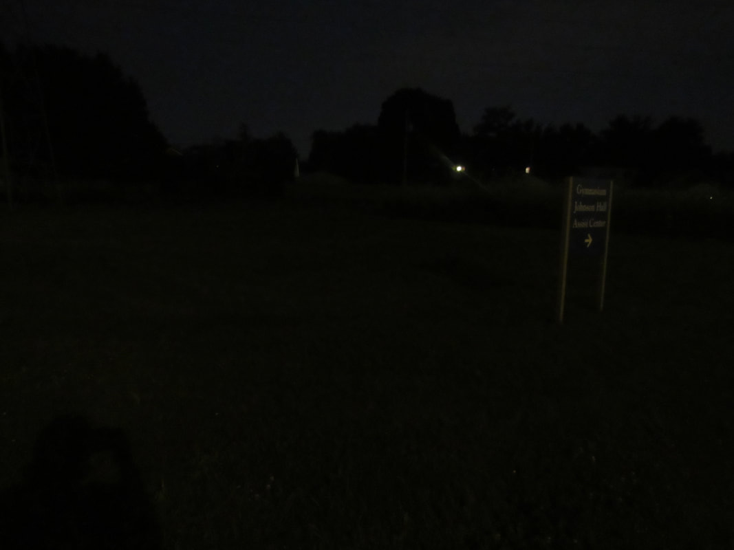

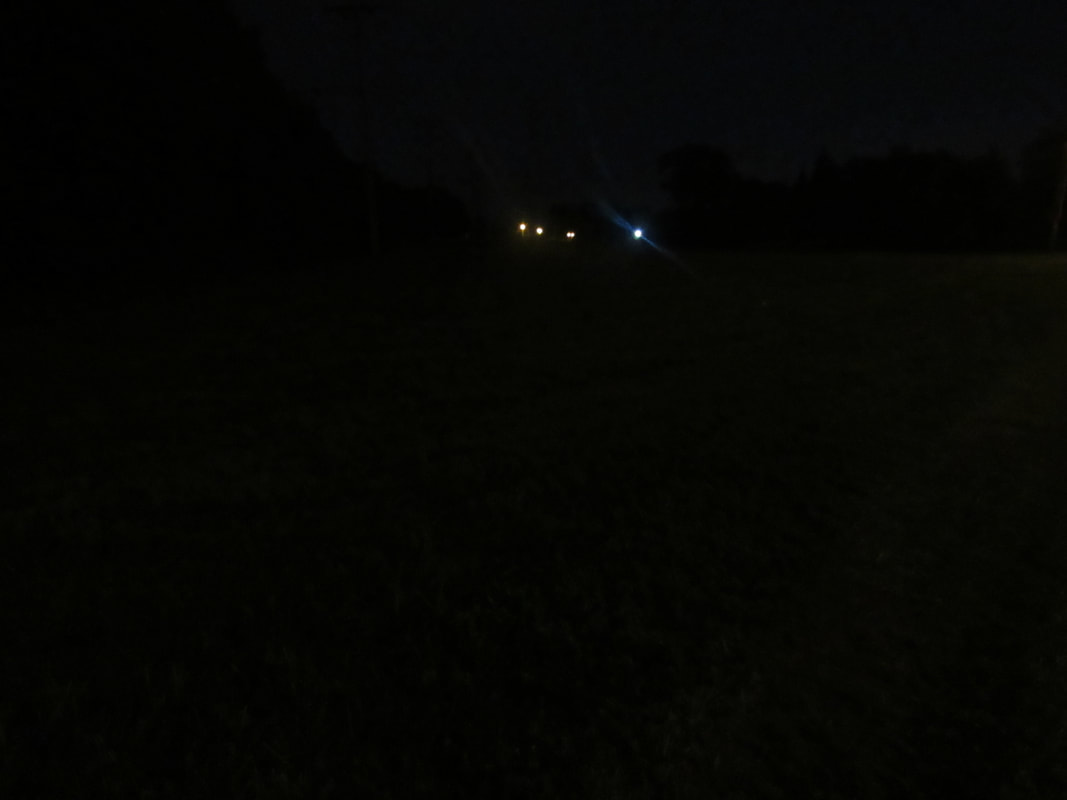


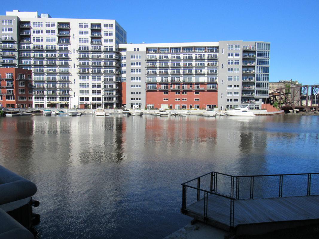
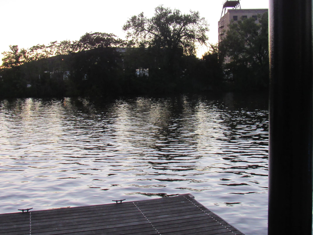
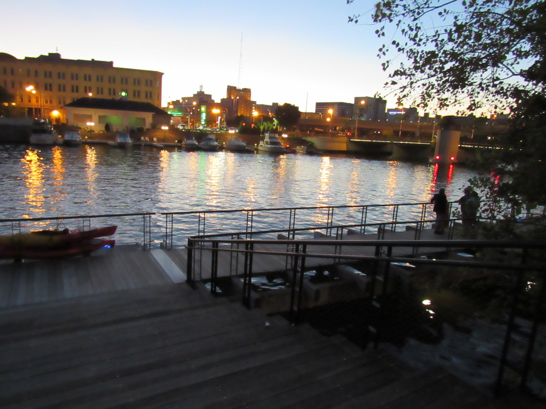
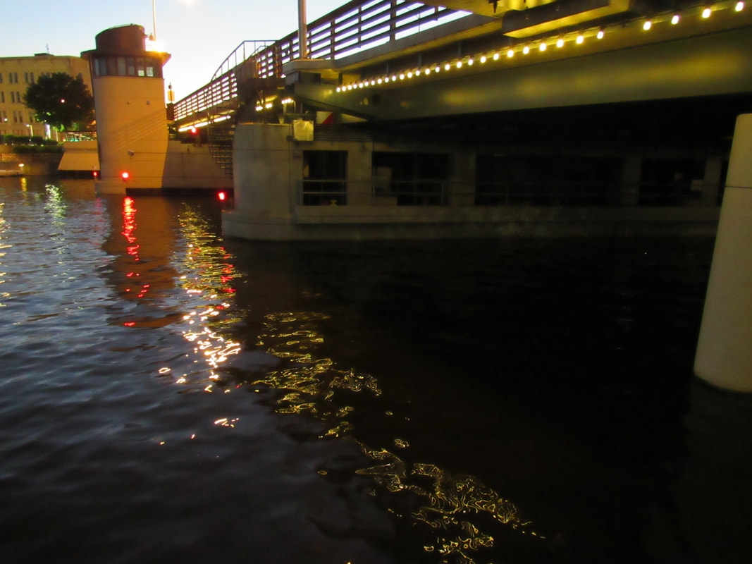
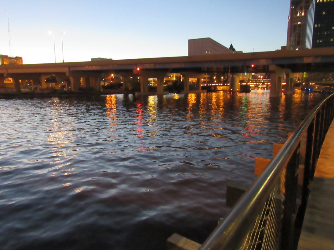
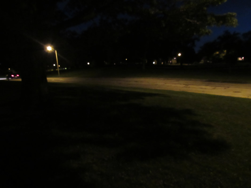
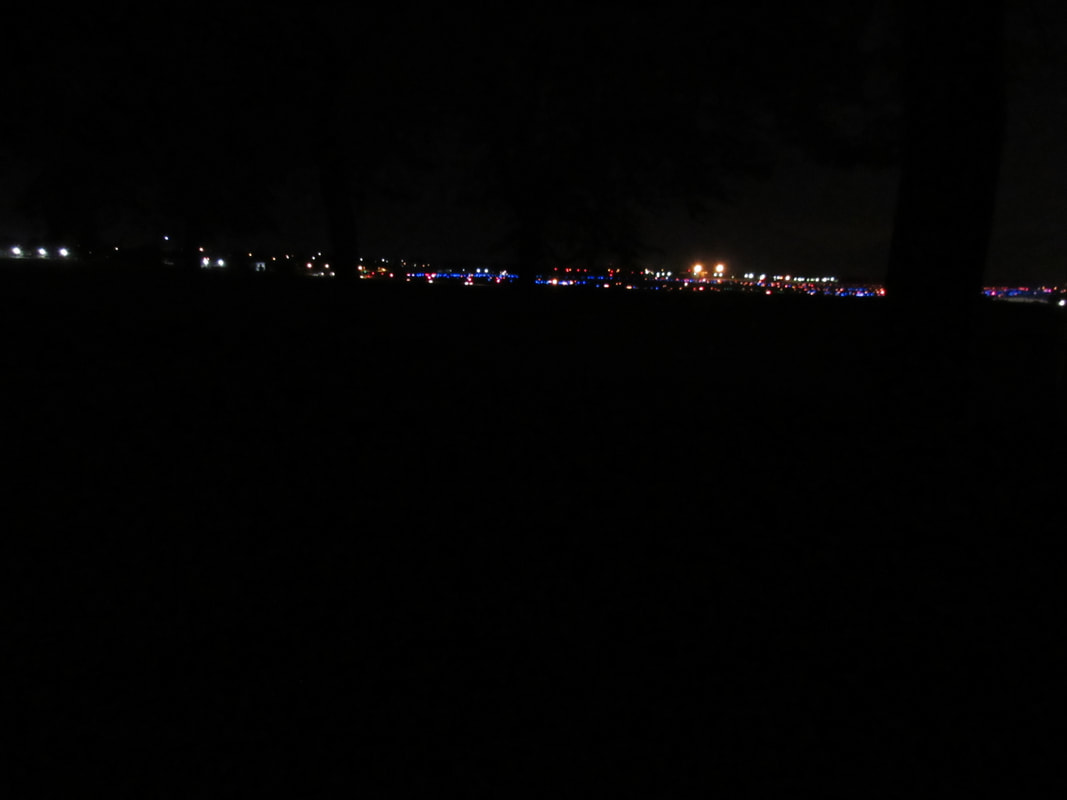
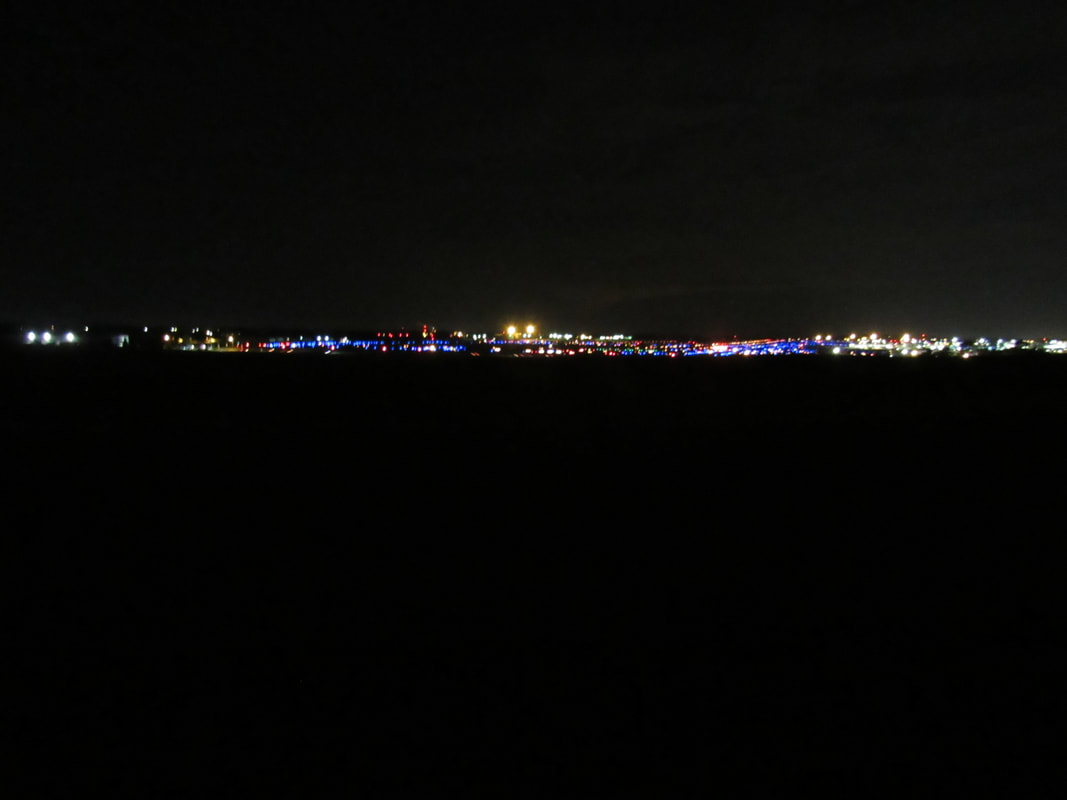
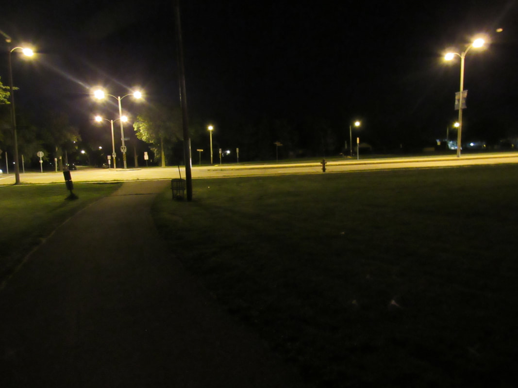
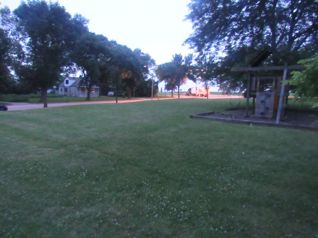
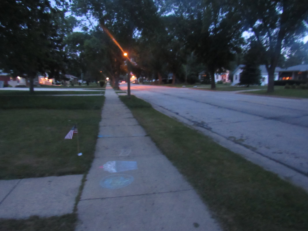
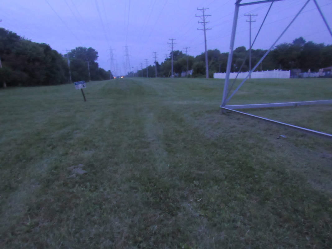
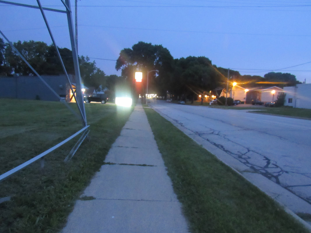
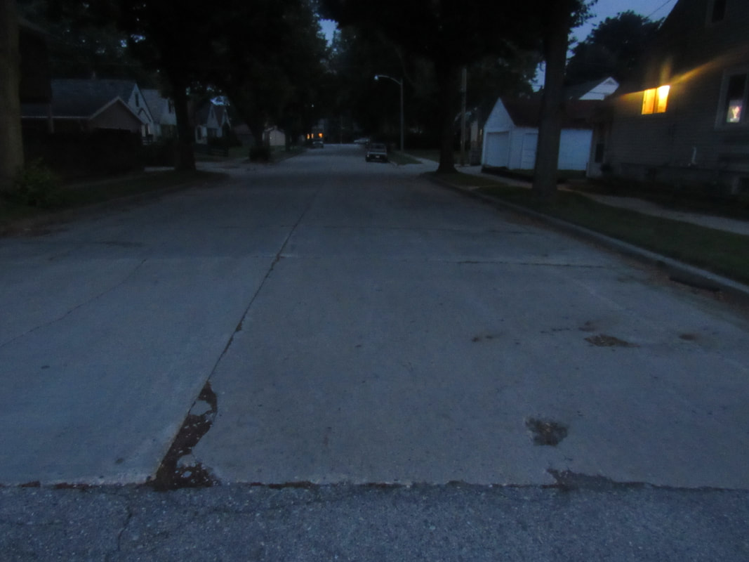
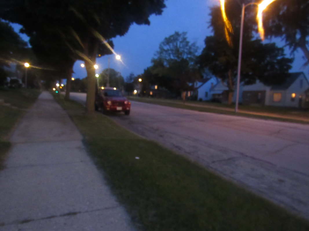
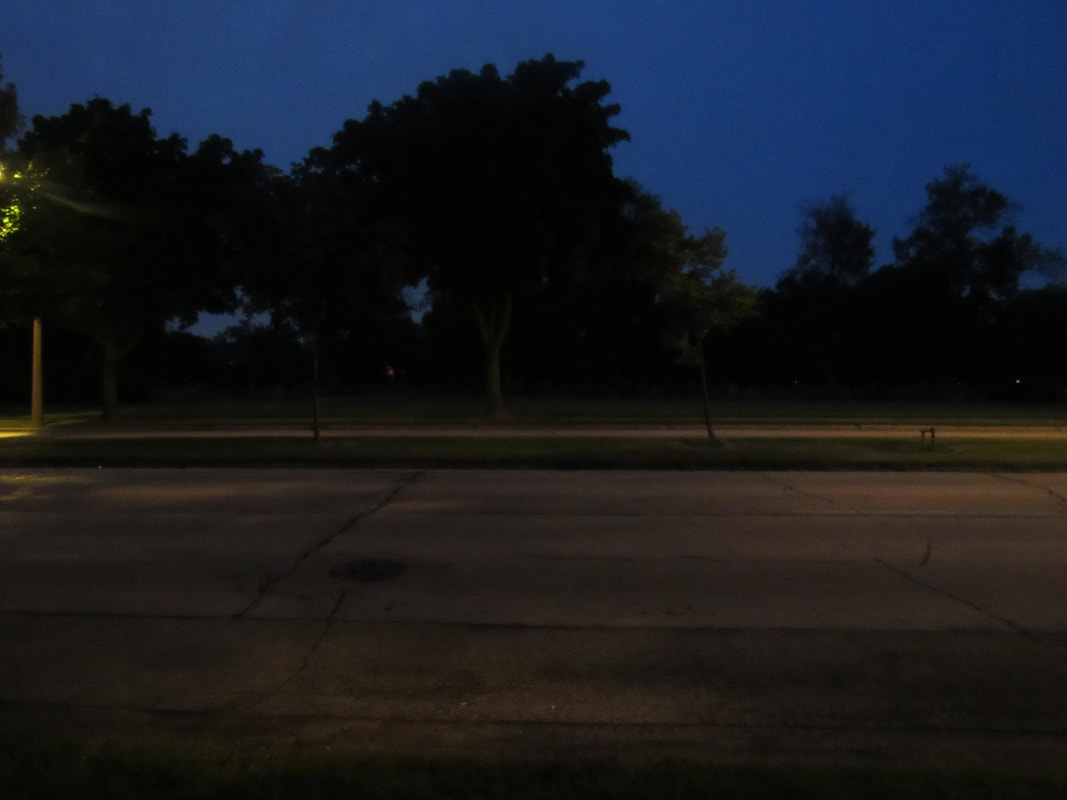
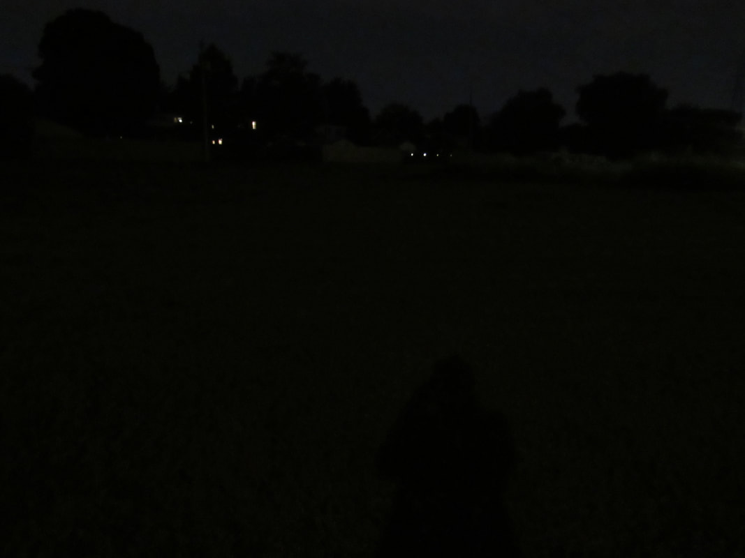
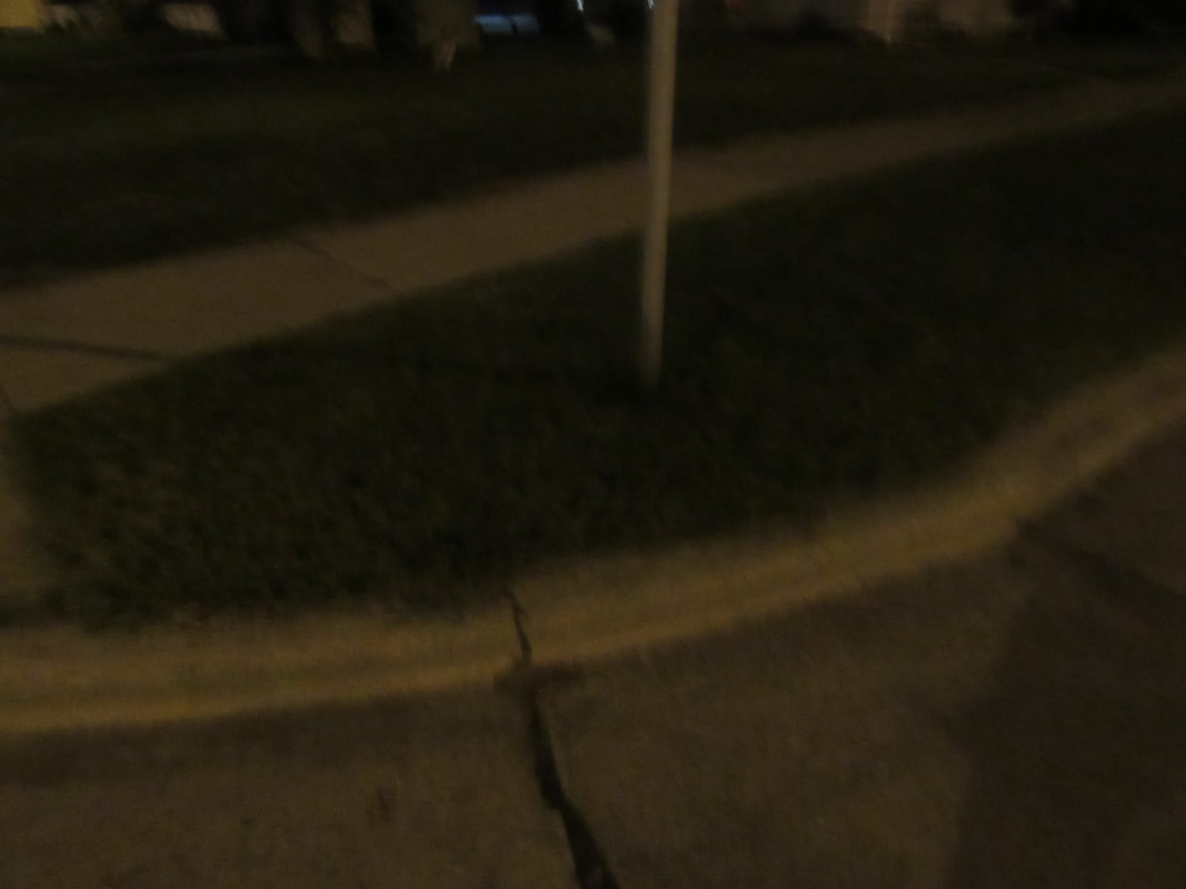
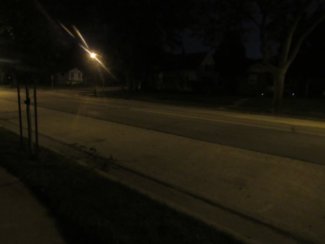
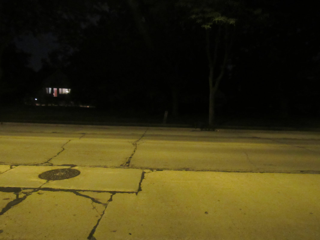
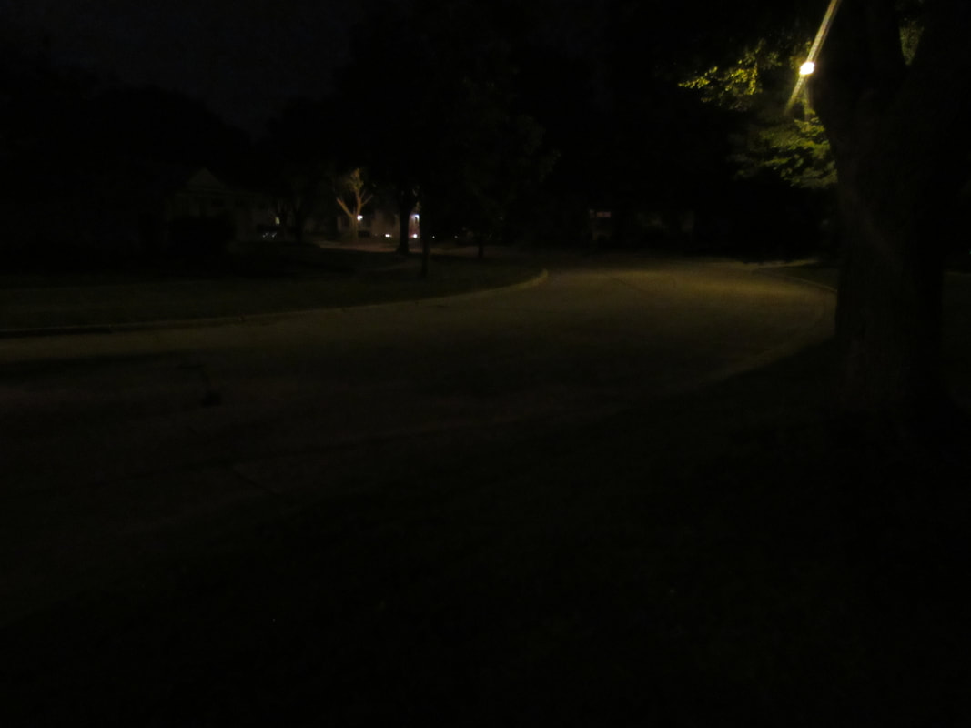
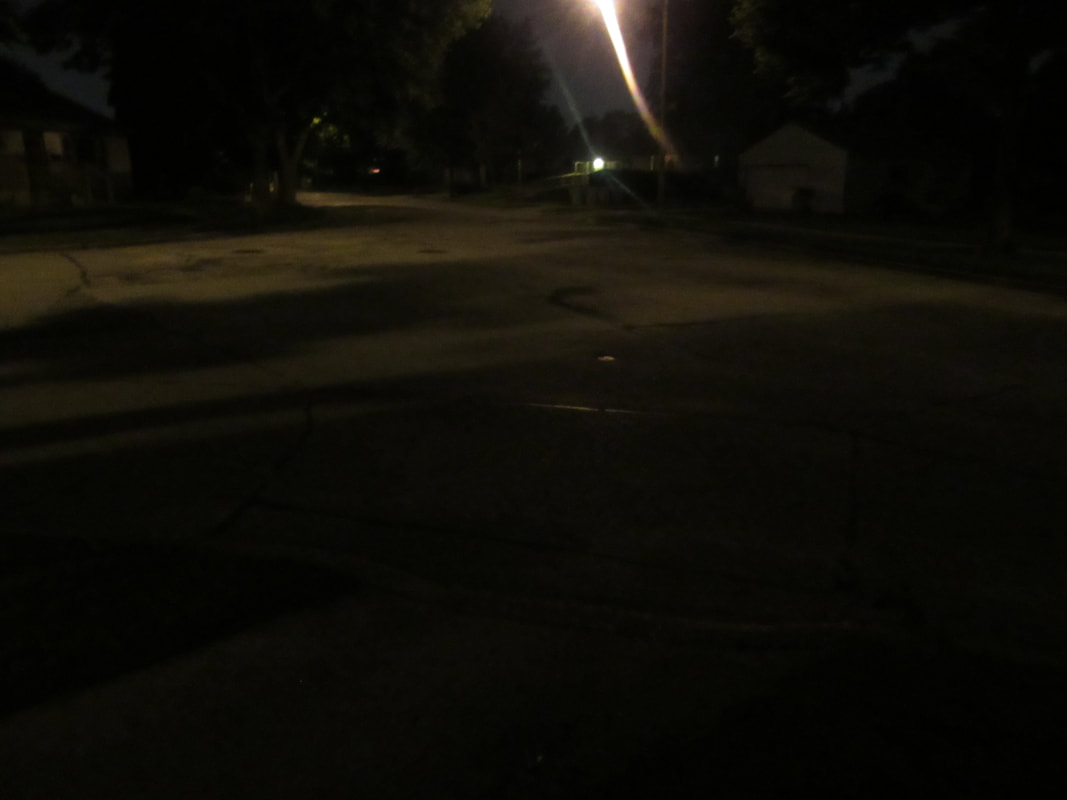
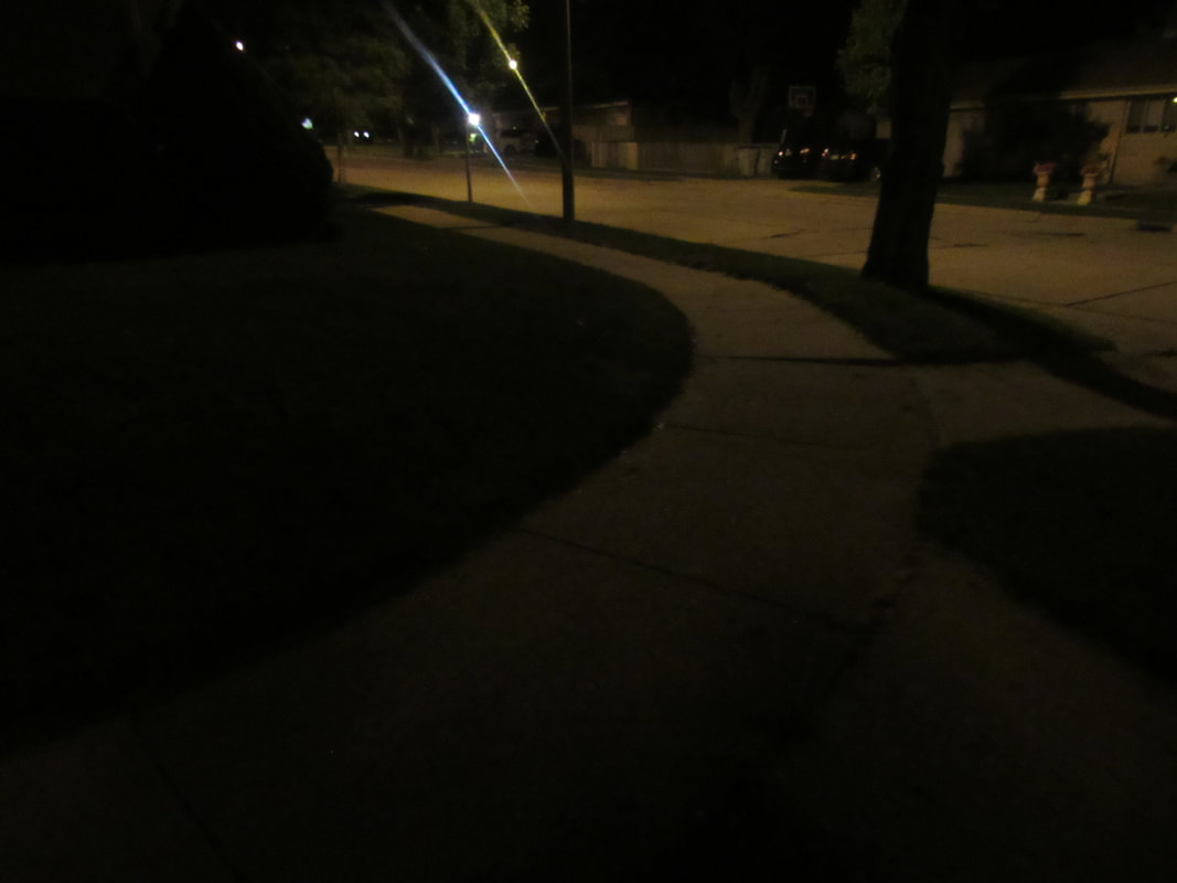
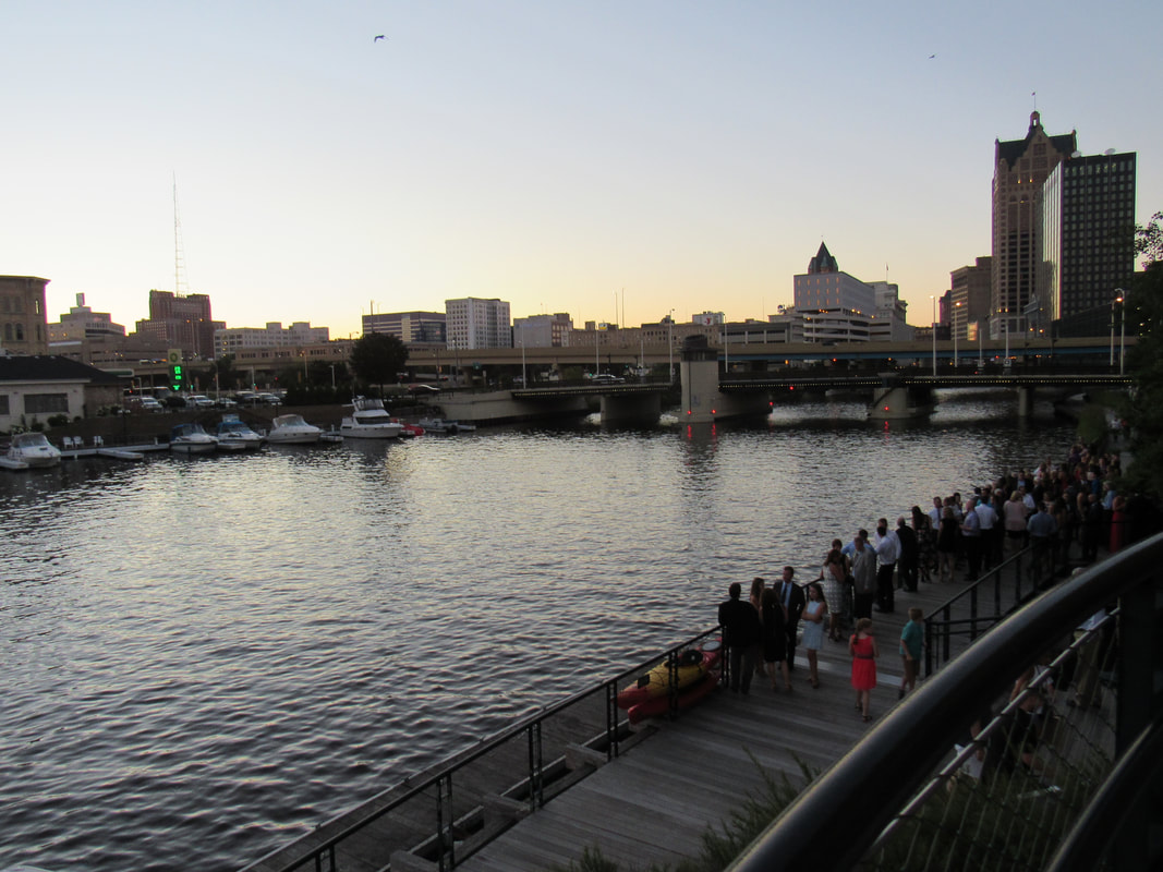
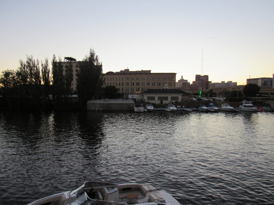
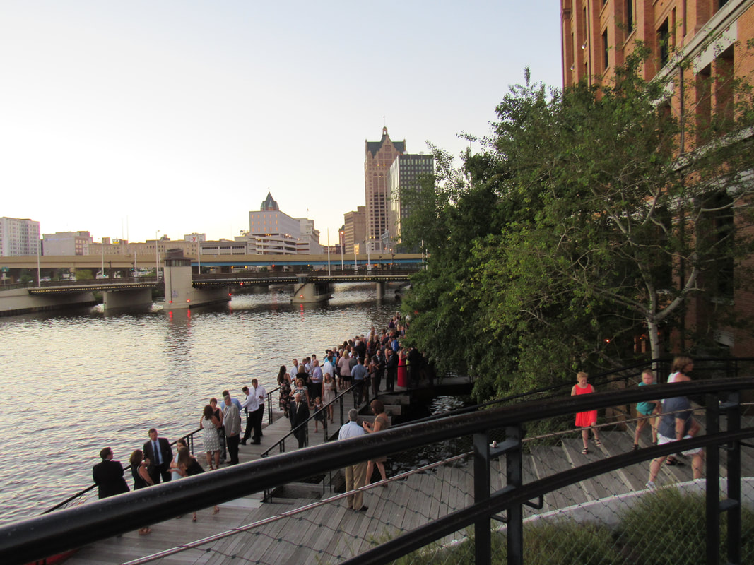
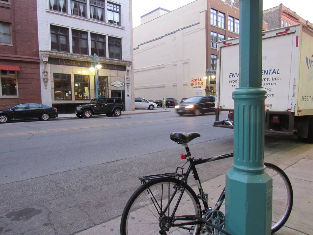
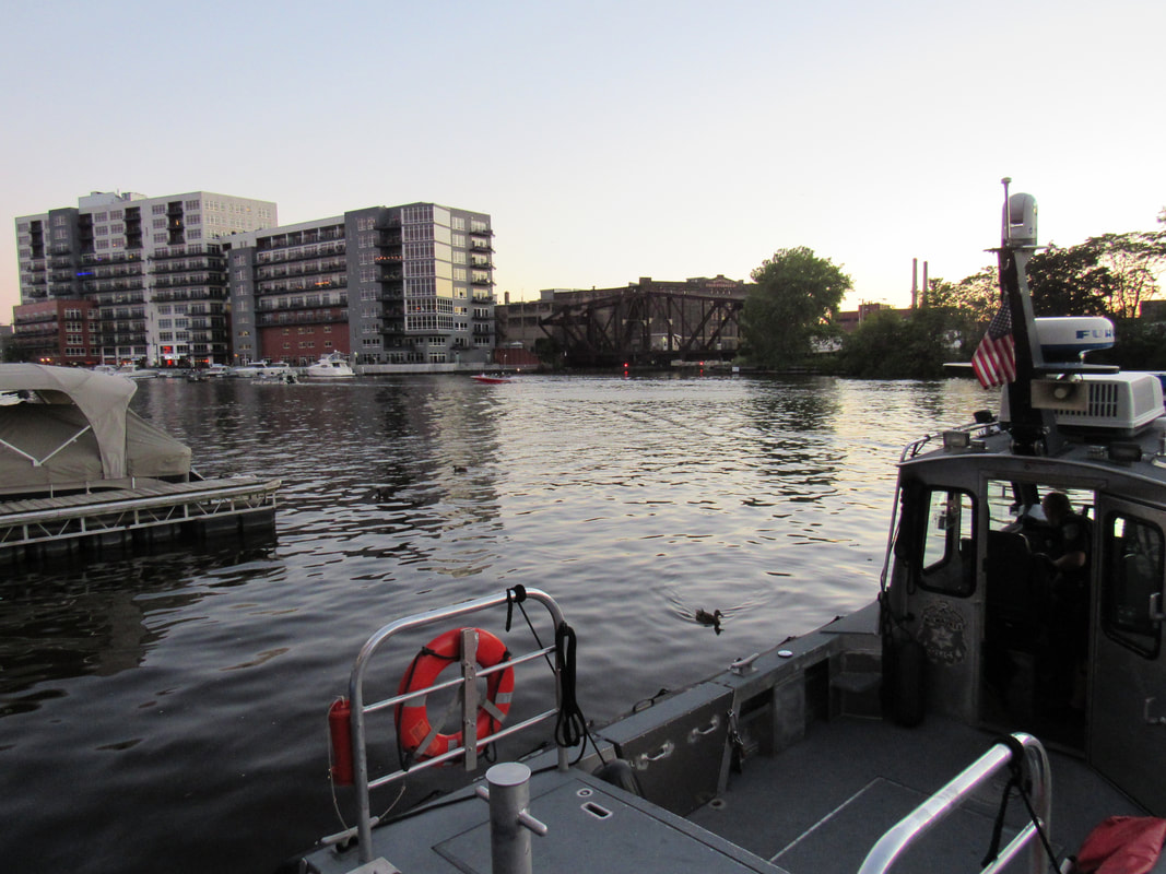
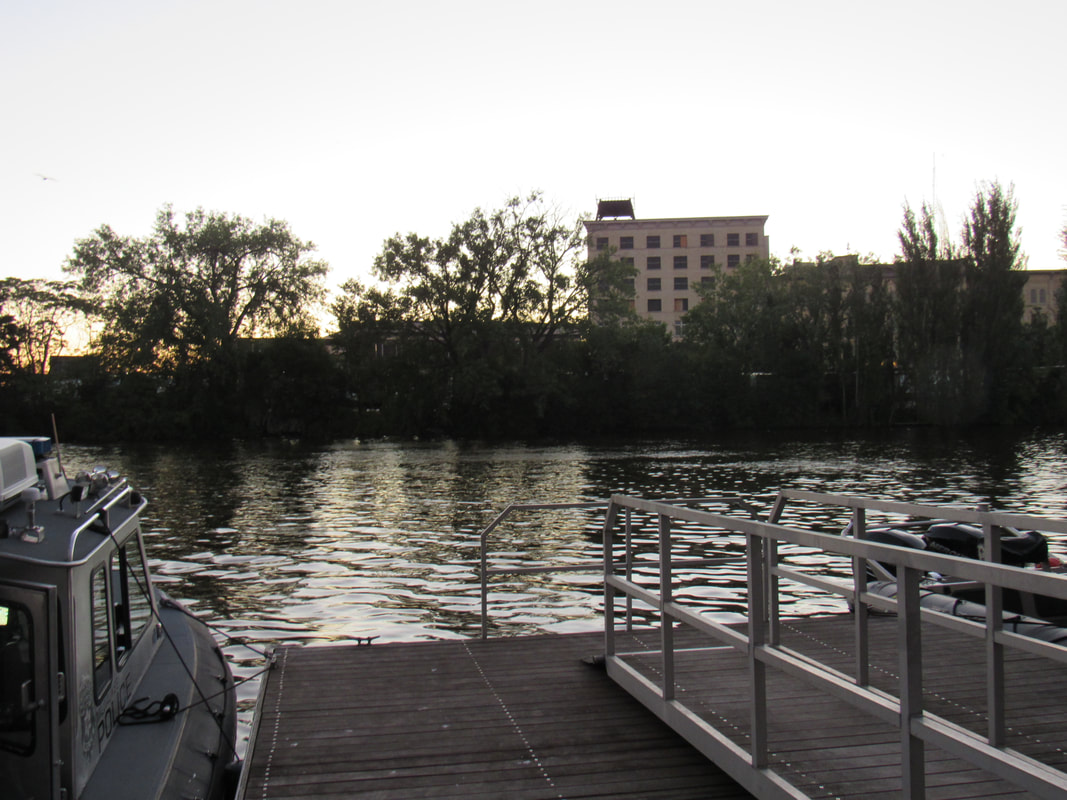
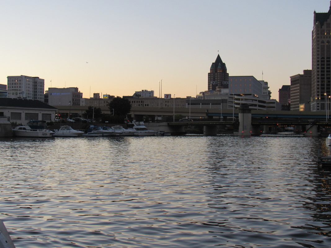
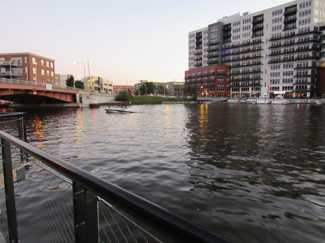
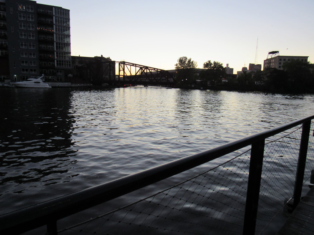
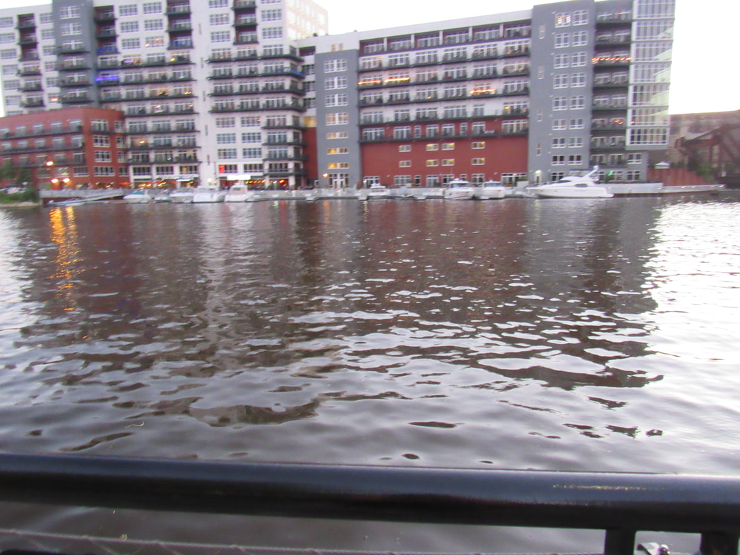
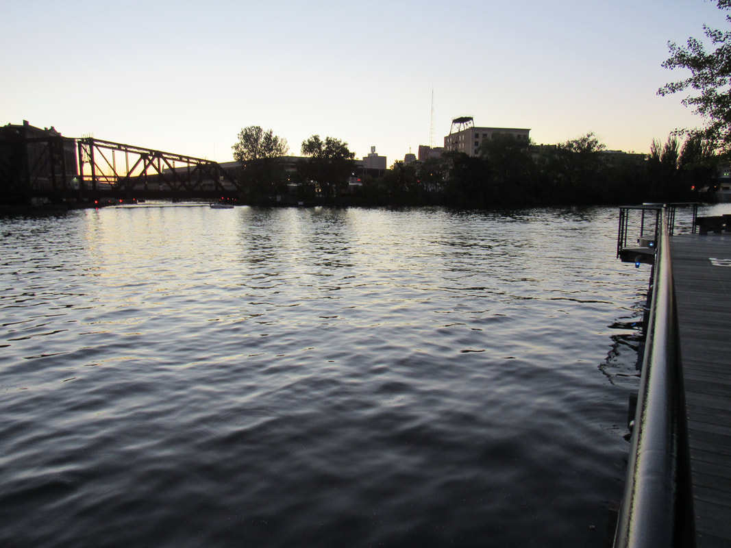
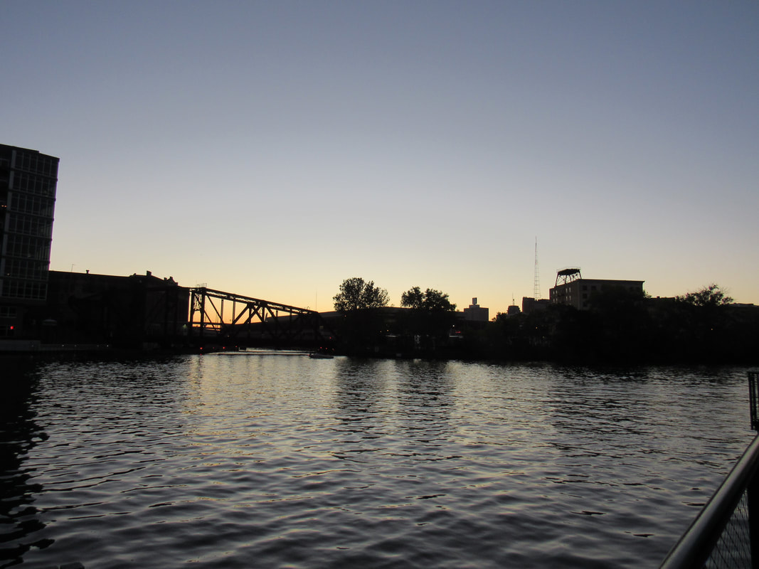
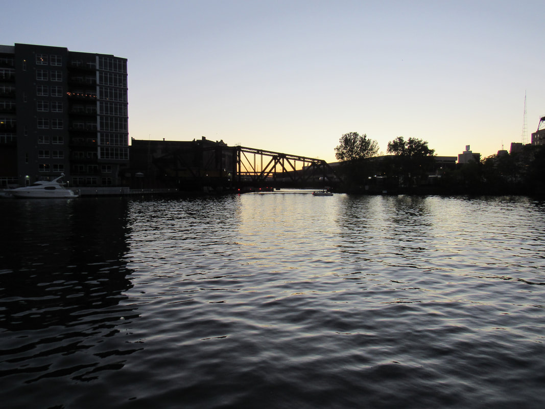
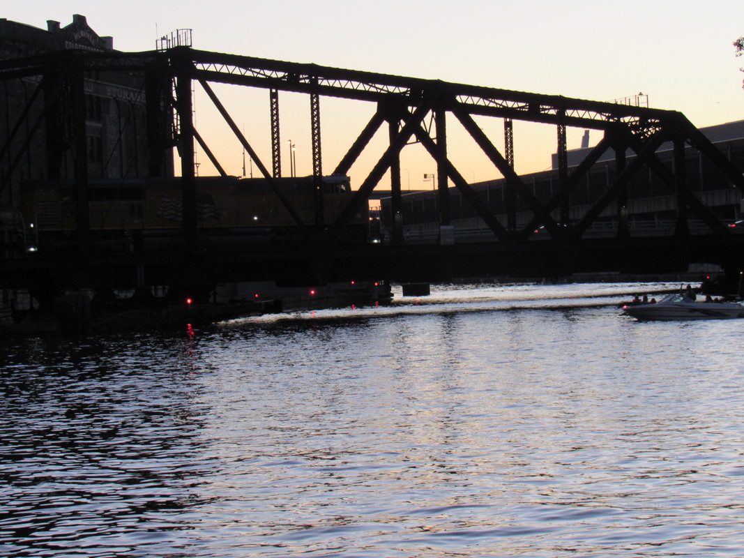
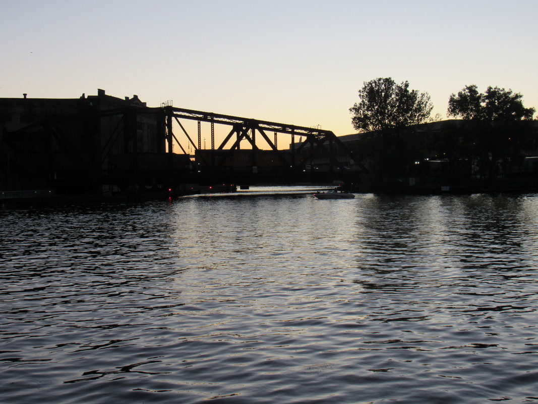
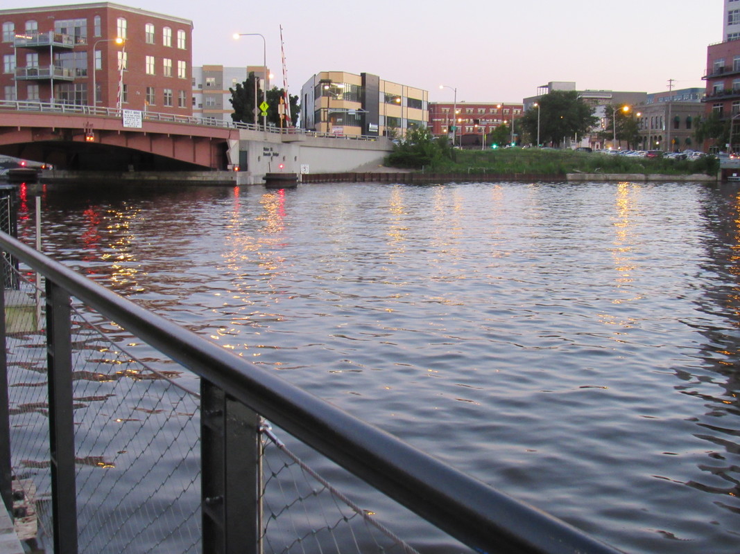
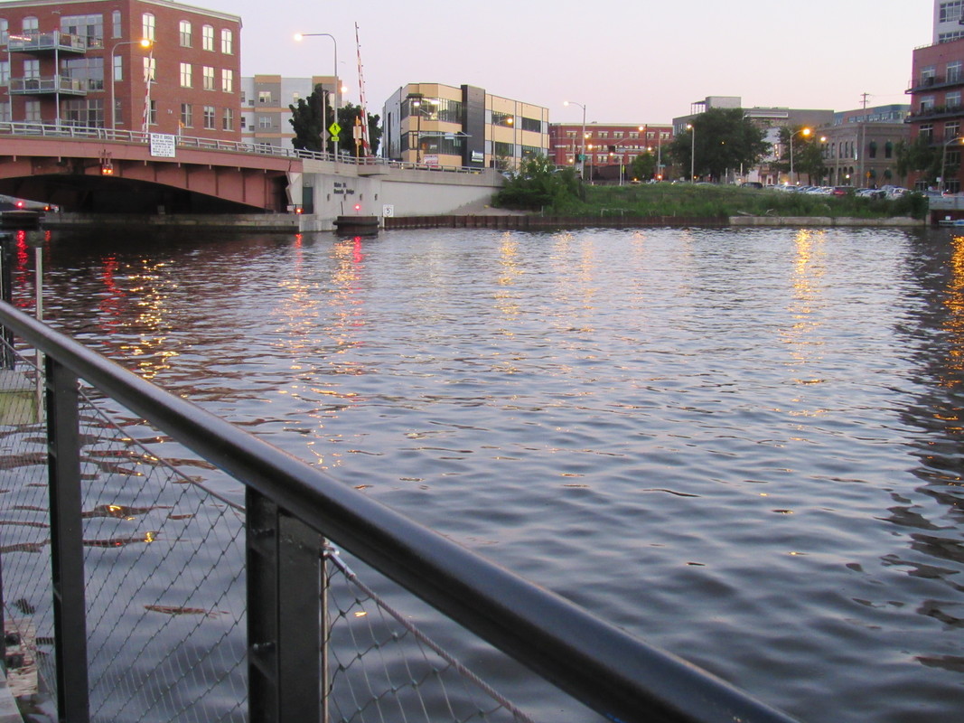
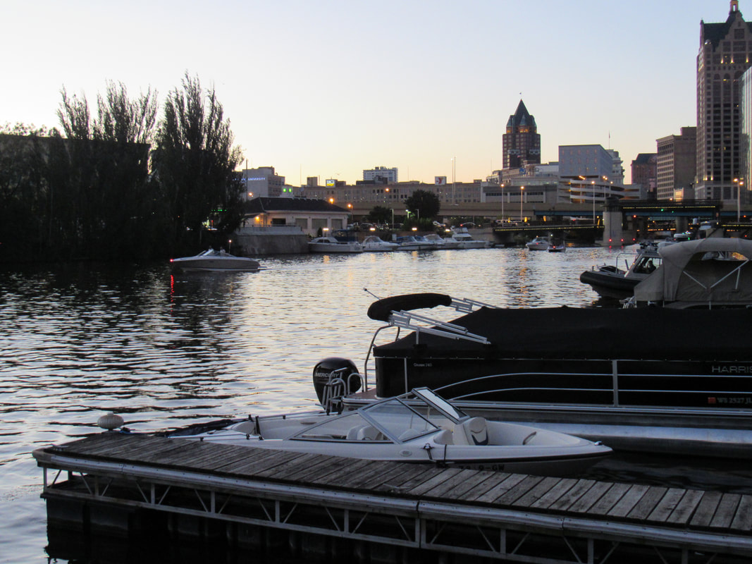
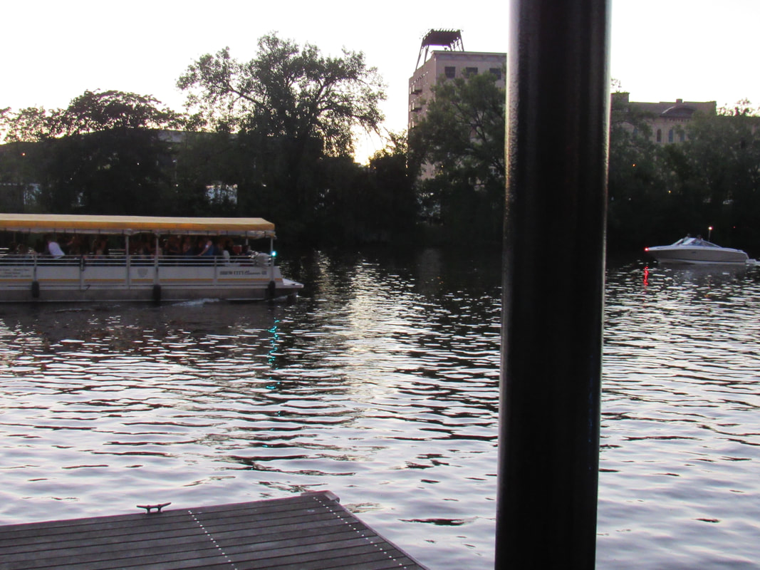
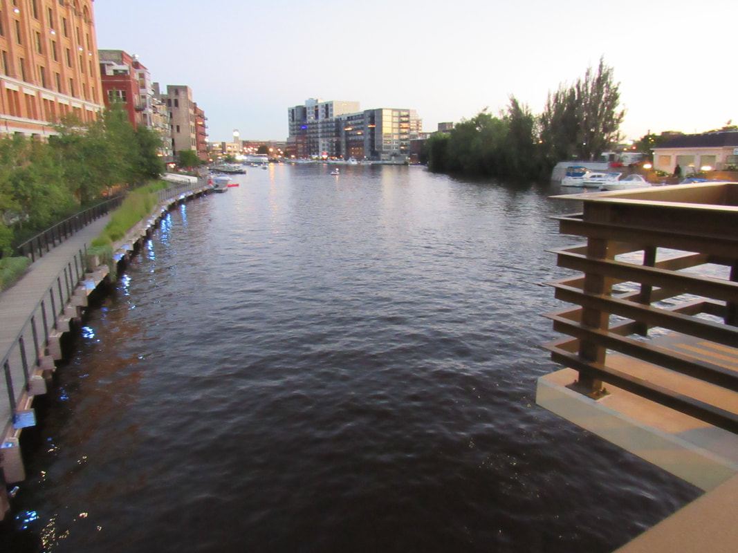
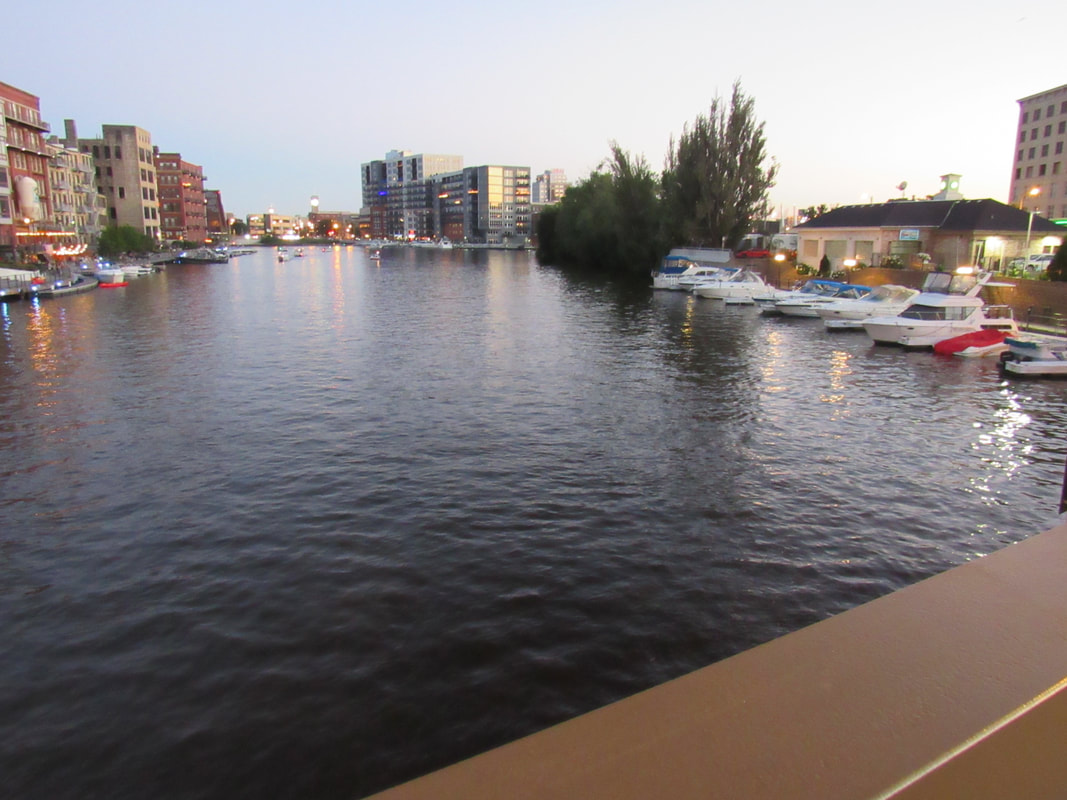
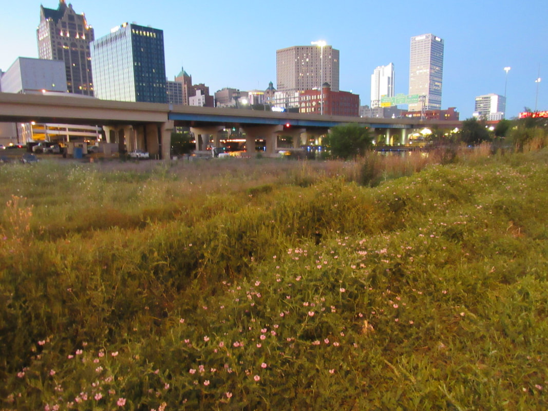
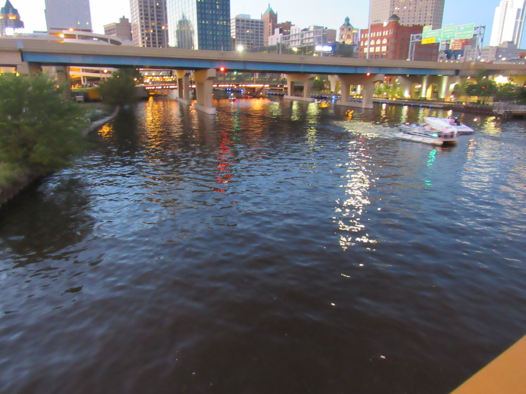
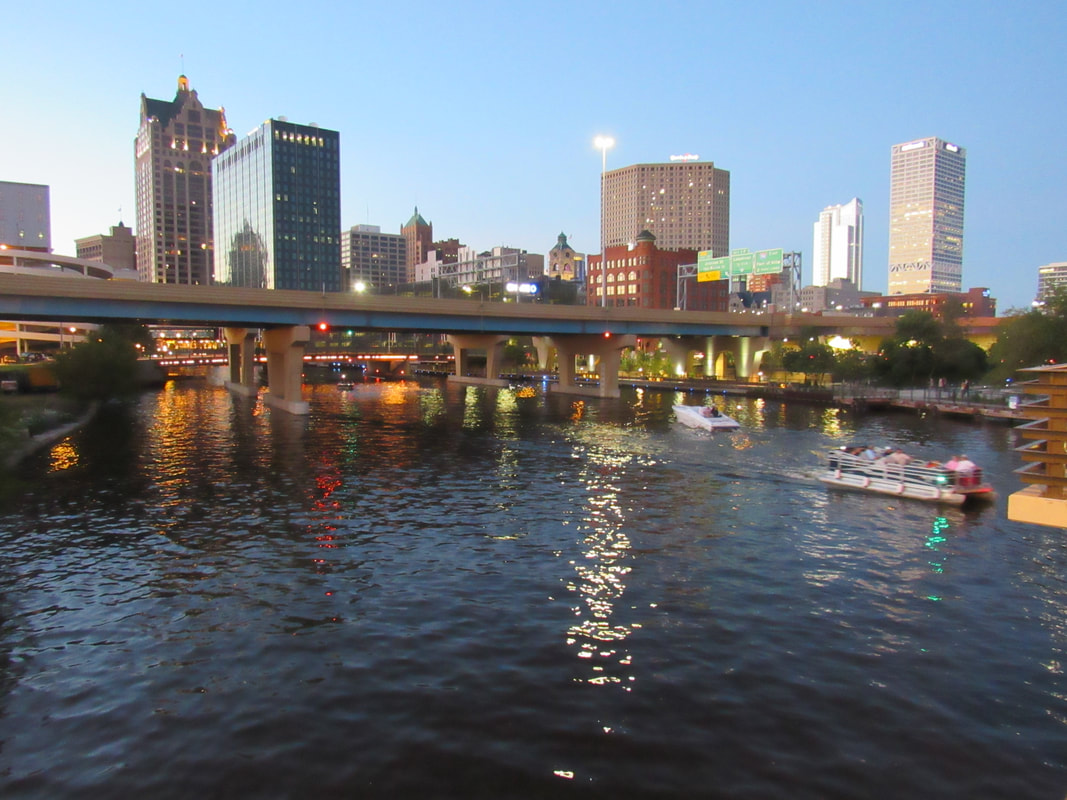
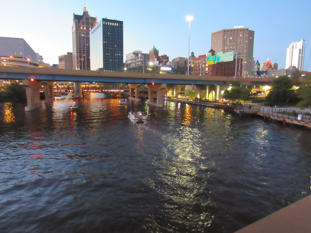
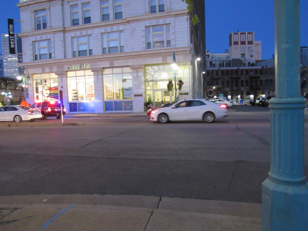
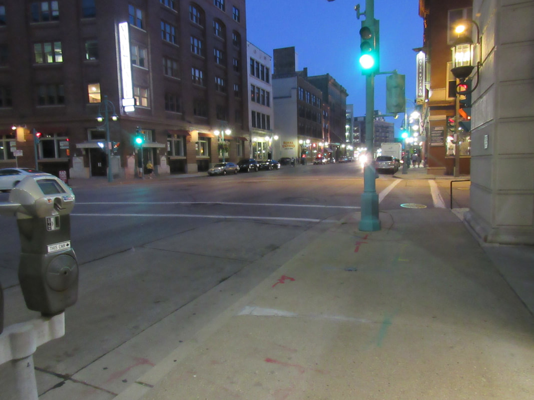
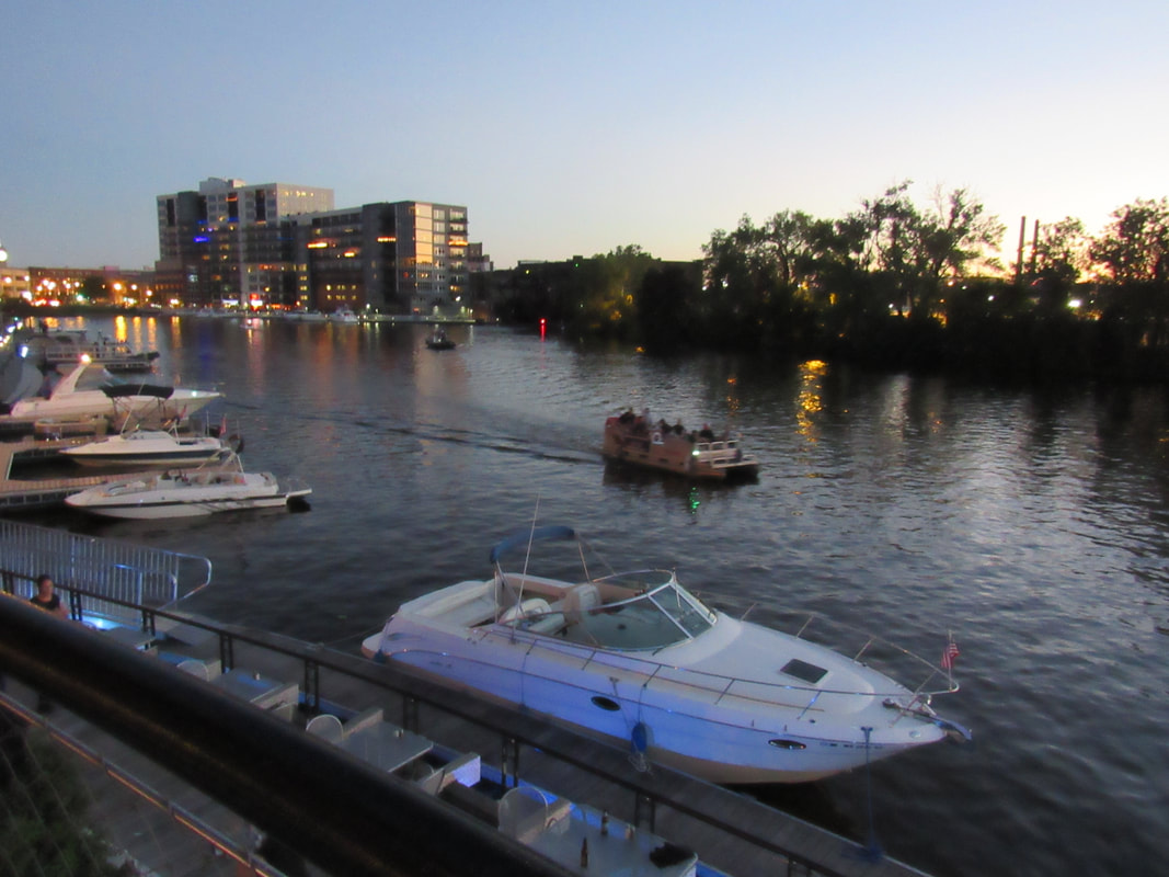
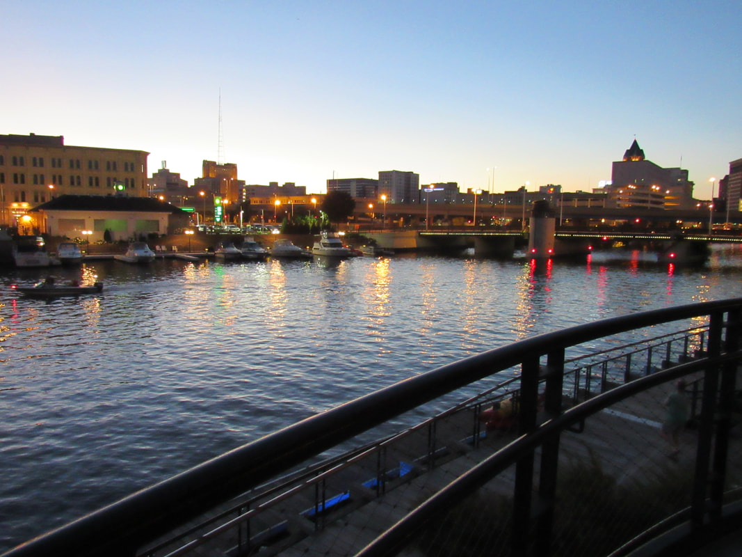
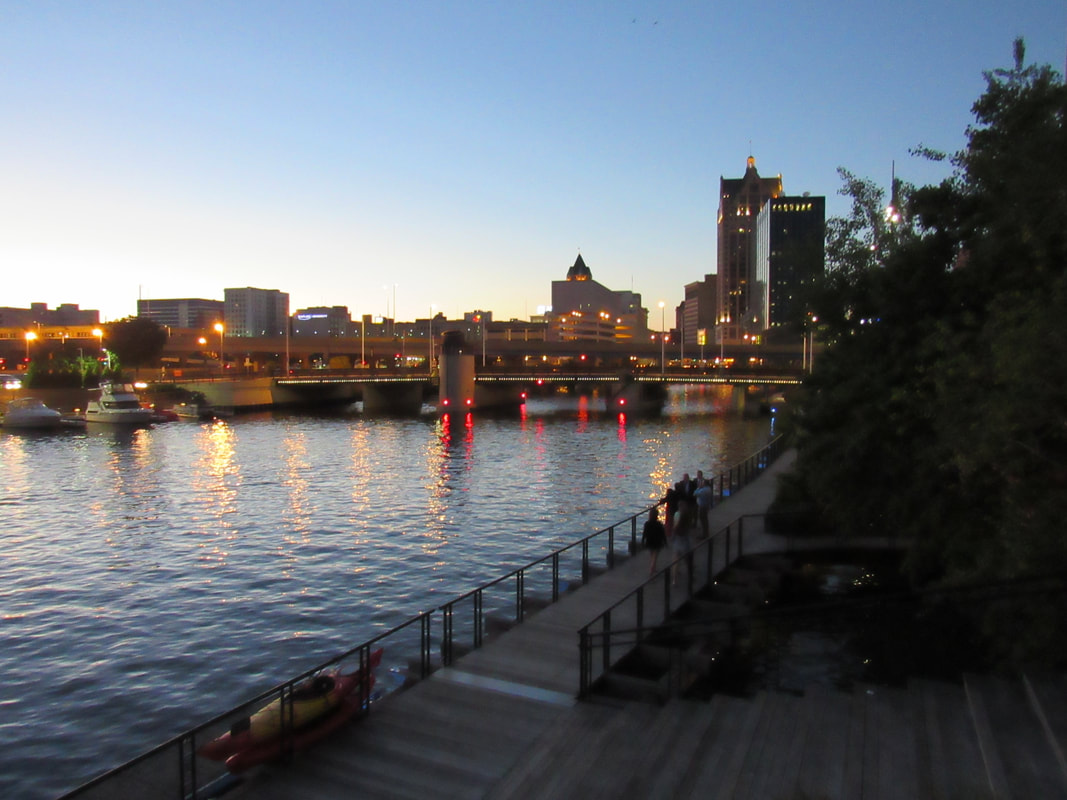
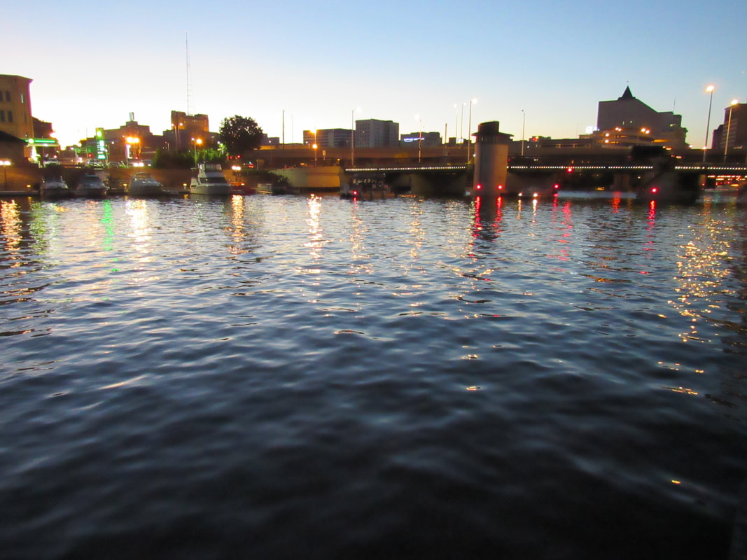
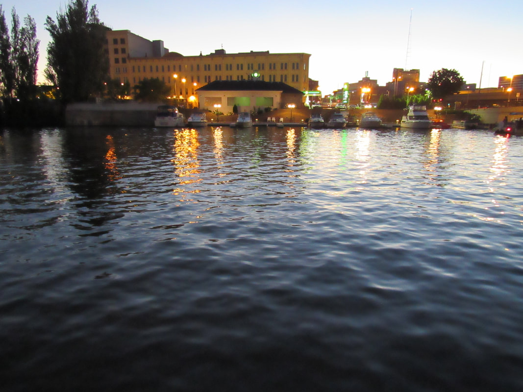
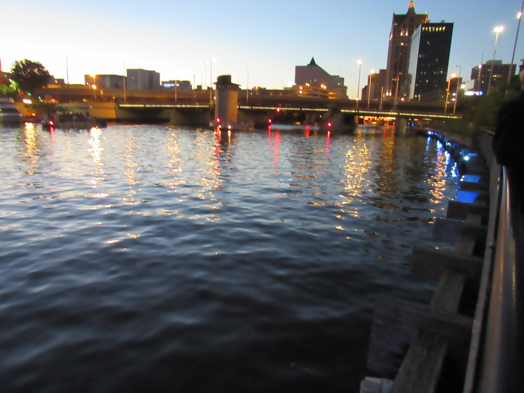
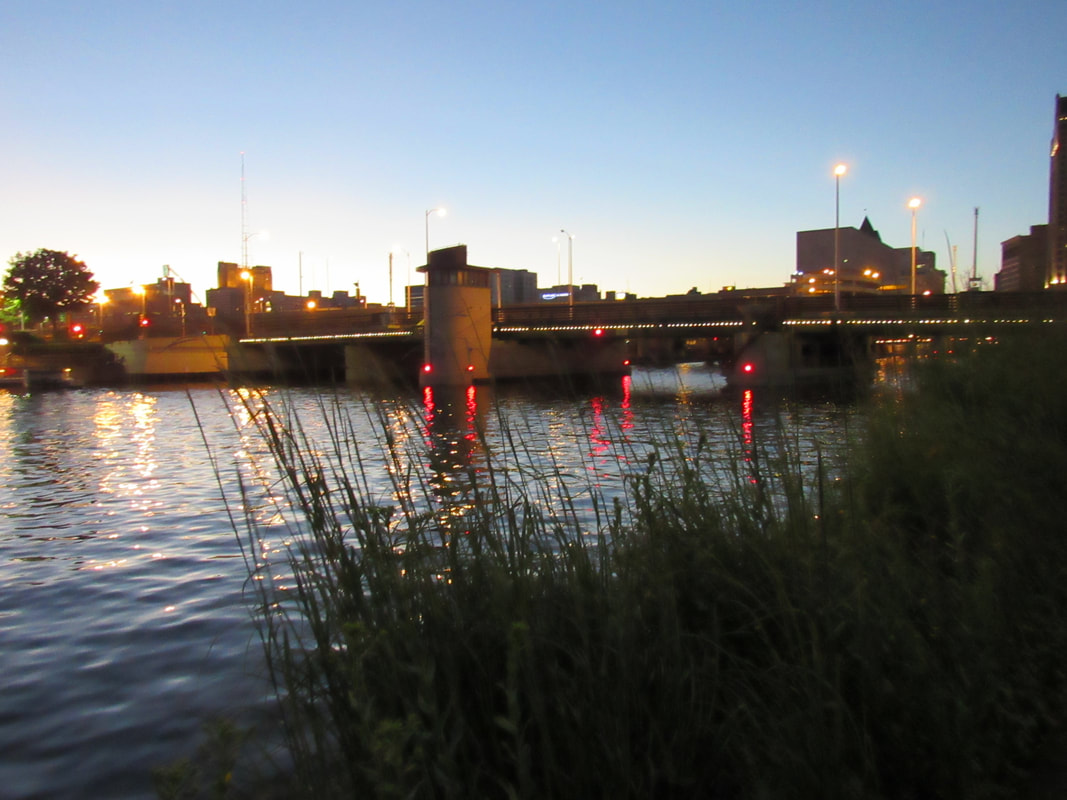
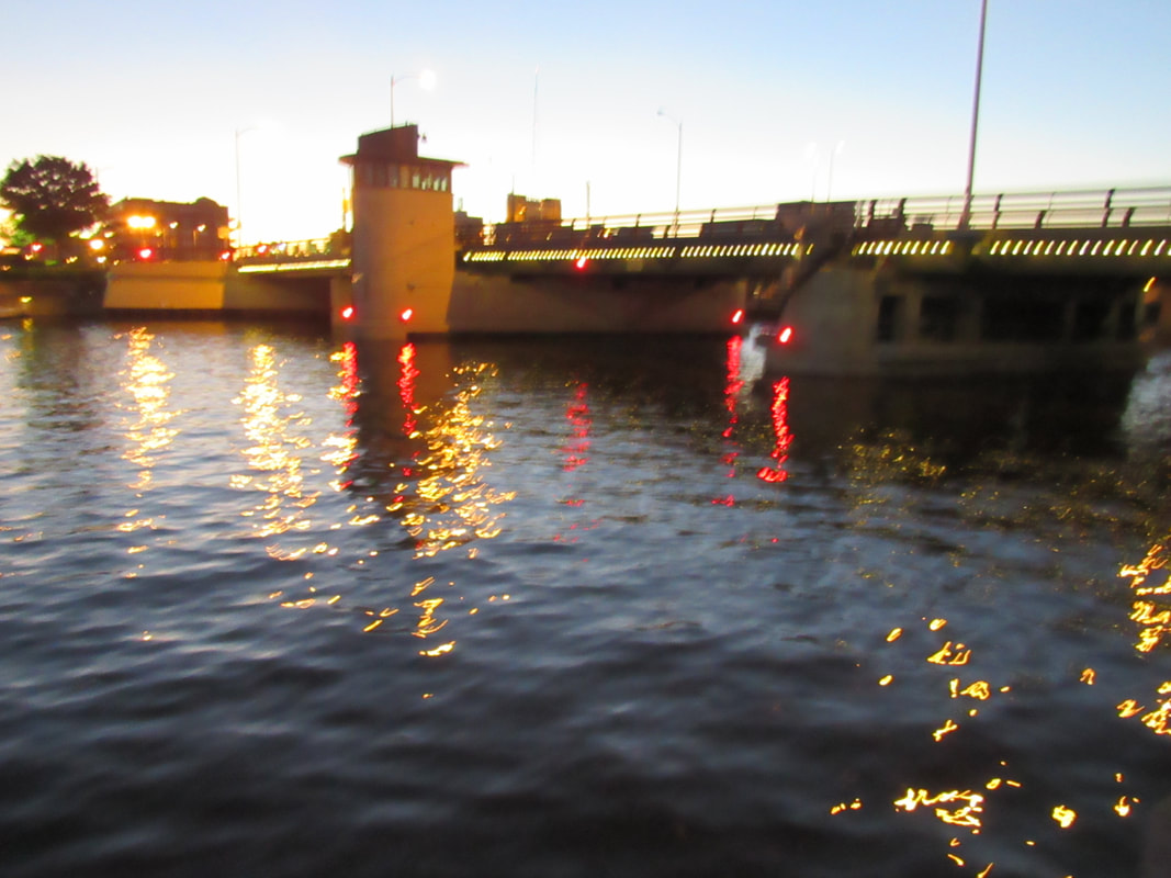
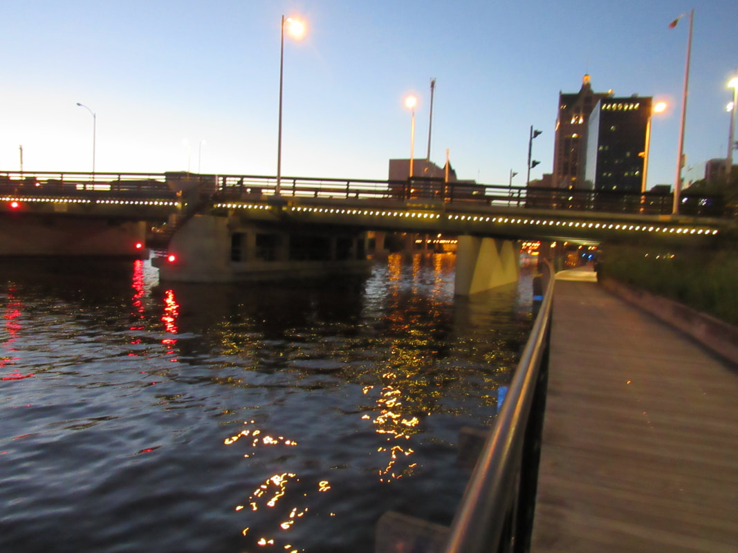
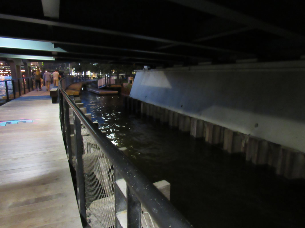
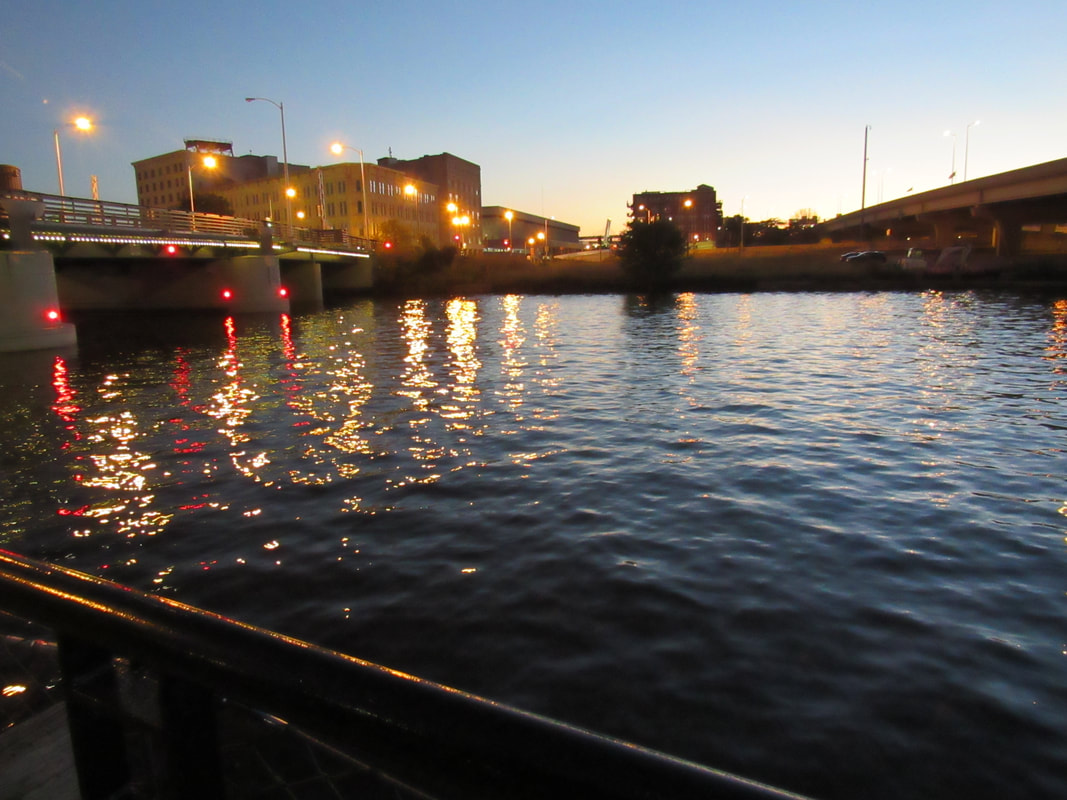
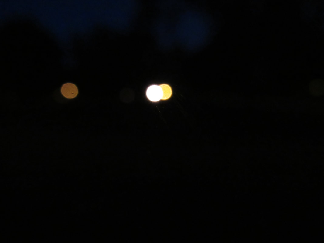
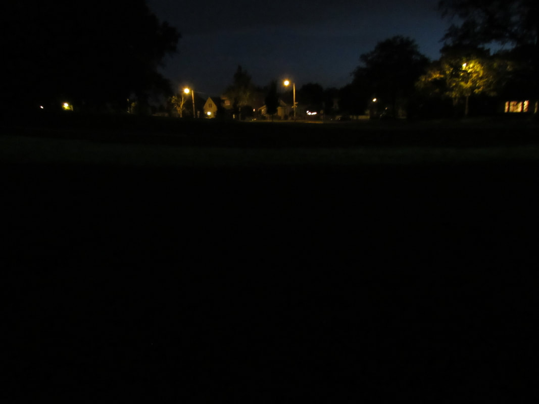
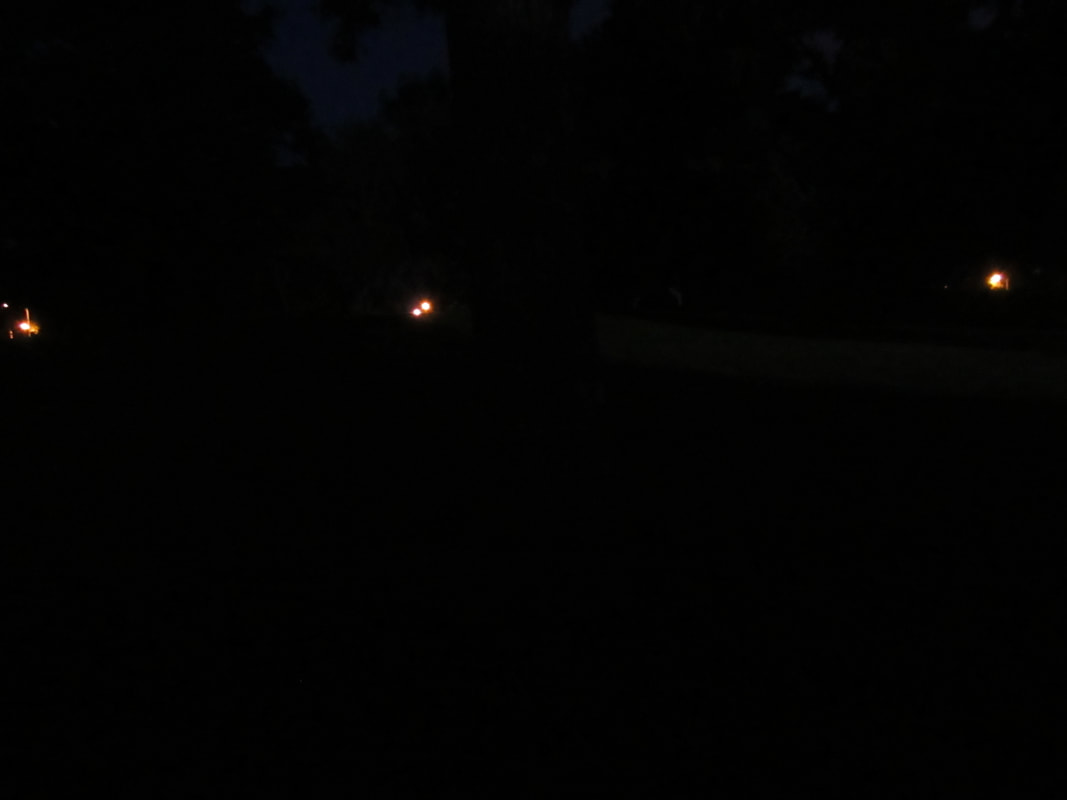
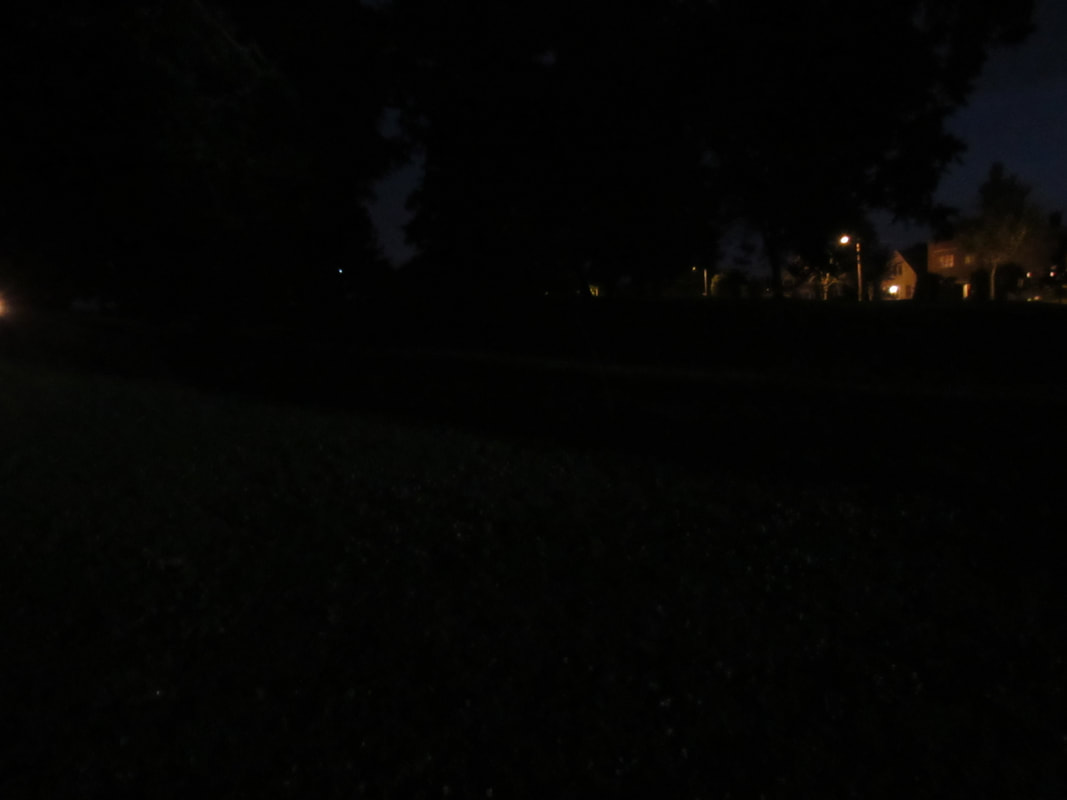
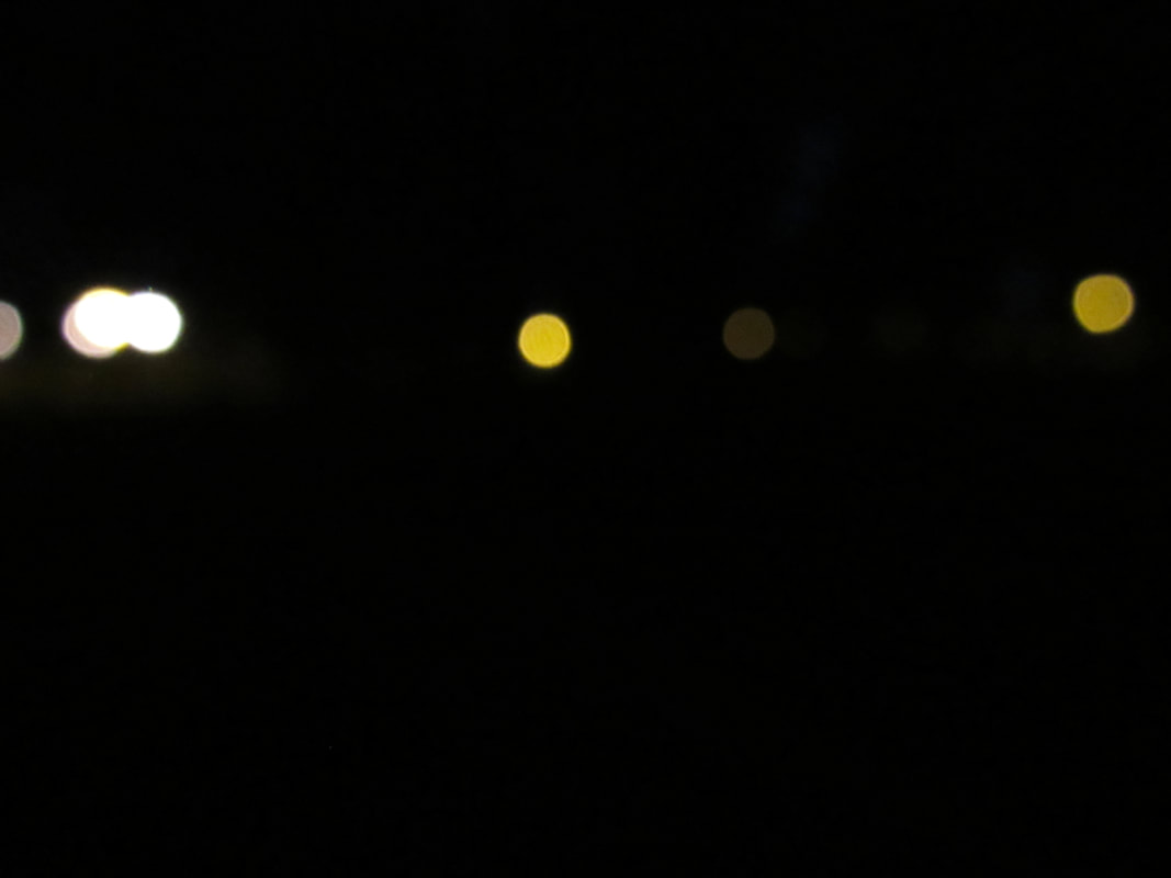
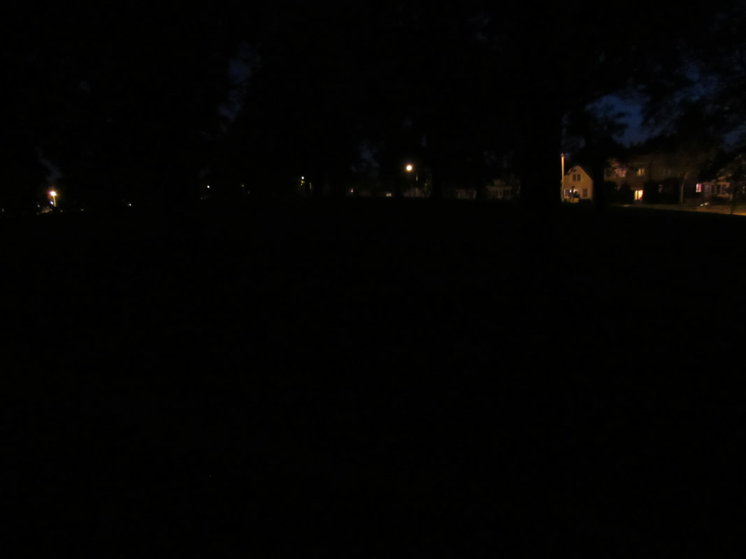
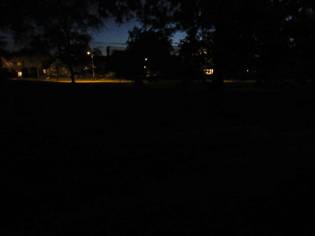
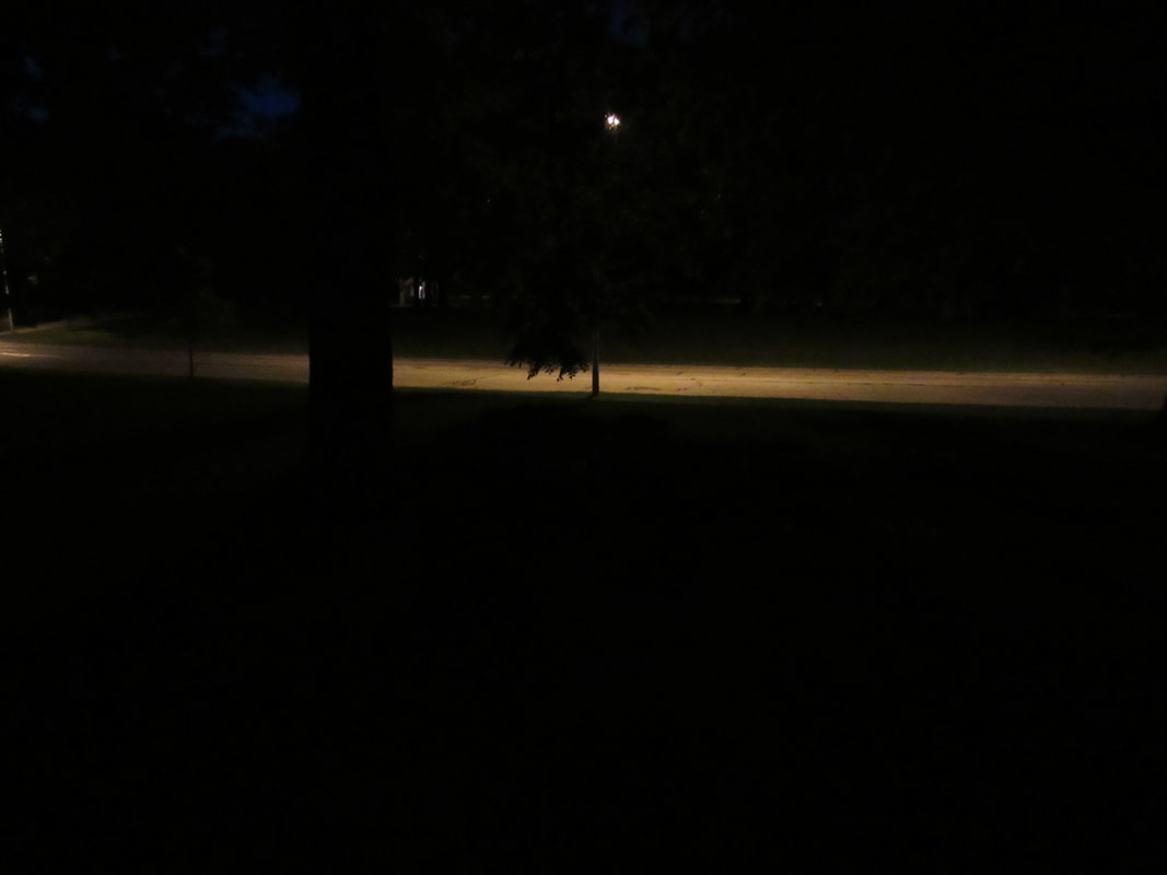
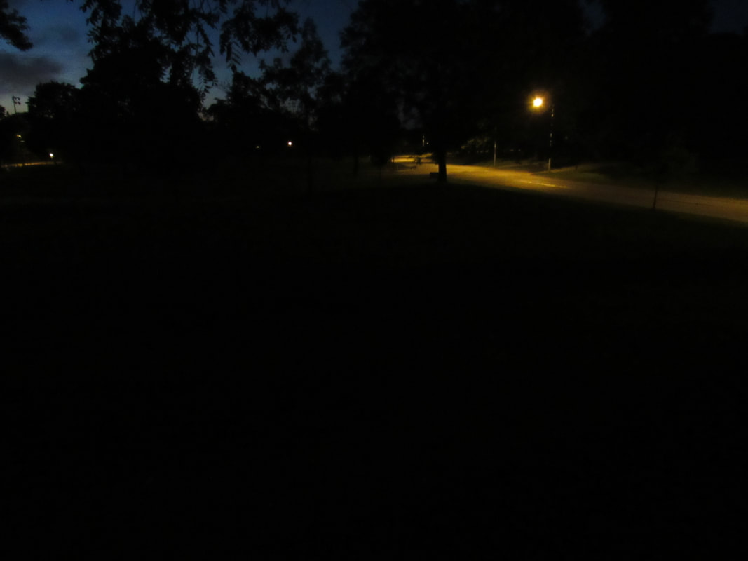
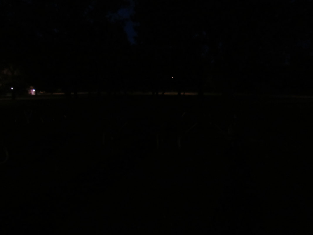
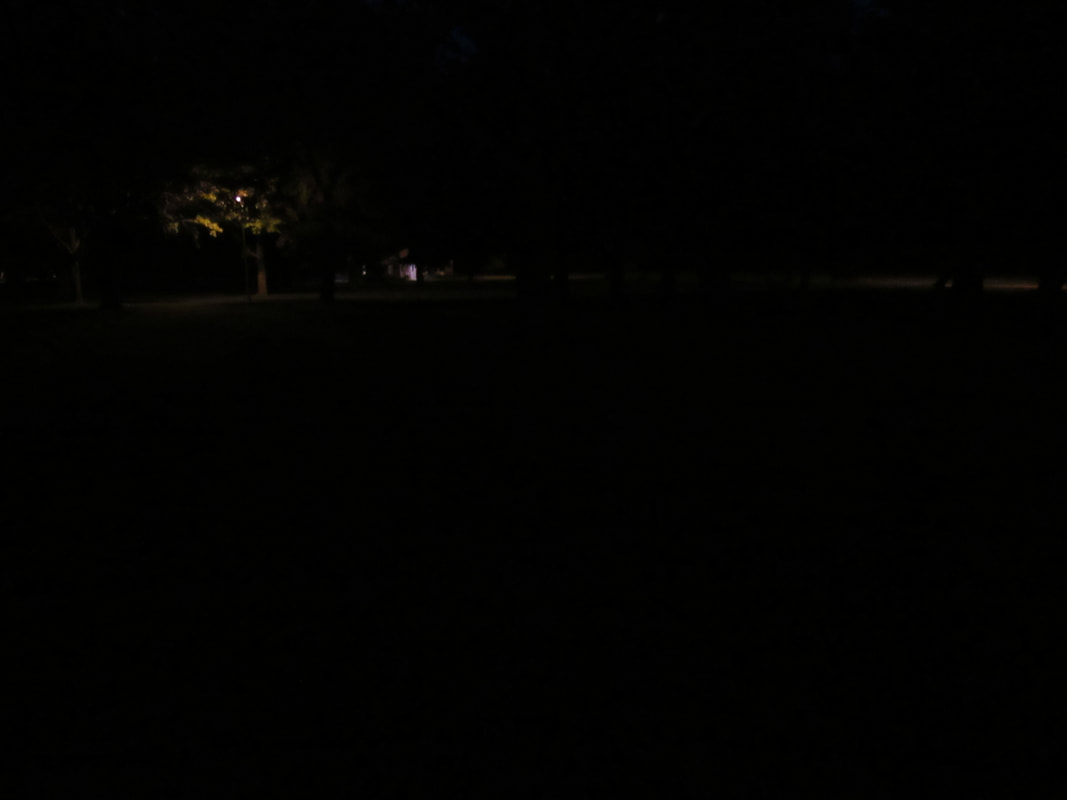
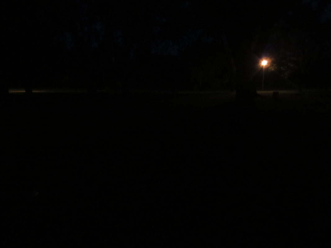
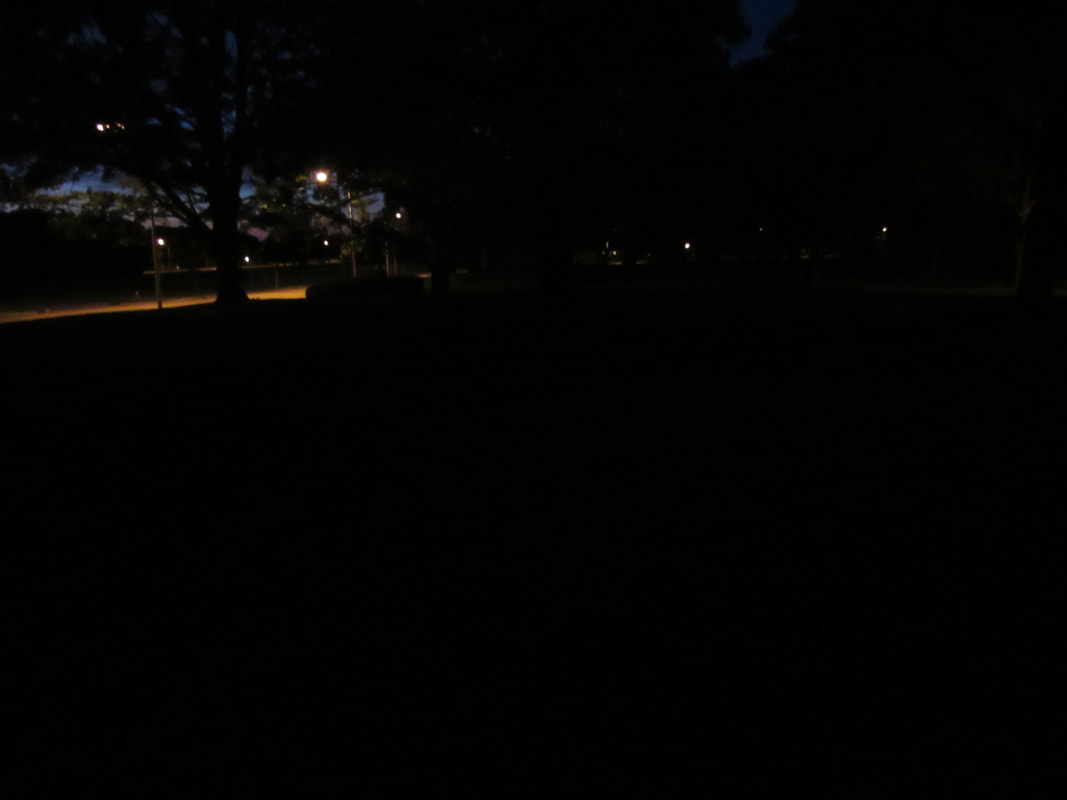
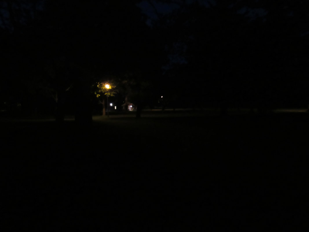
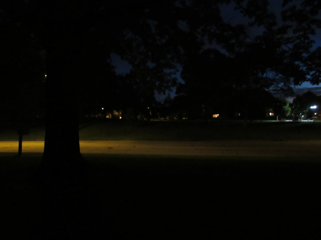
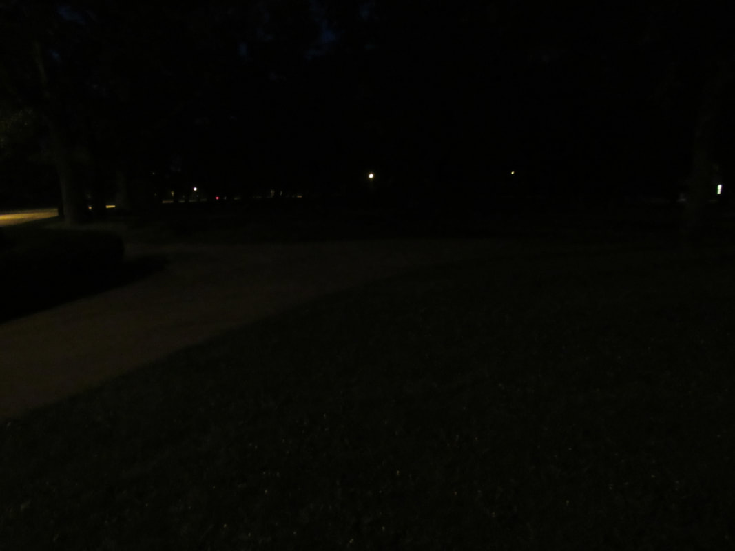
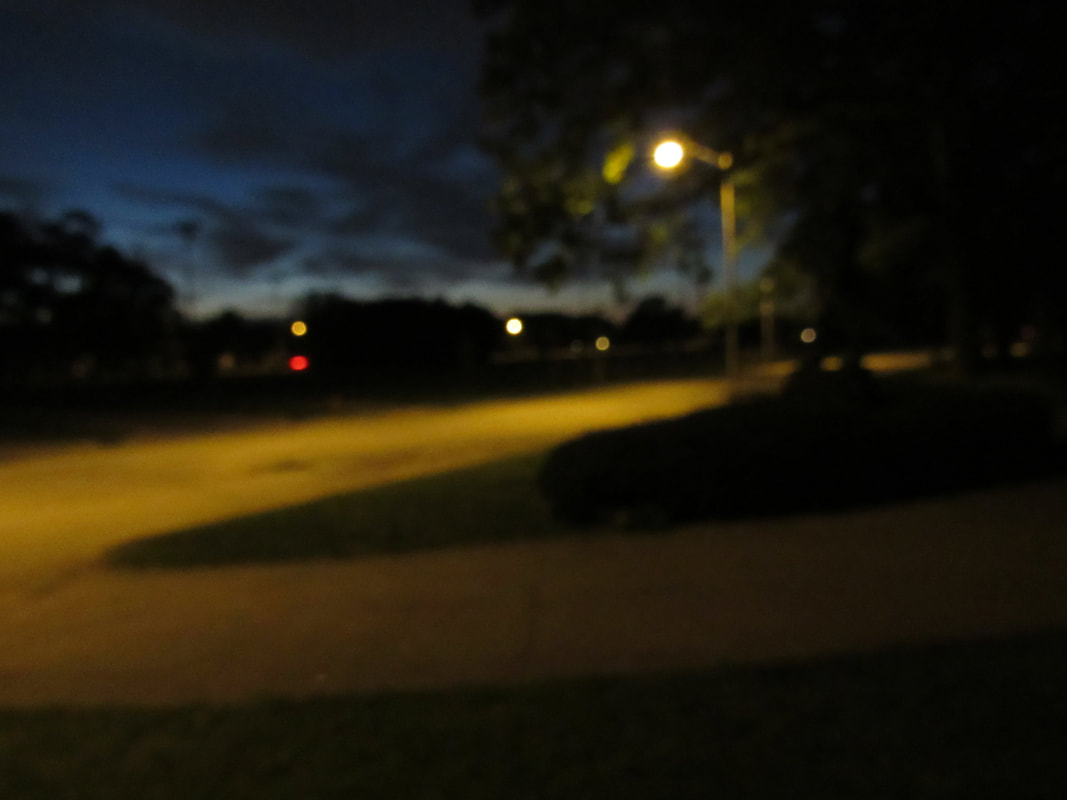
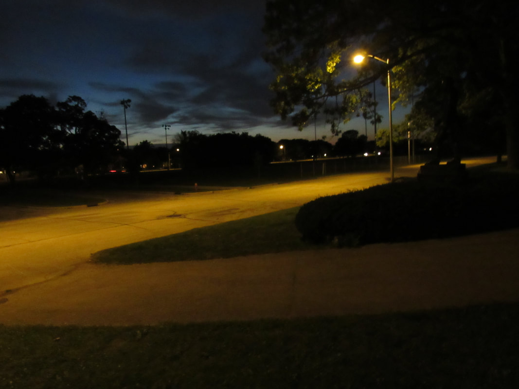
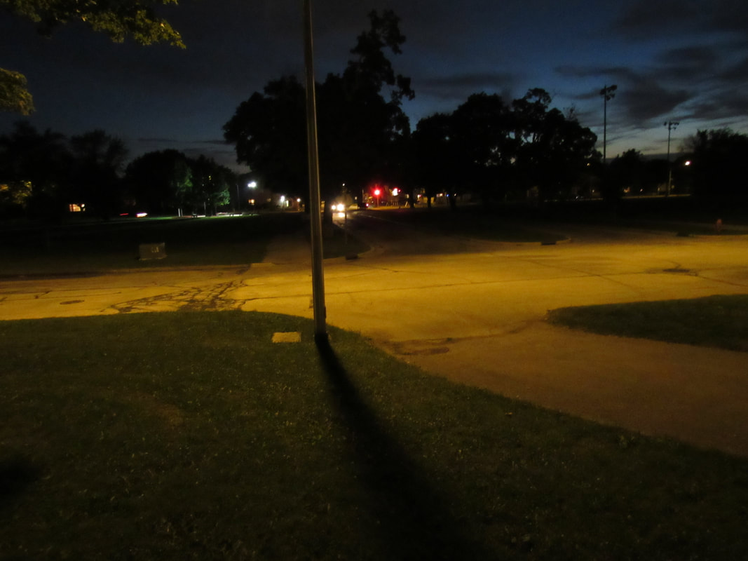
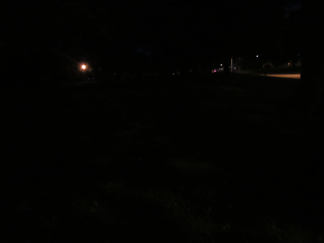
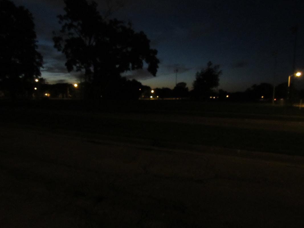
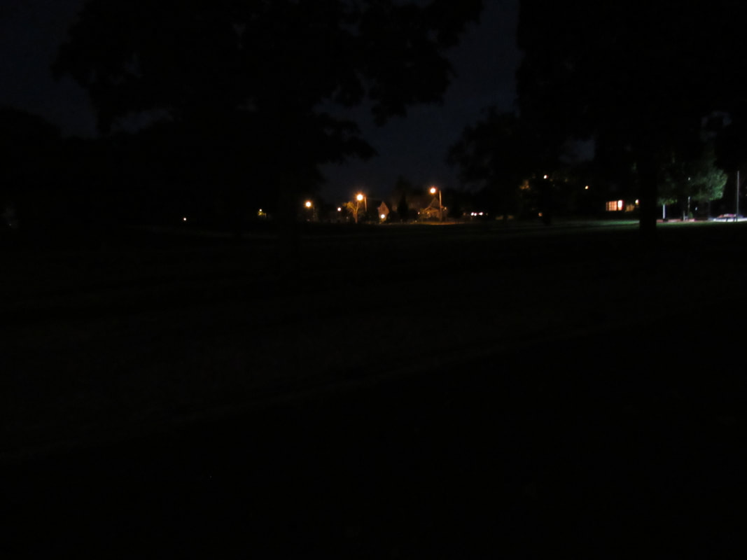
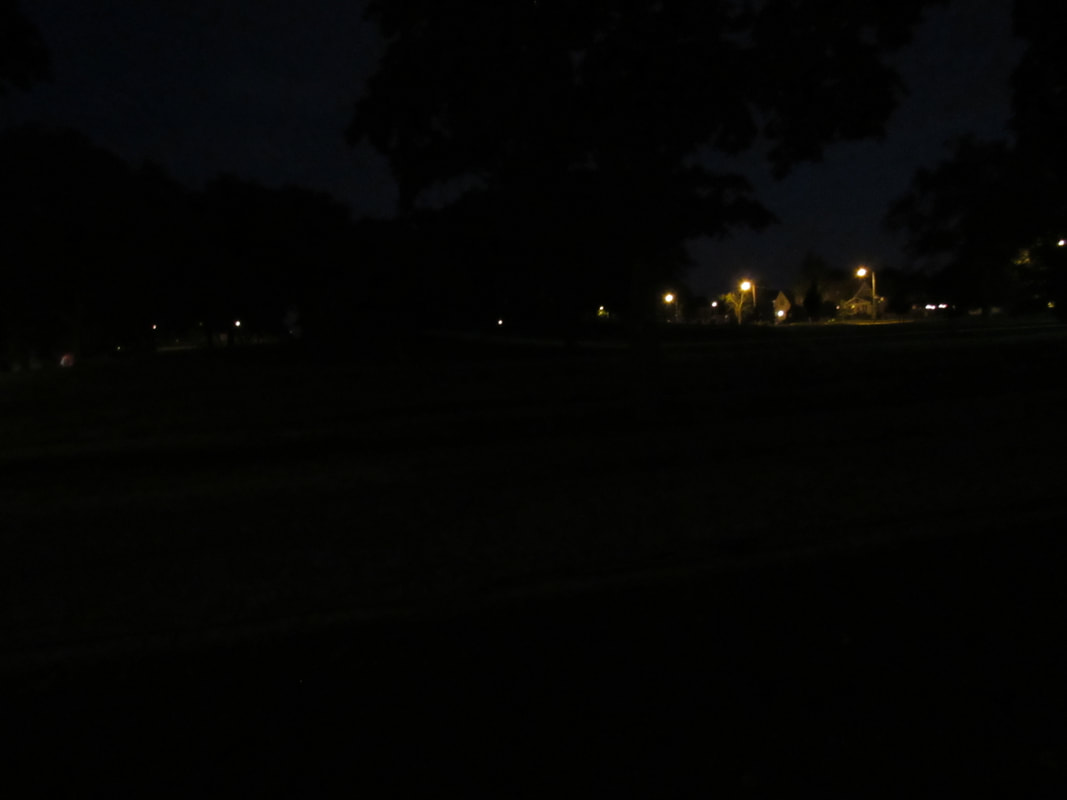
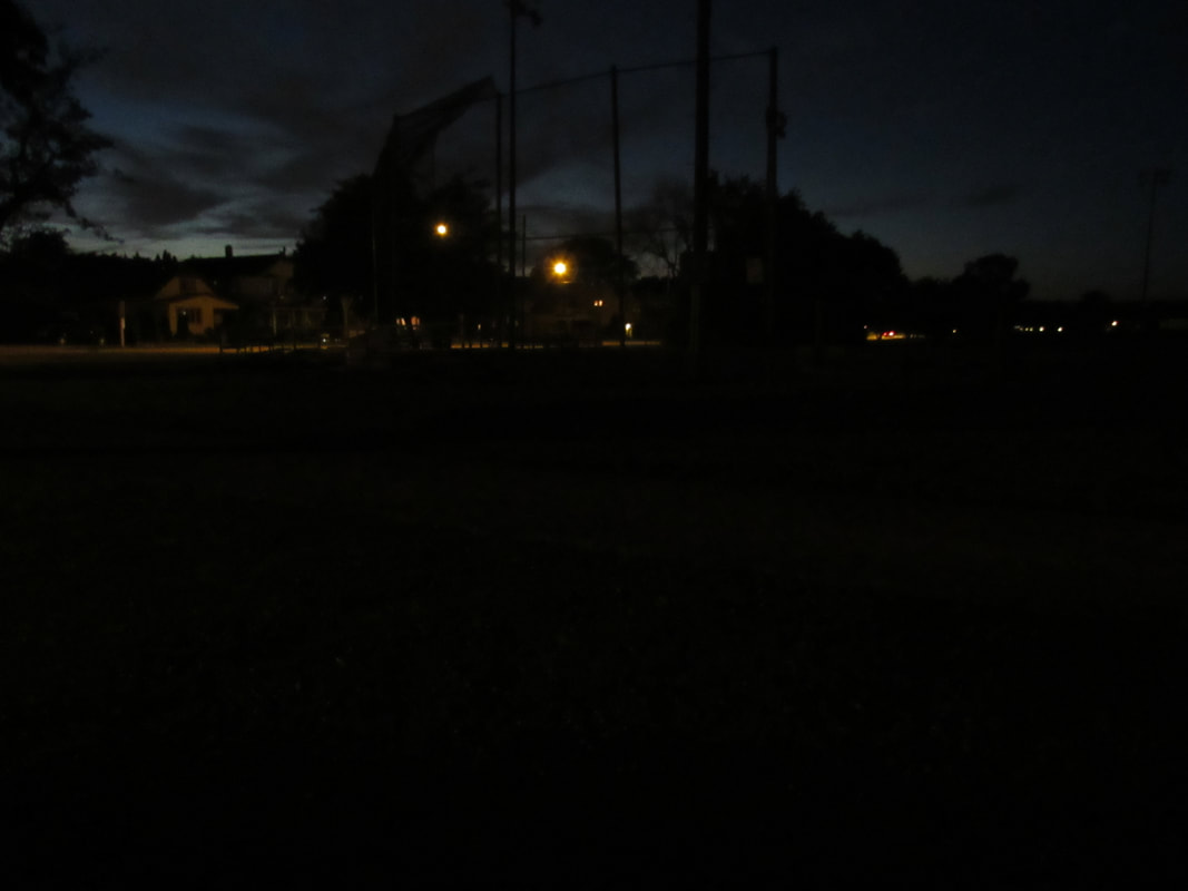
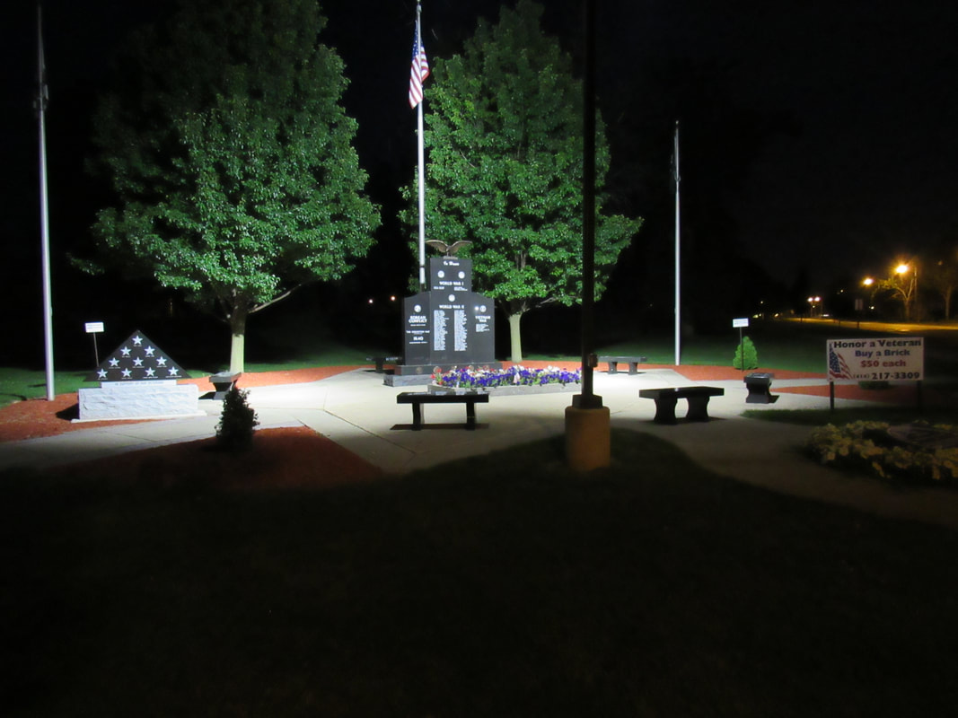
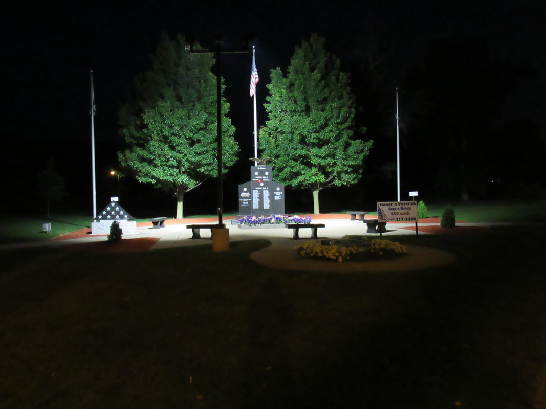
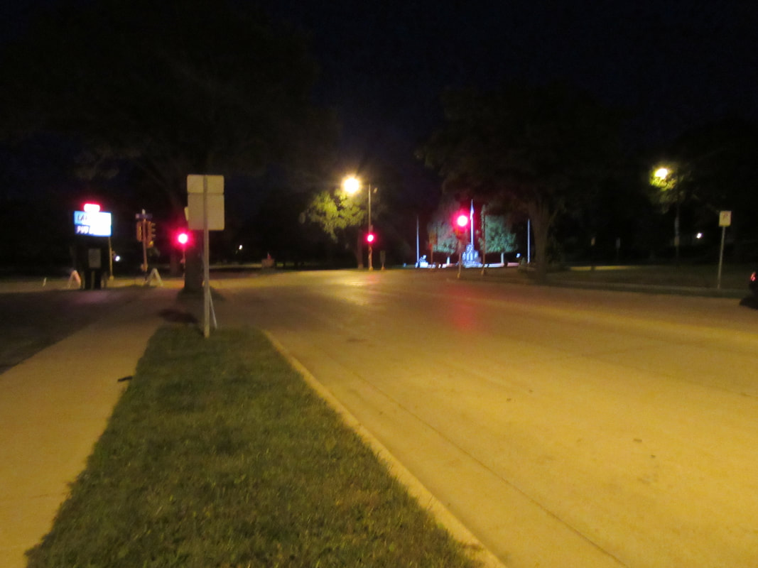
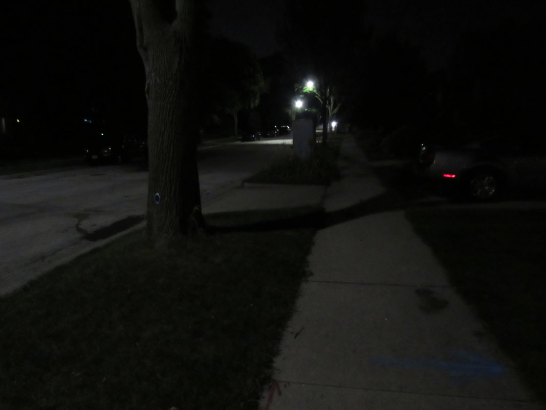
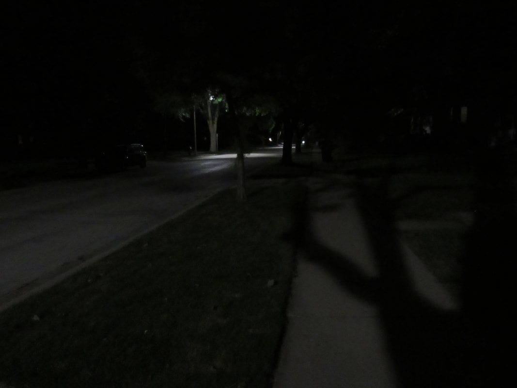
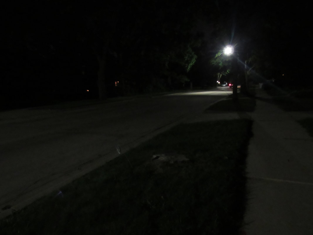
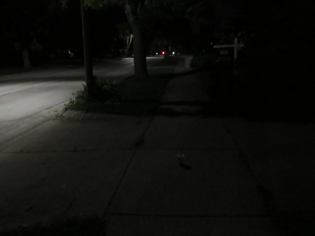
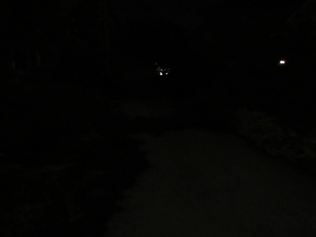
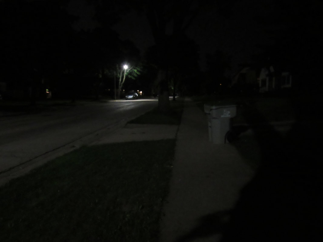
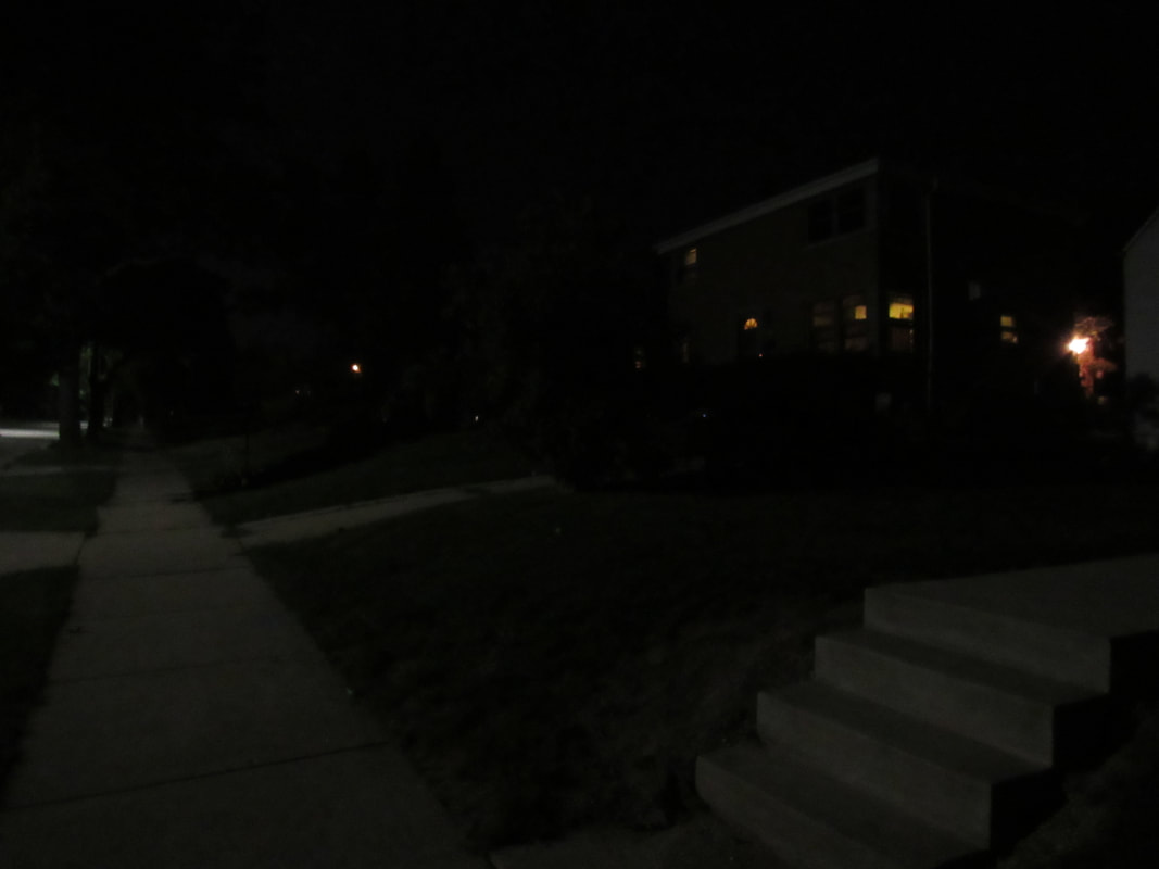
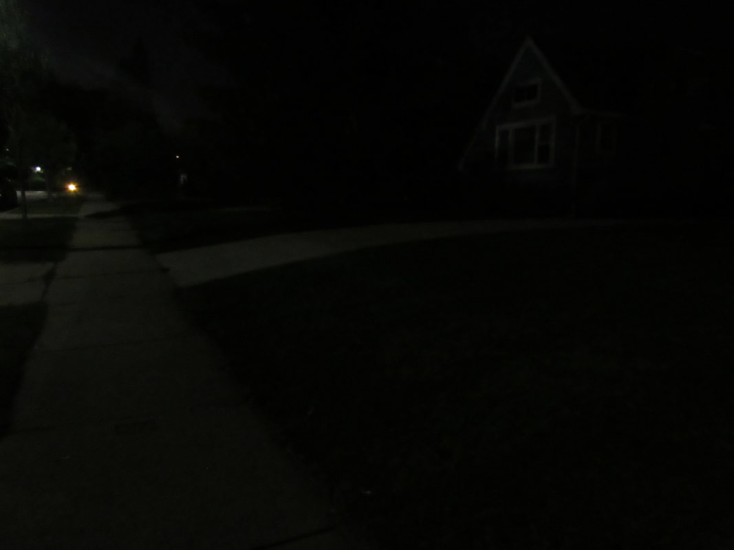
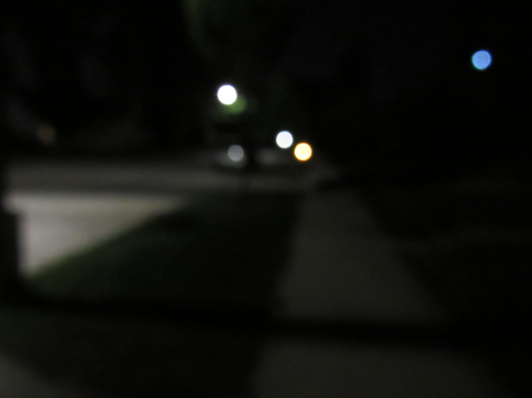
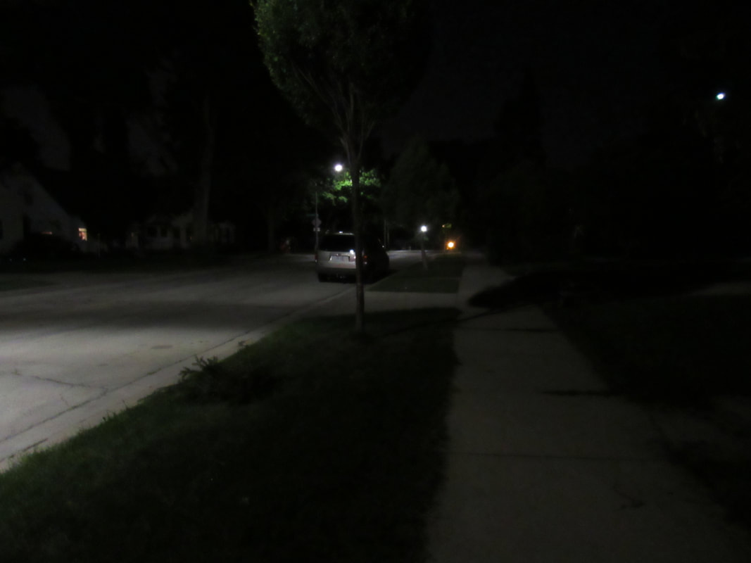
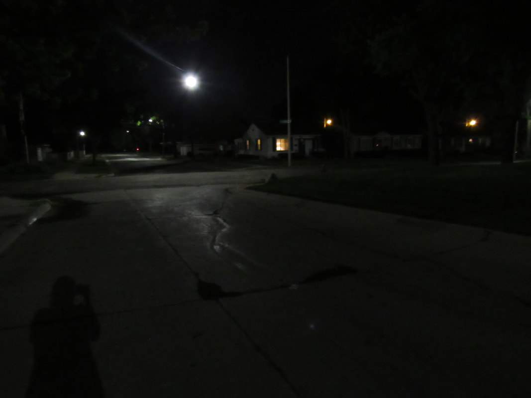
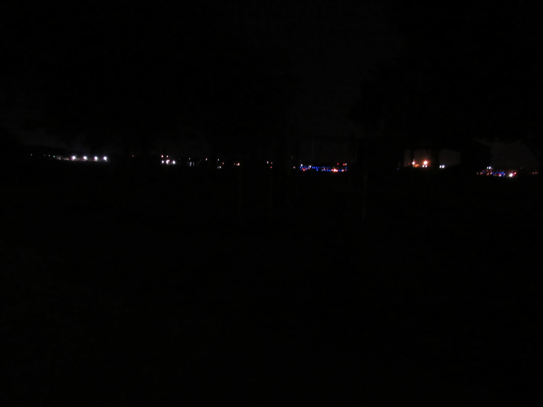
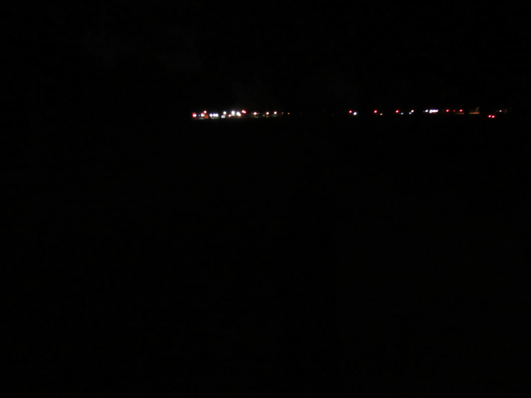
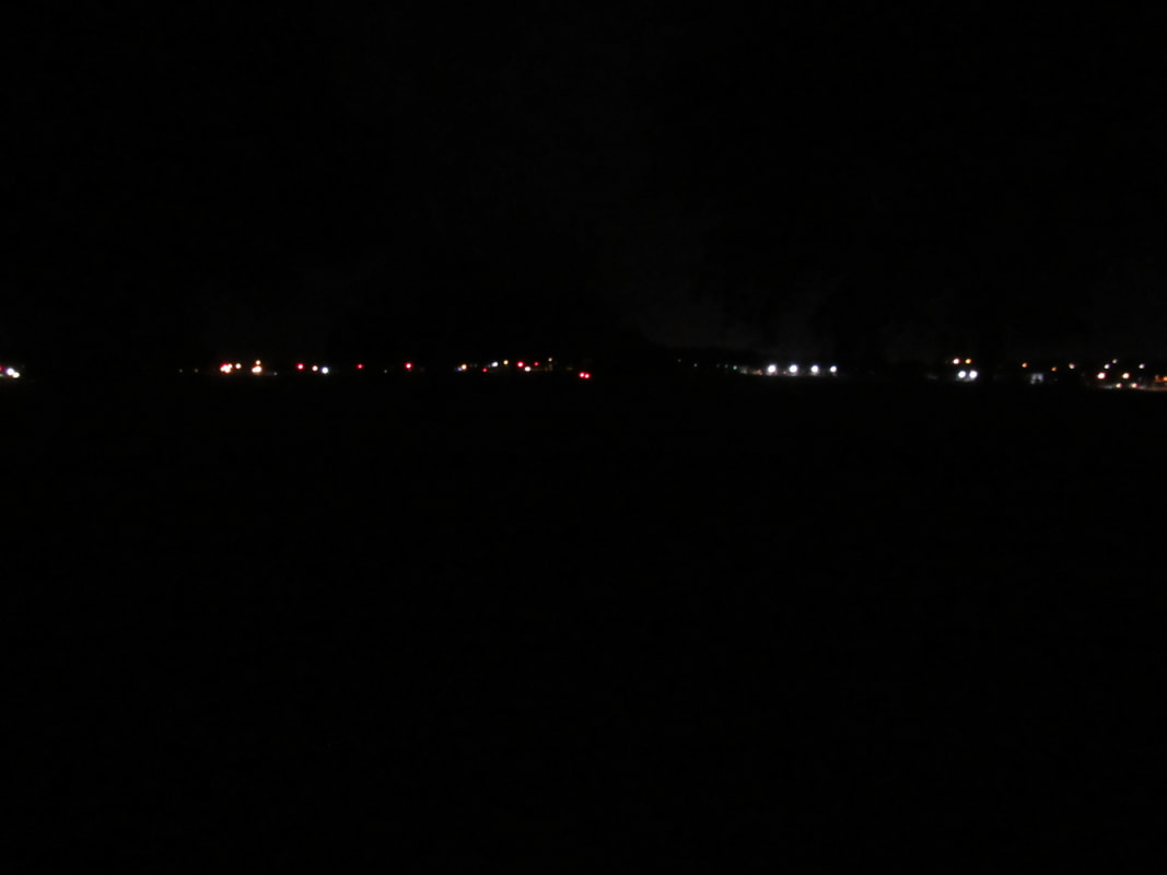
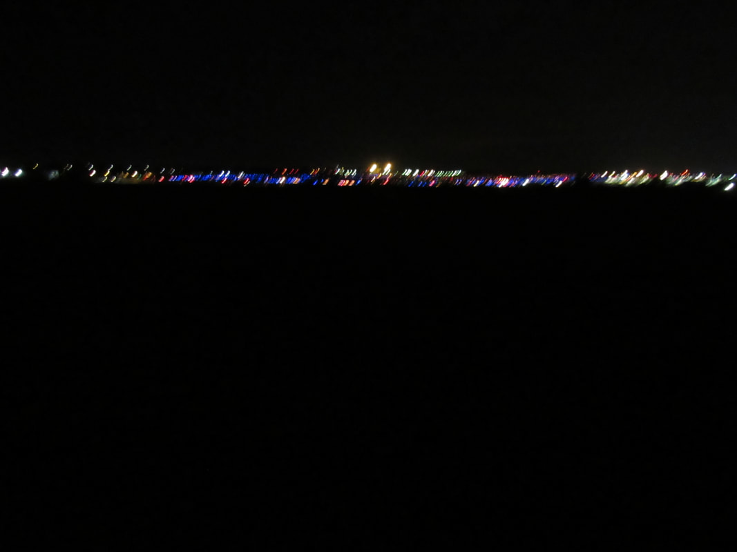
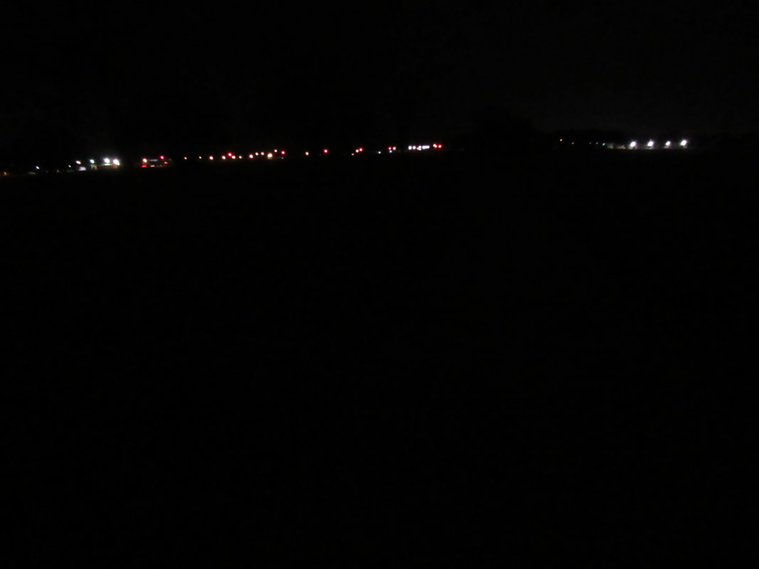
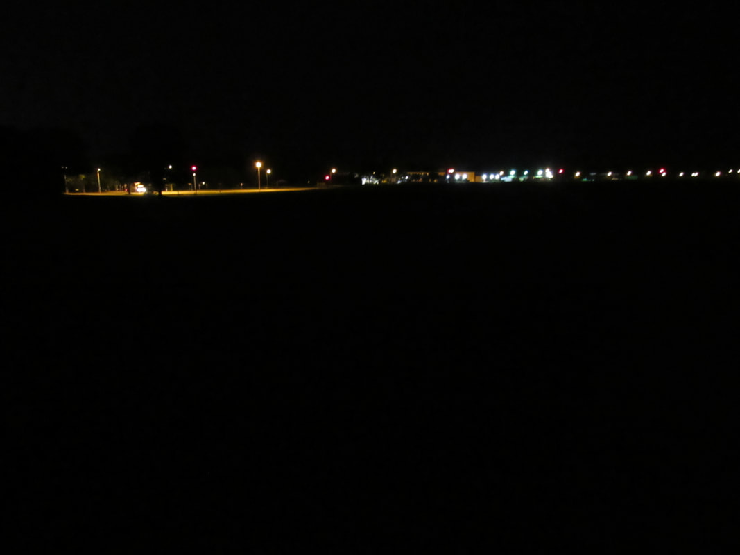
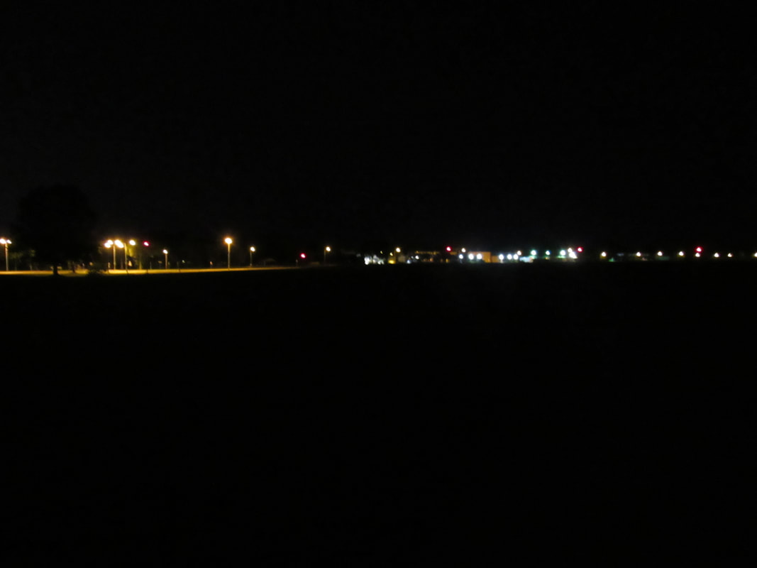
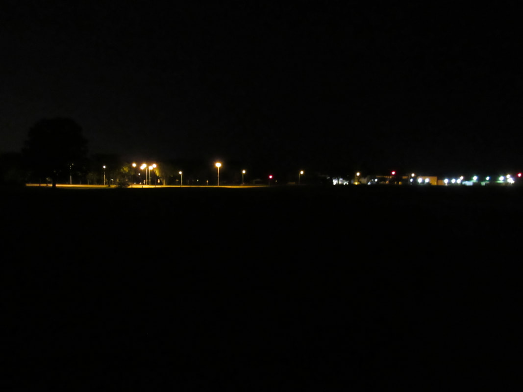
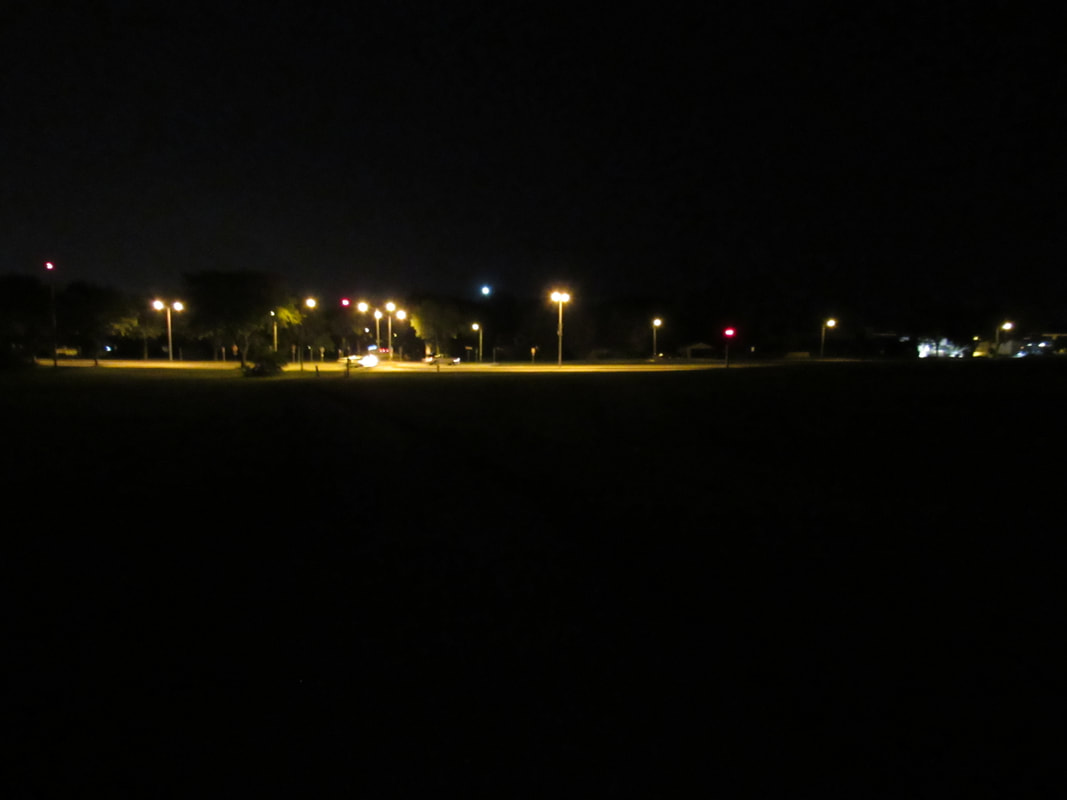
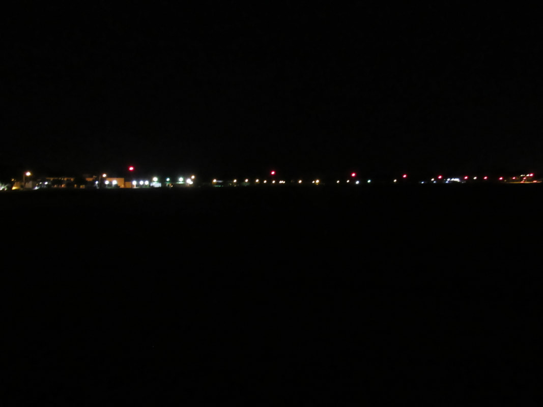
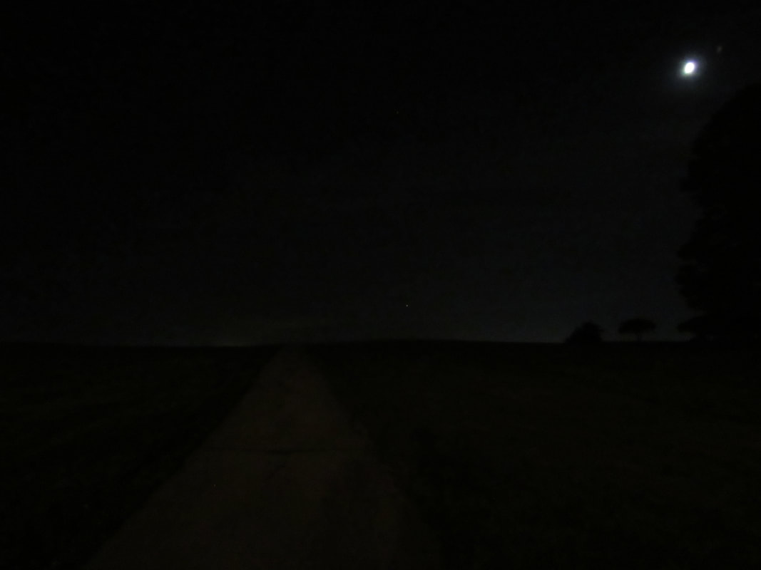
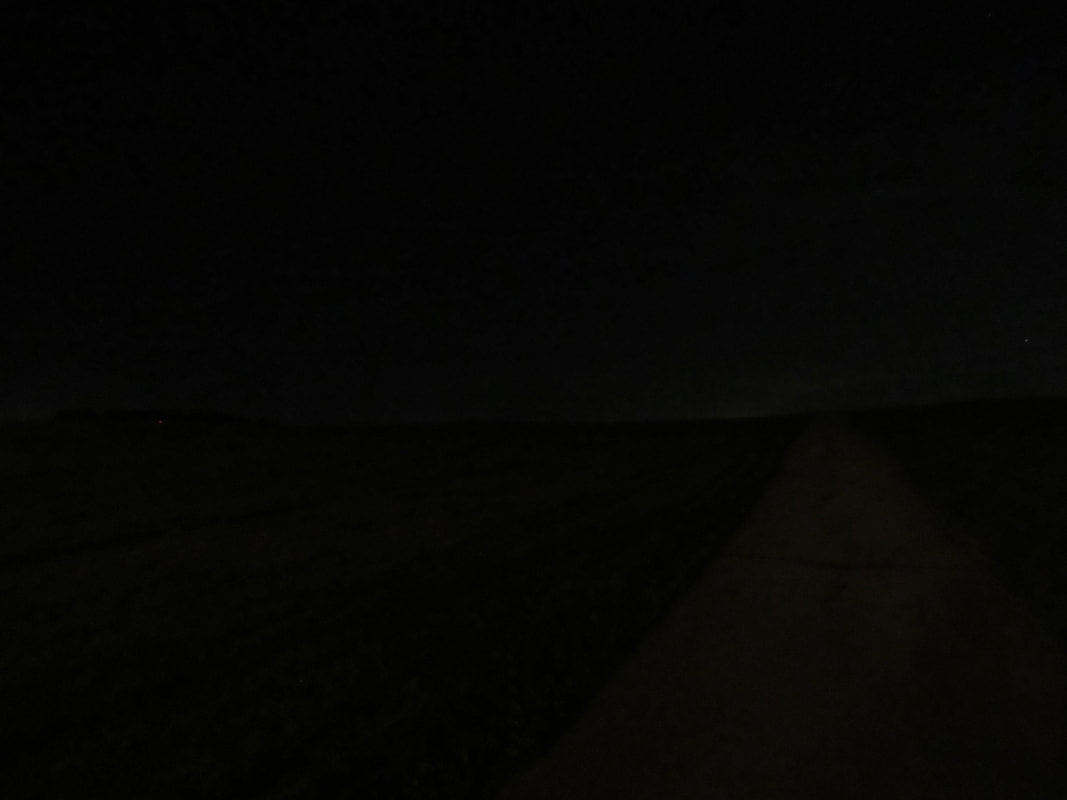
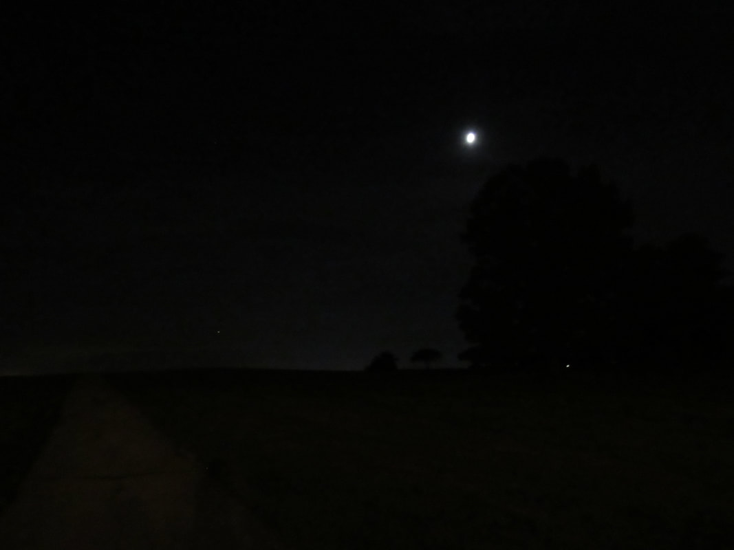
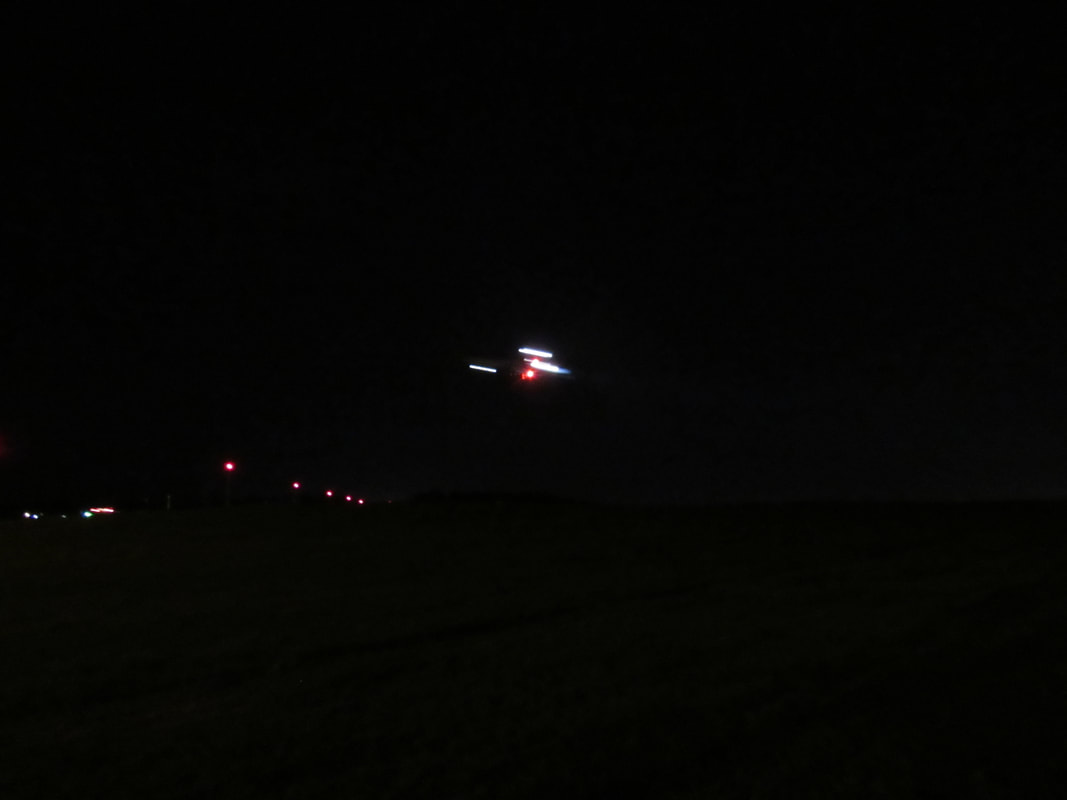
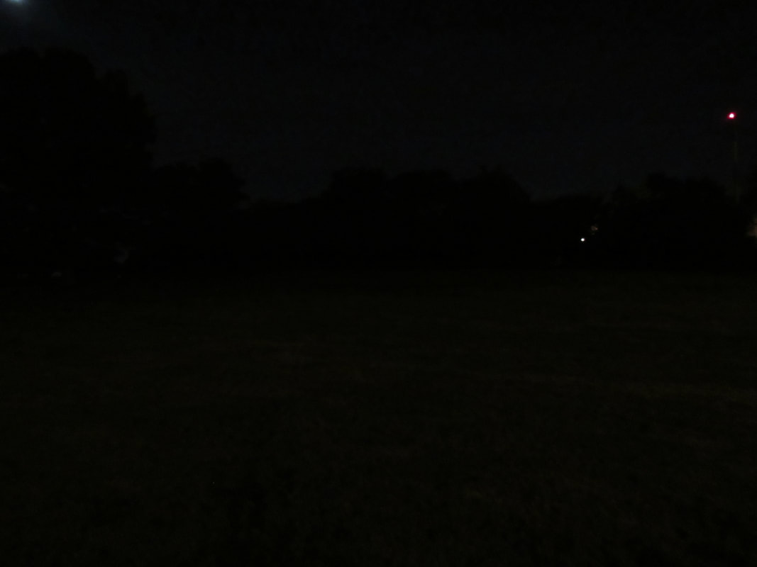
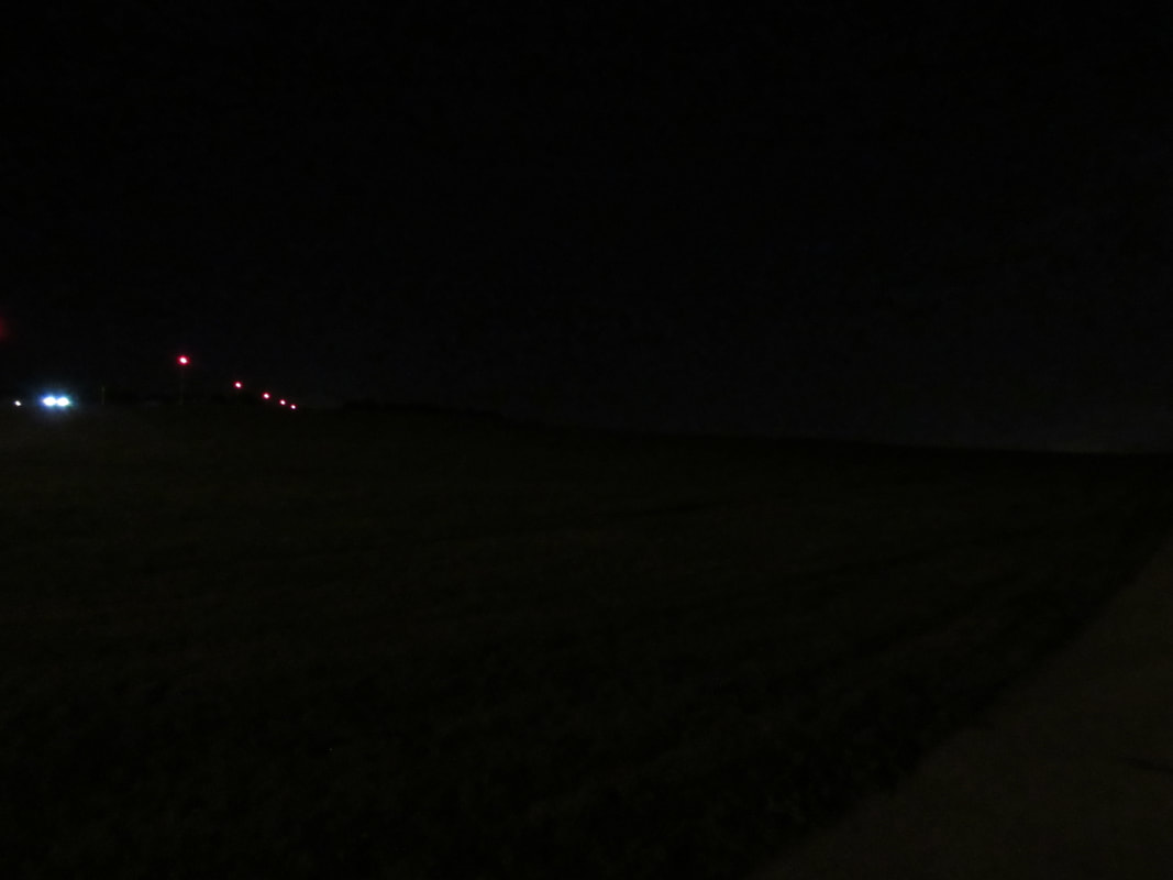
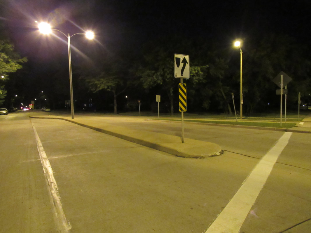
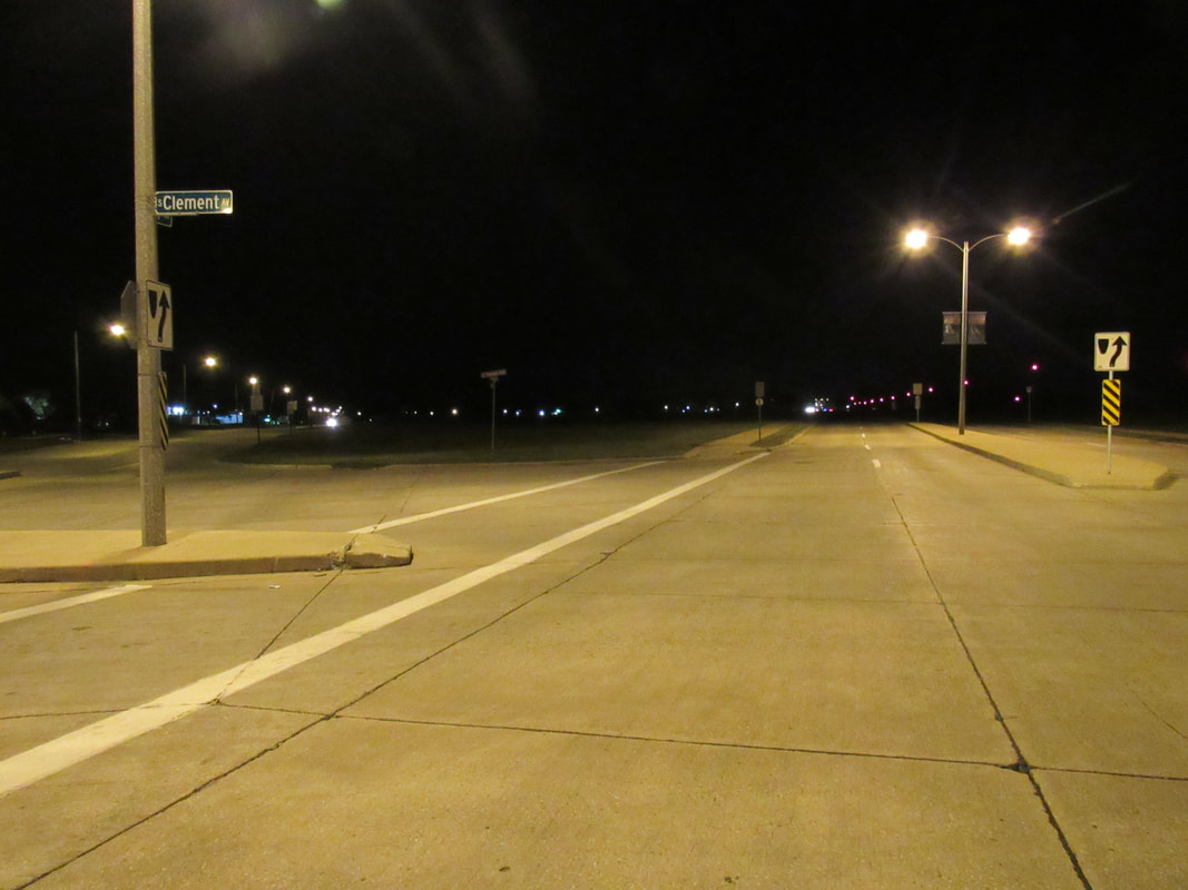
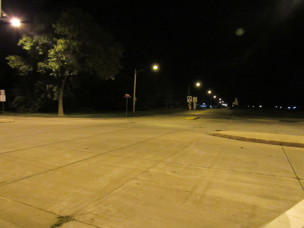
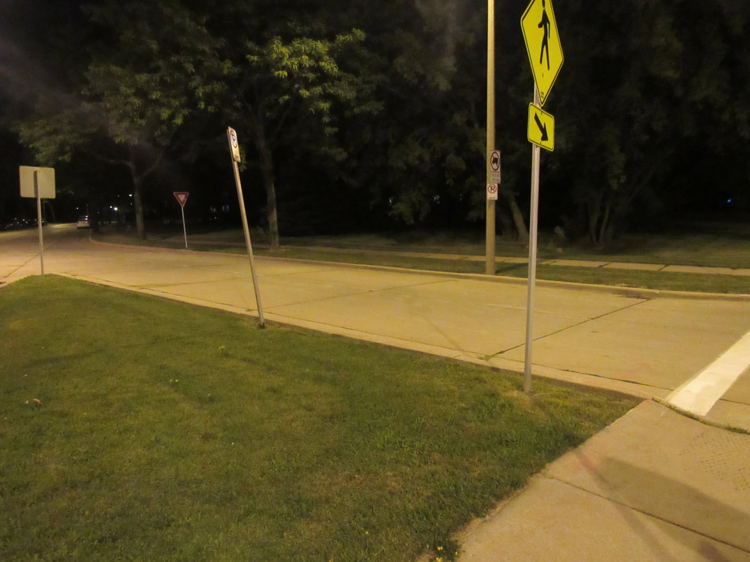
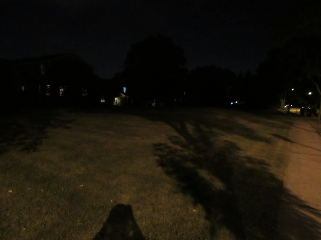
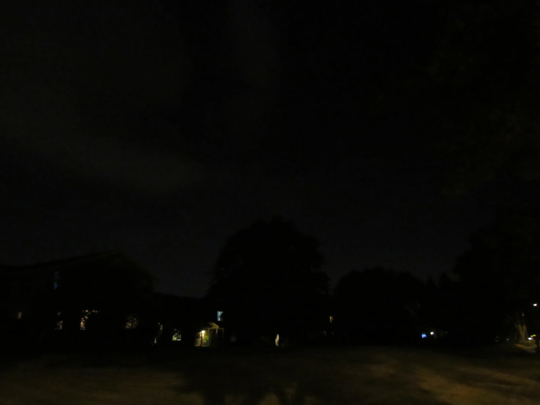
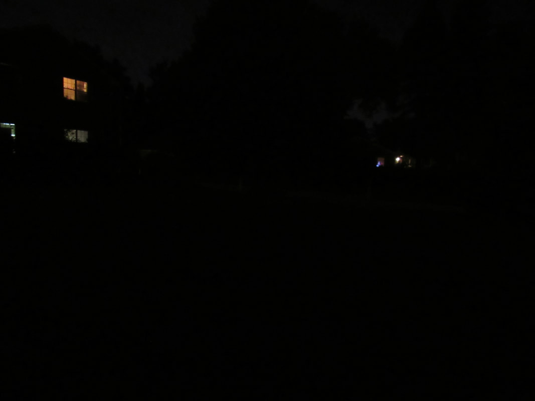
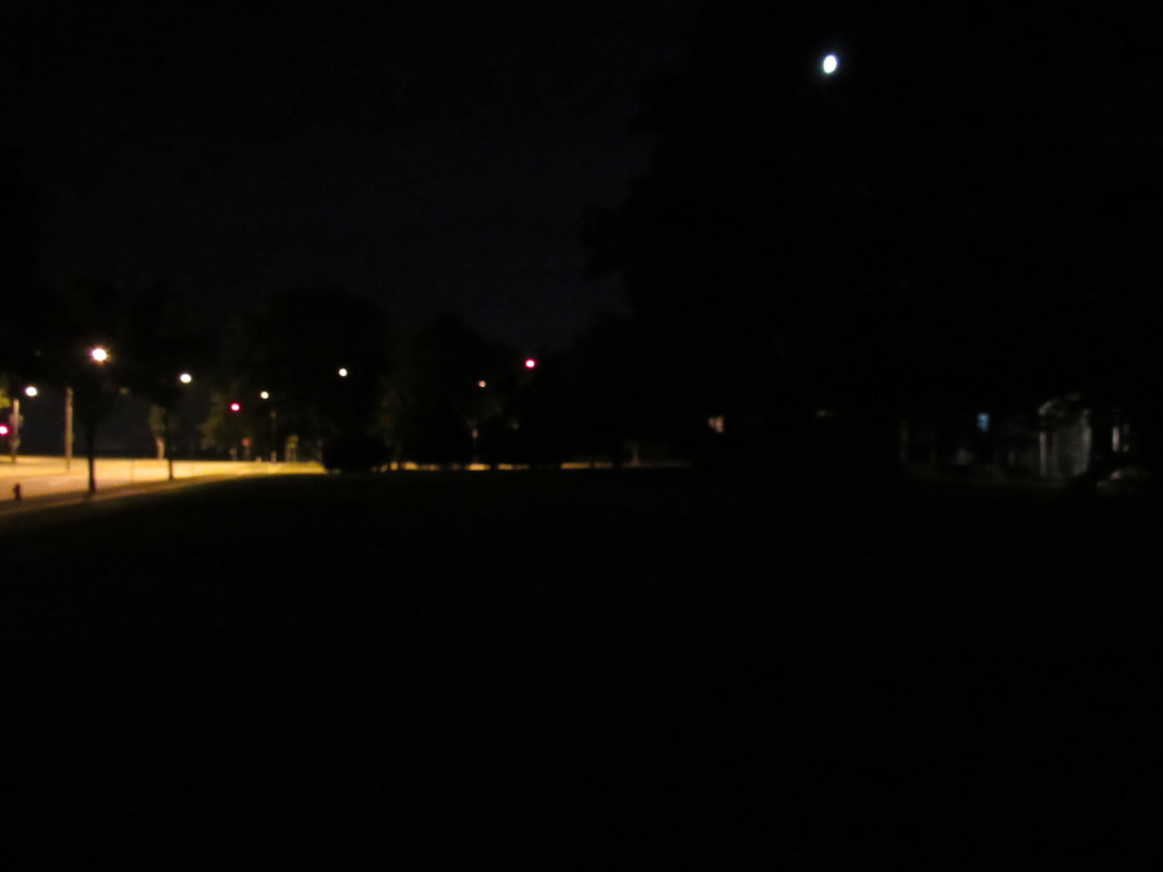
This was where I tested the boundaries of my camera. I went out at the last shreds of sunlight and kept taking pictures as I walked in about a 2.5 mile loop near the airport, taking a route I know had many different landscapes, different amounts of artificial light and natural light. From parks to just plain fields, to the side streets, everything. And this collection told me when is the best time to take these shots.
All shots:
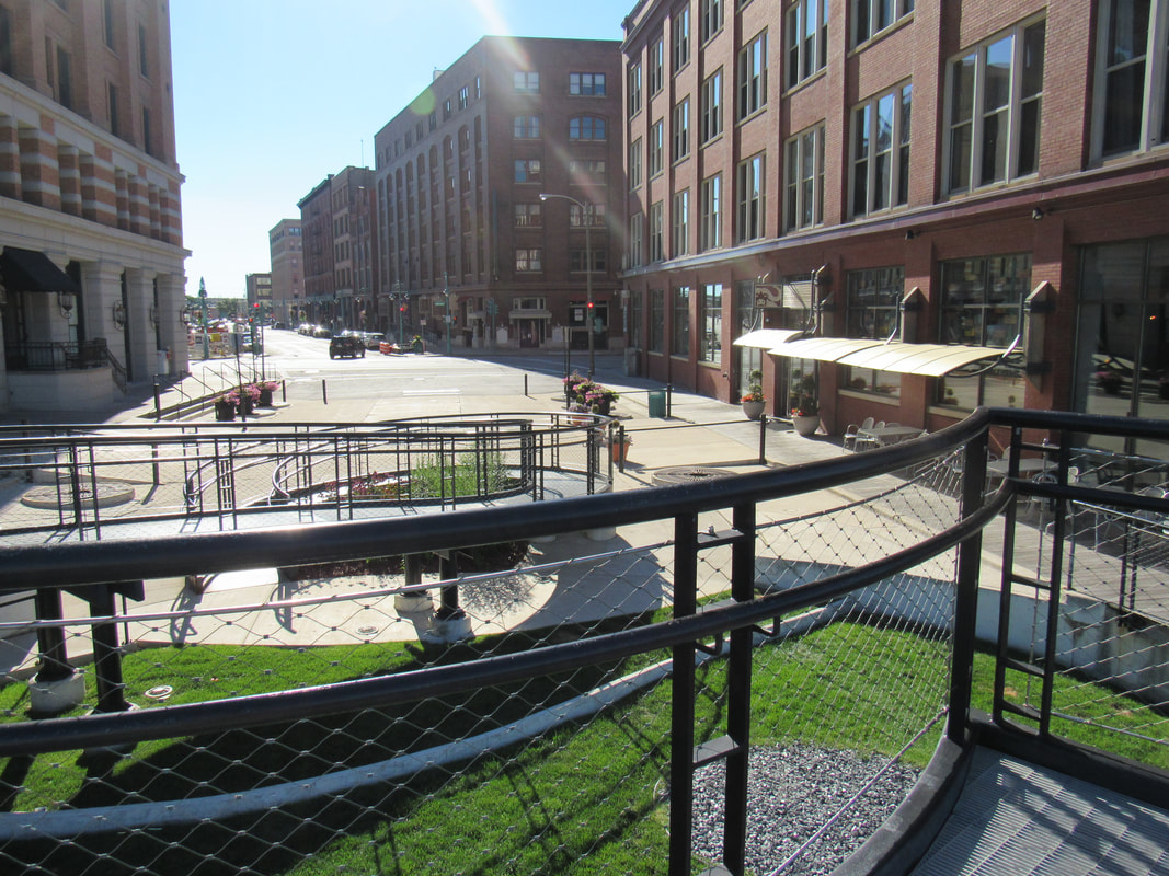
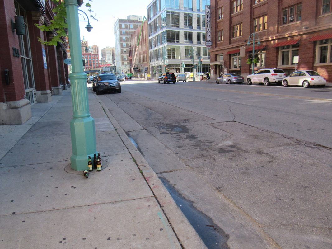
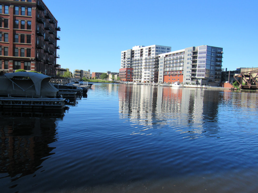
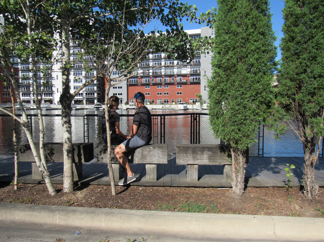
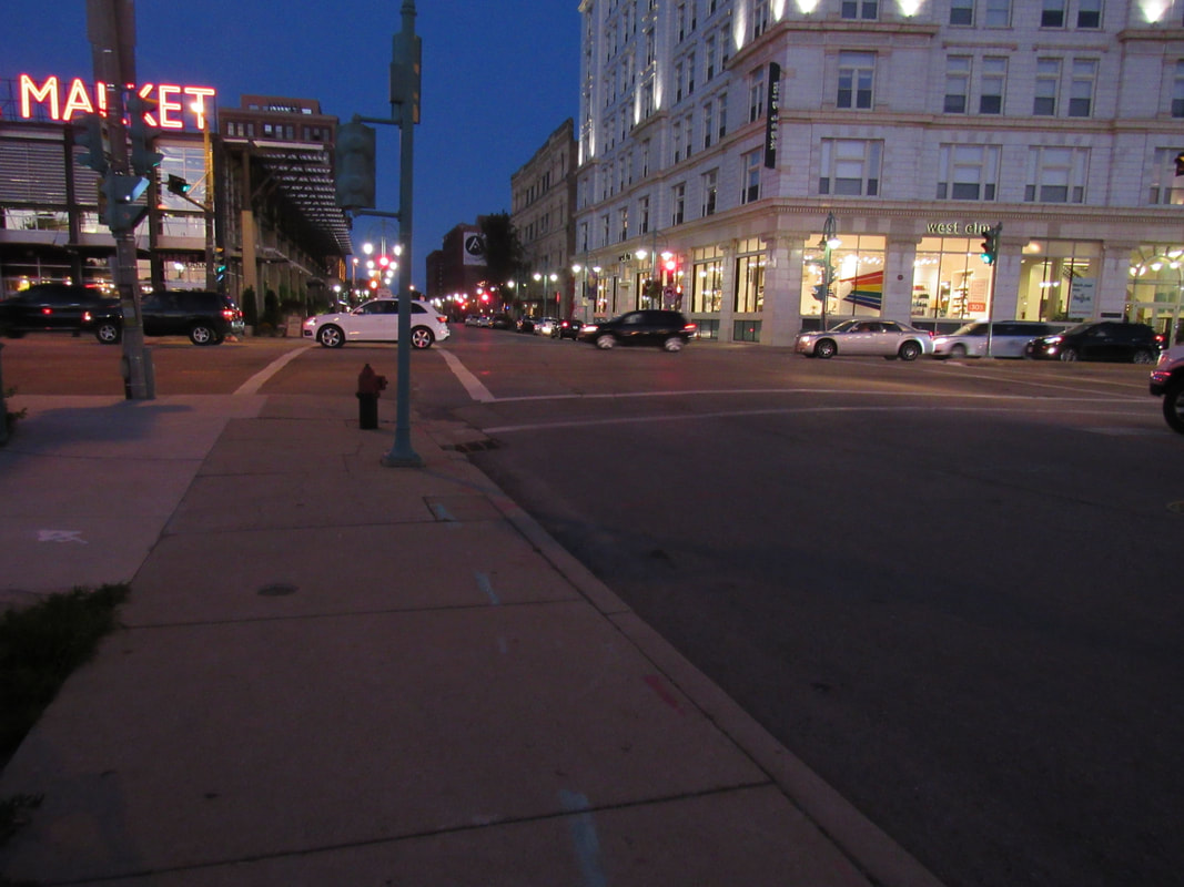
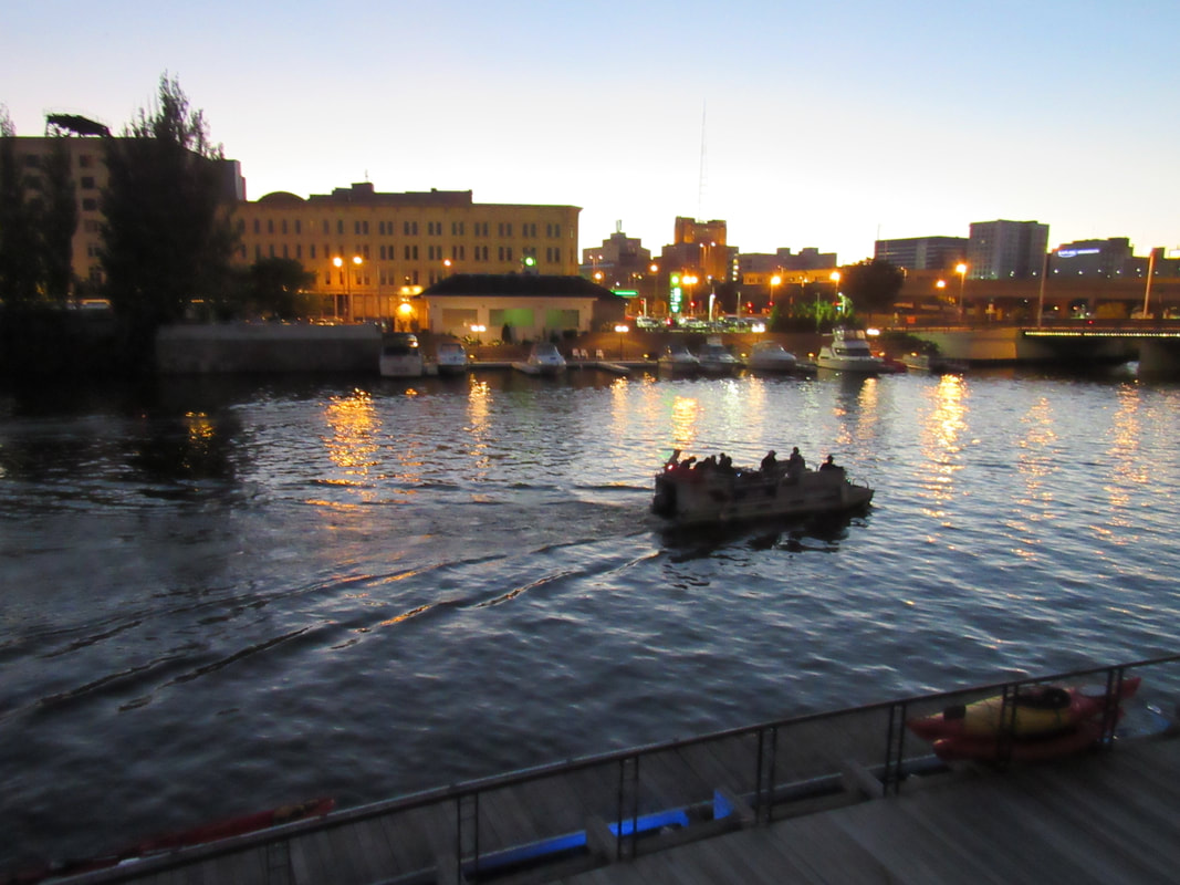
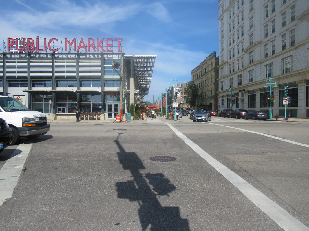
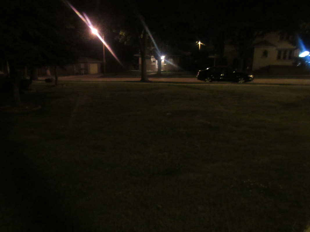
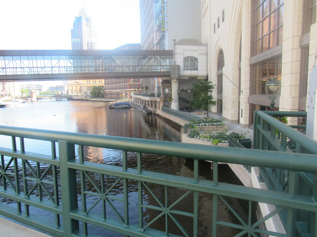
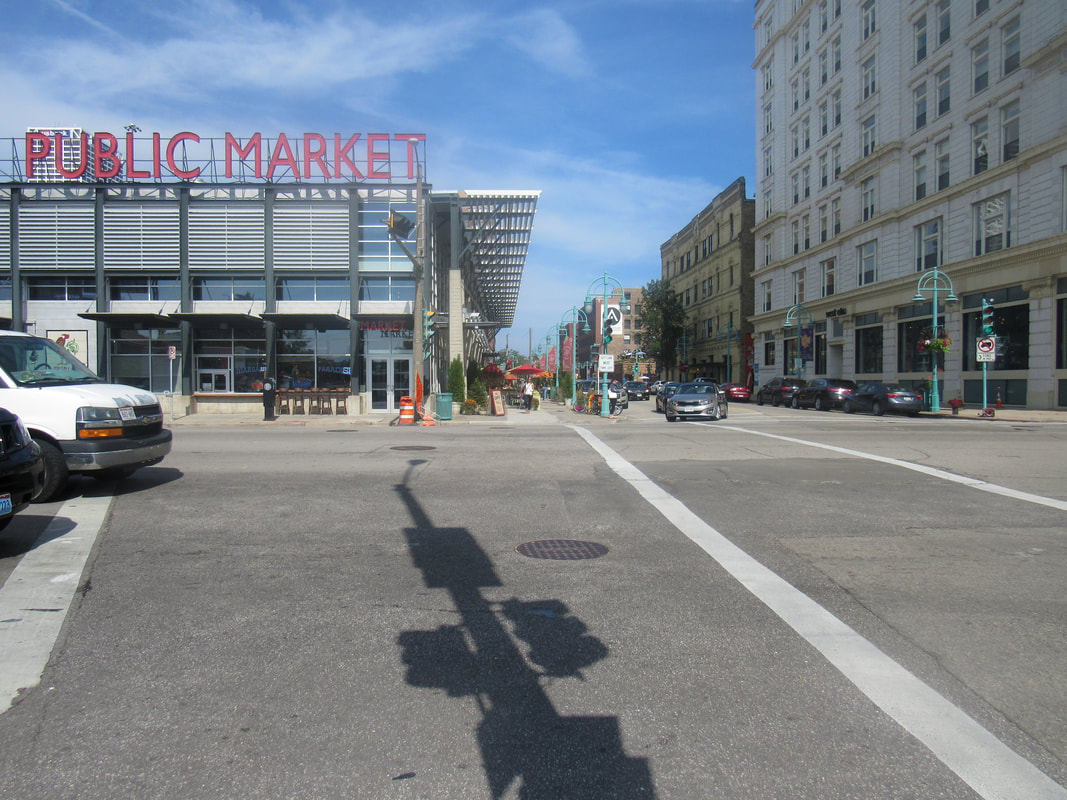
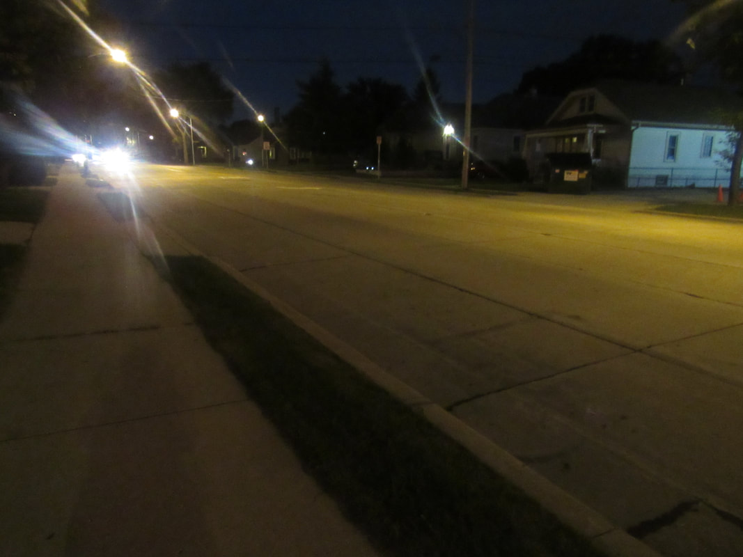
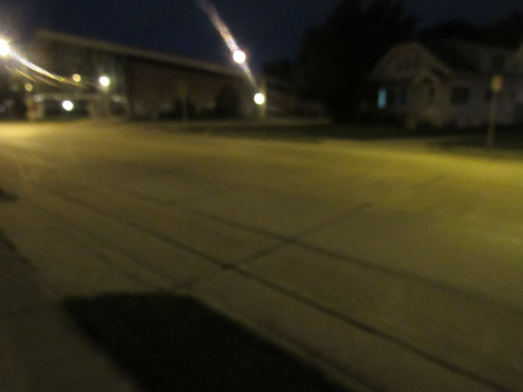
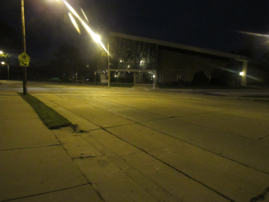
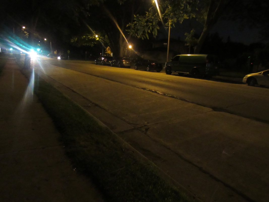
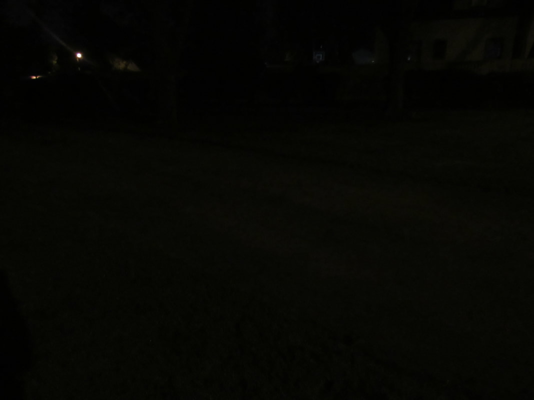
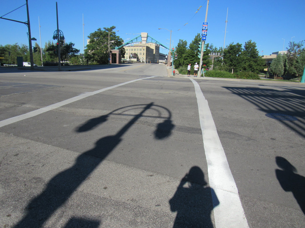
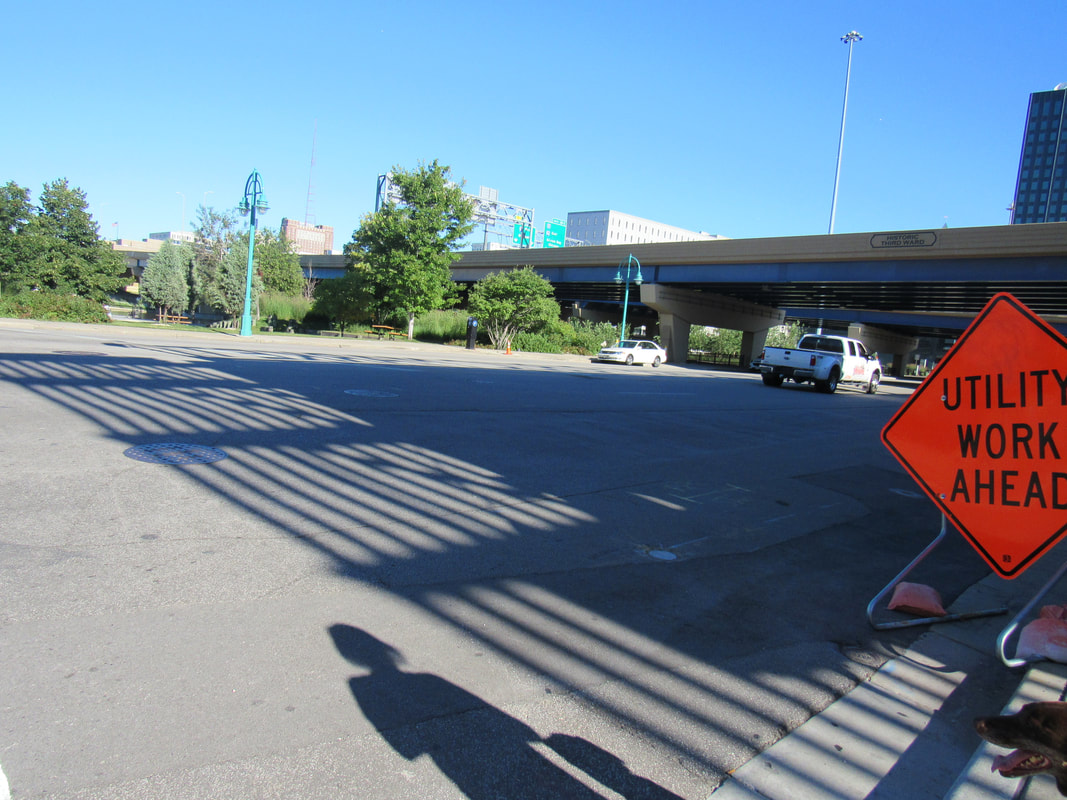
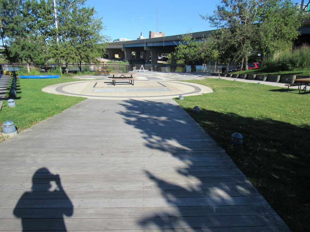
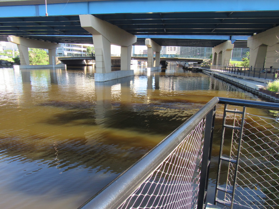
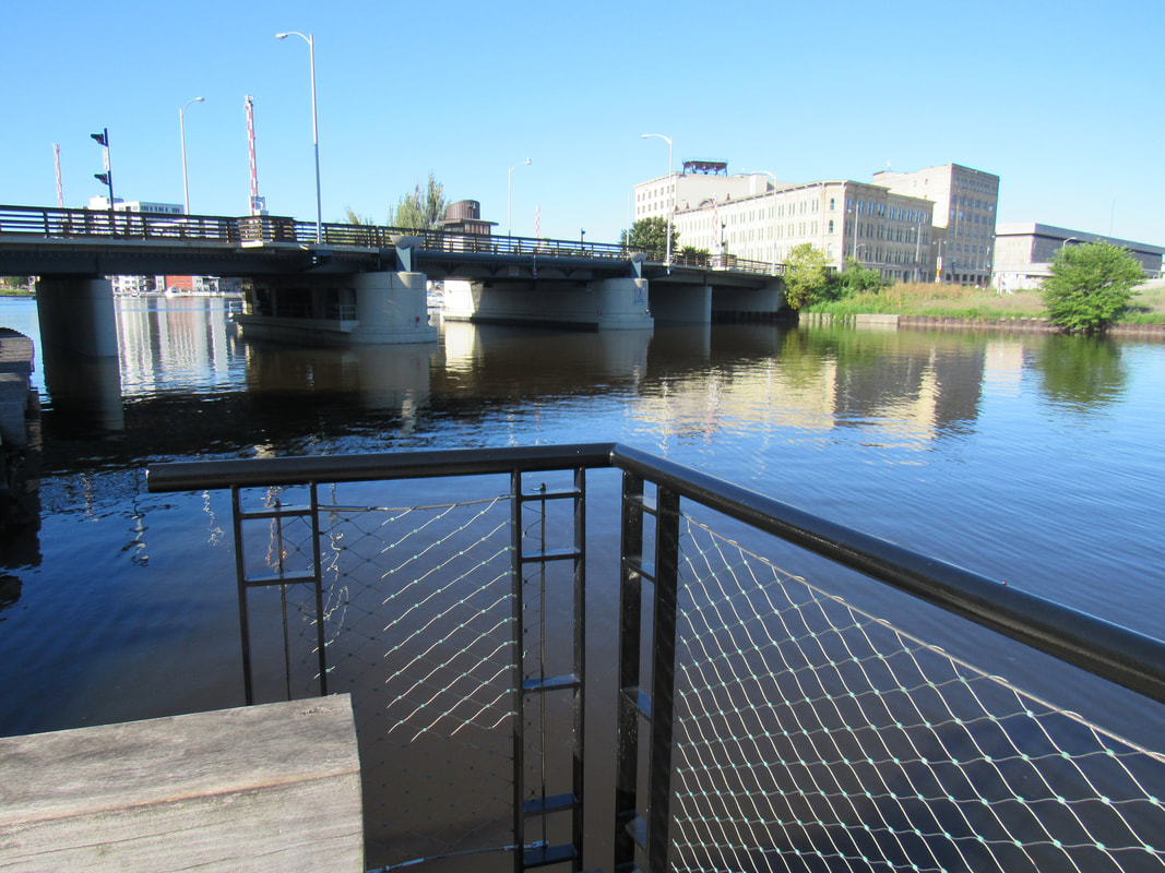
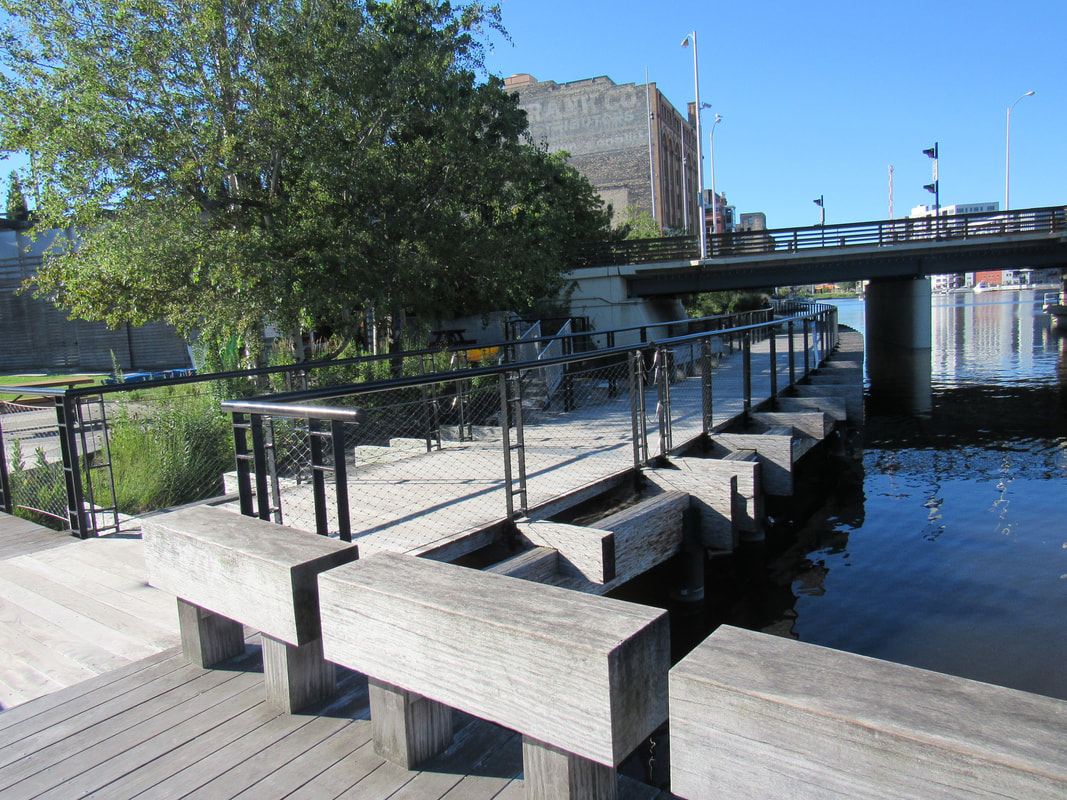
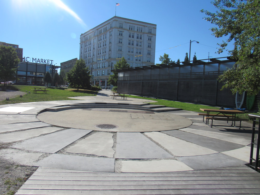
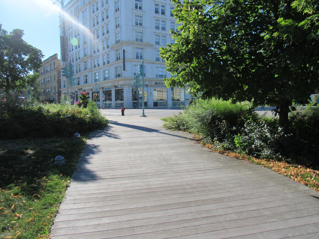
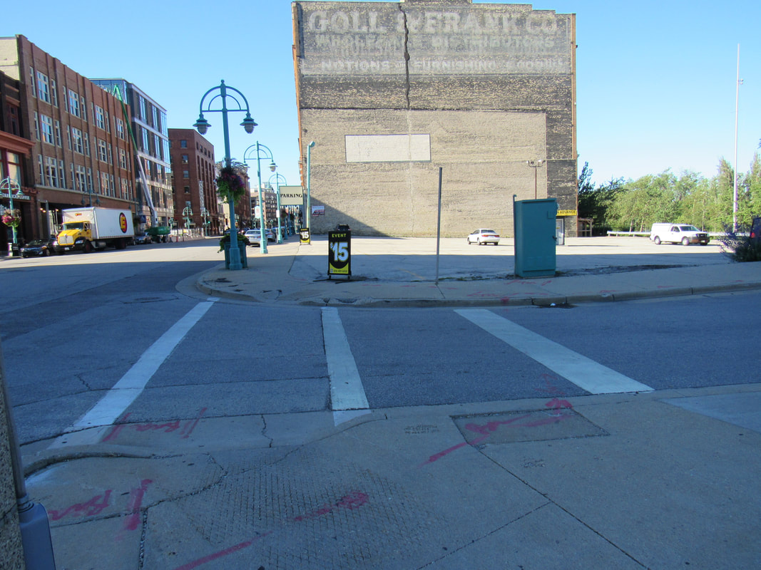
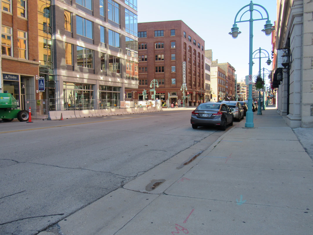
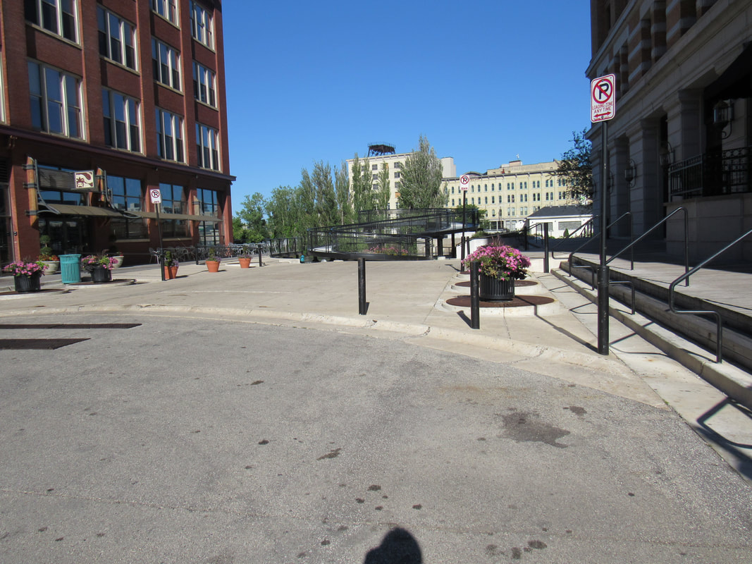
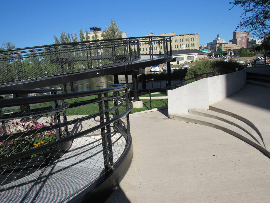
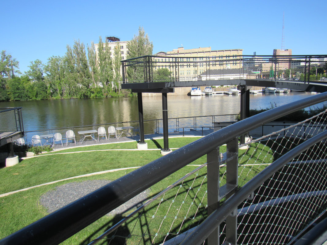
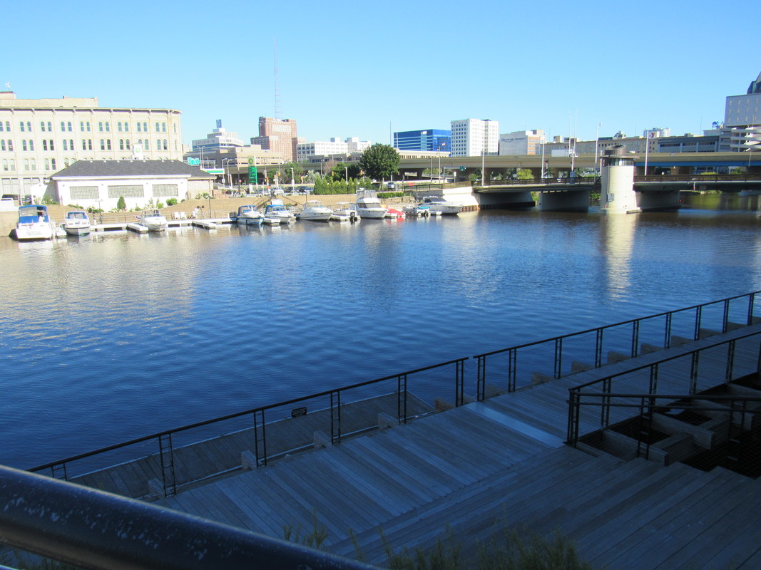
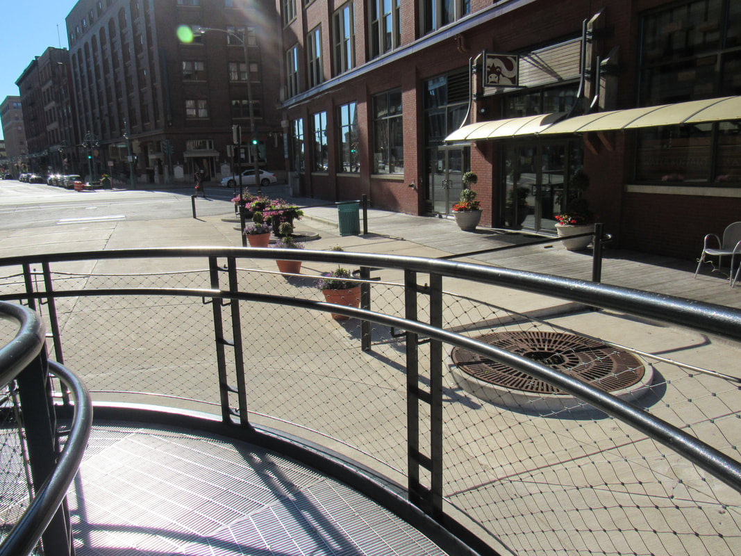
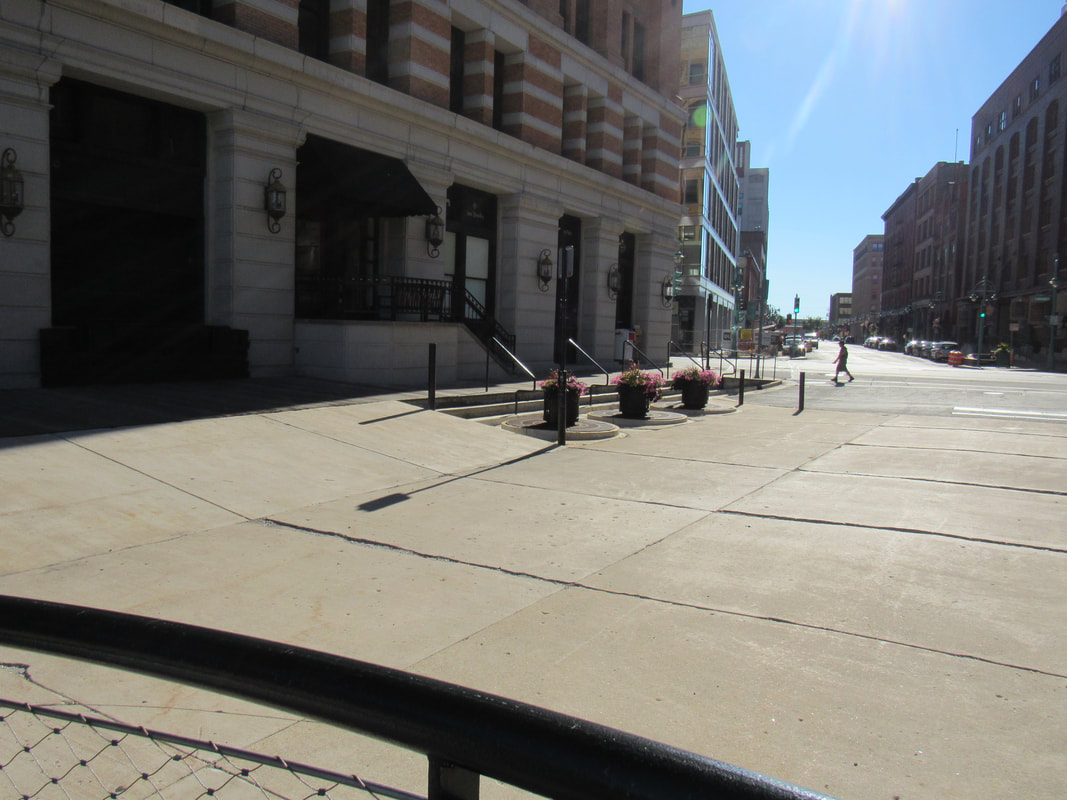
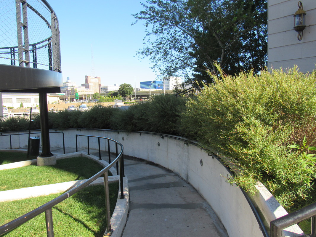
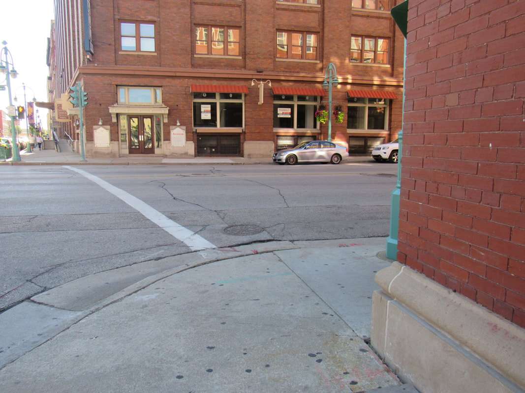
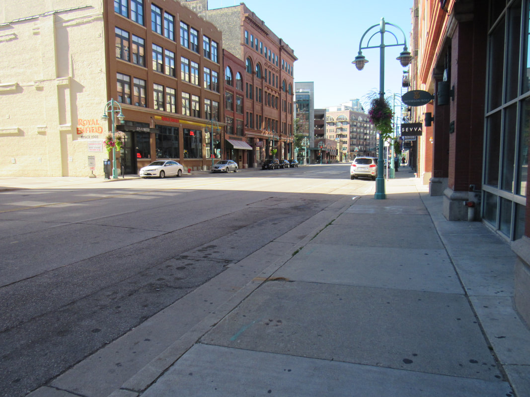
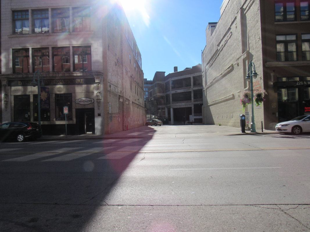
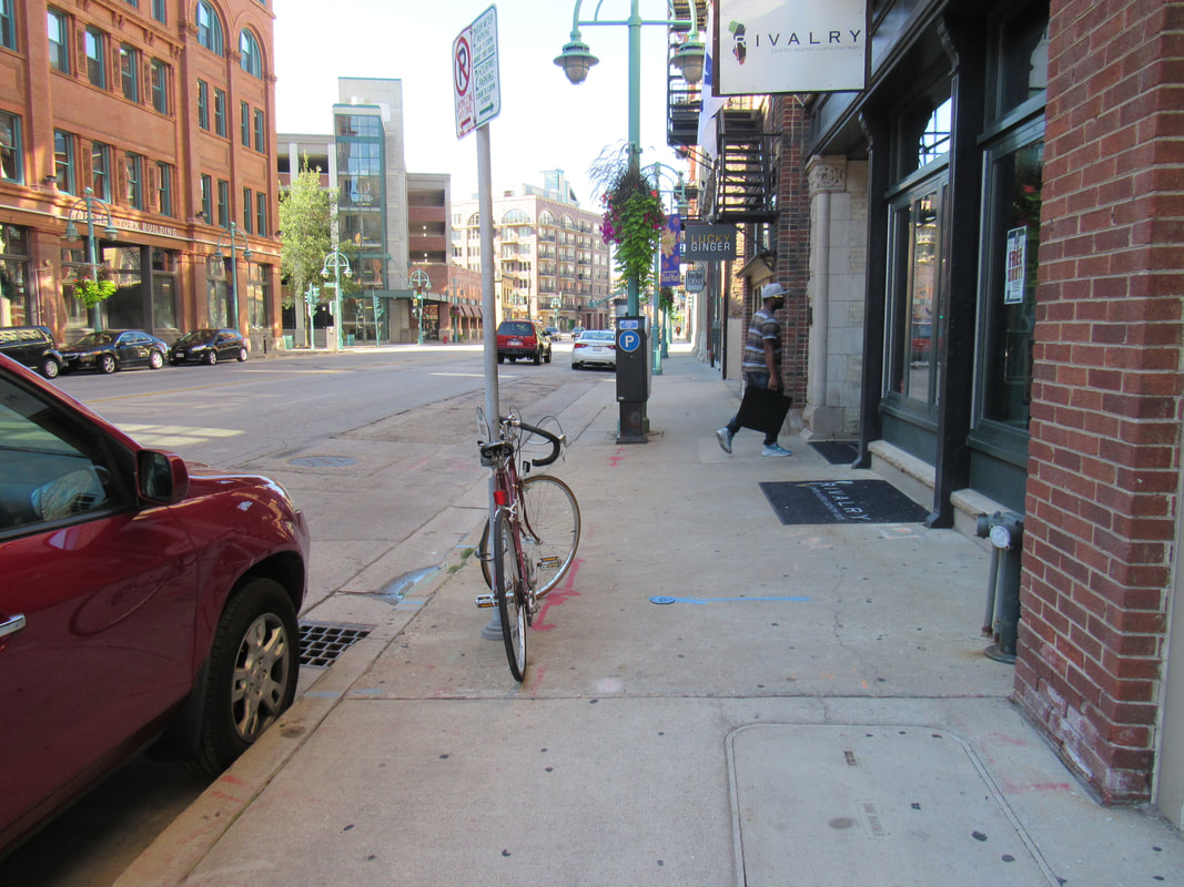
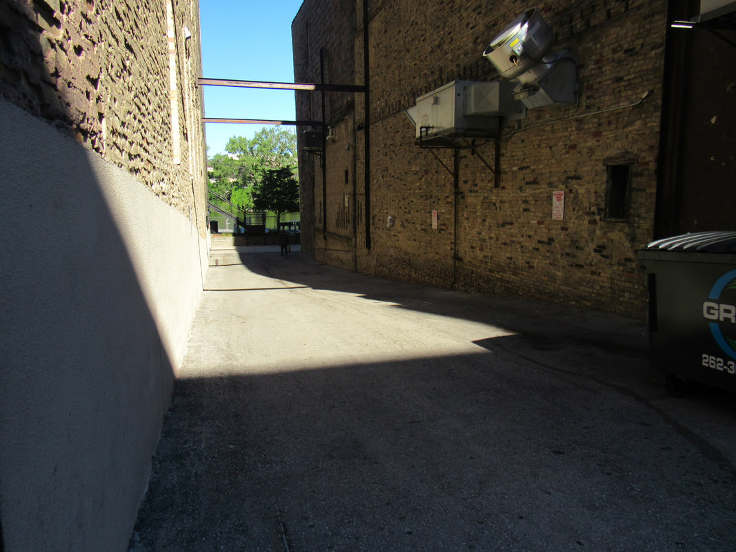
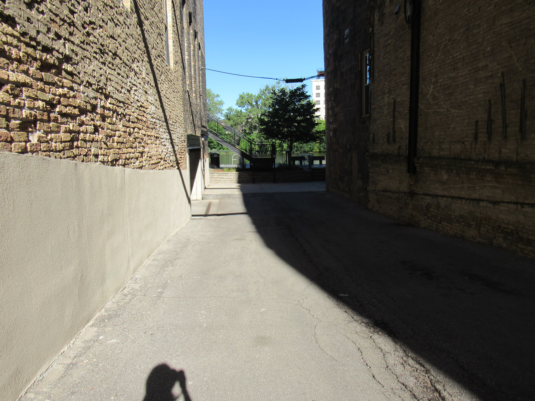
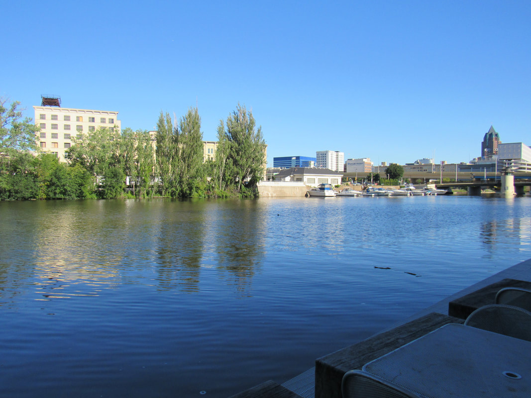
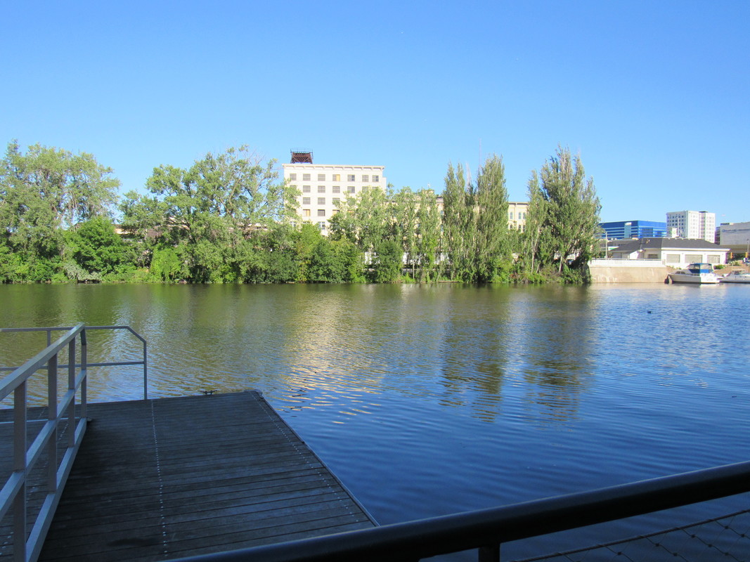
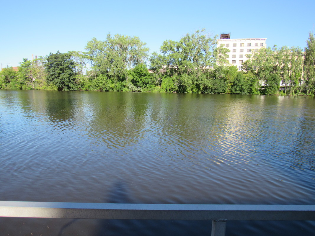
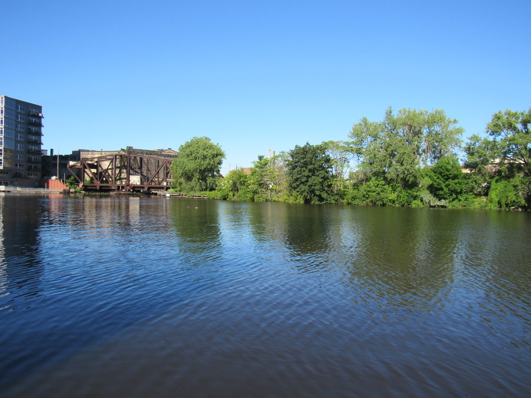
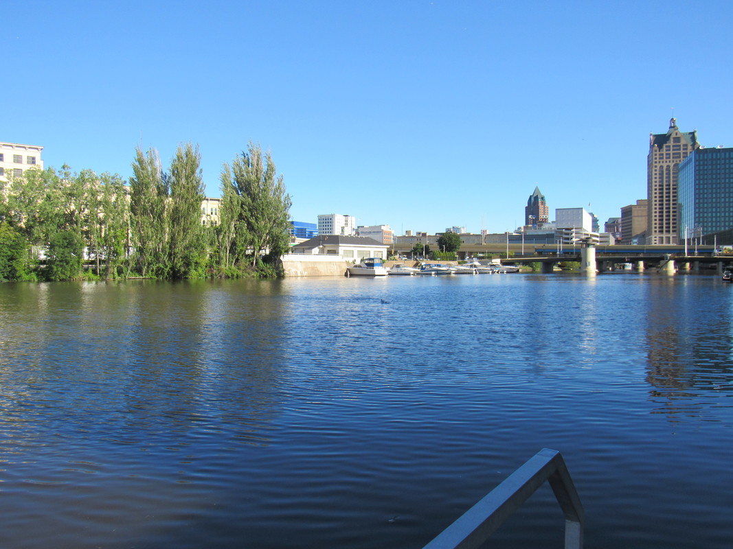
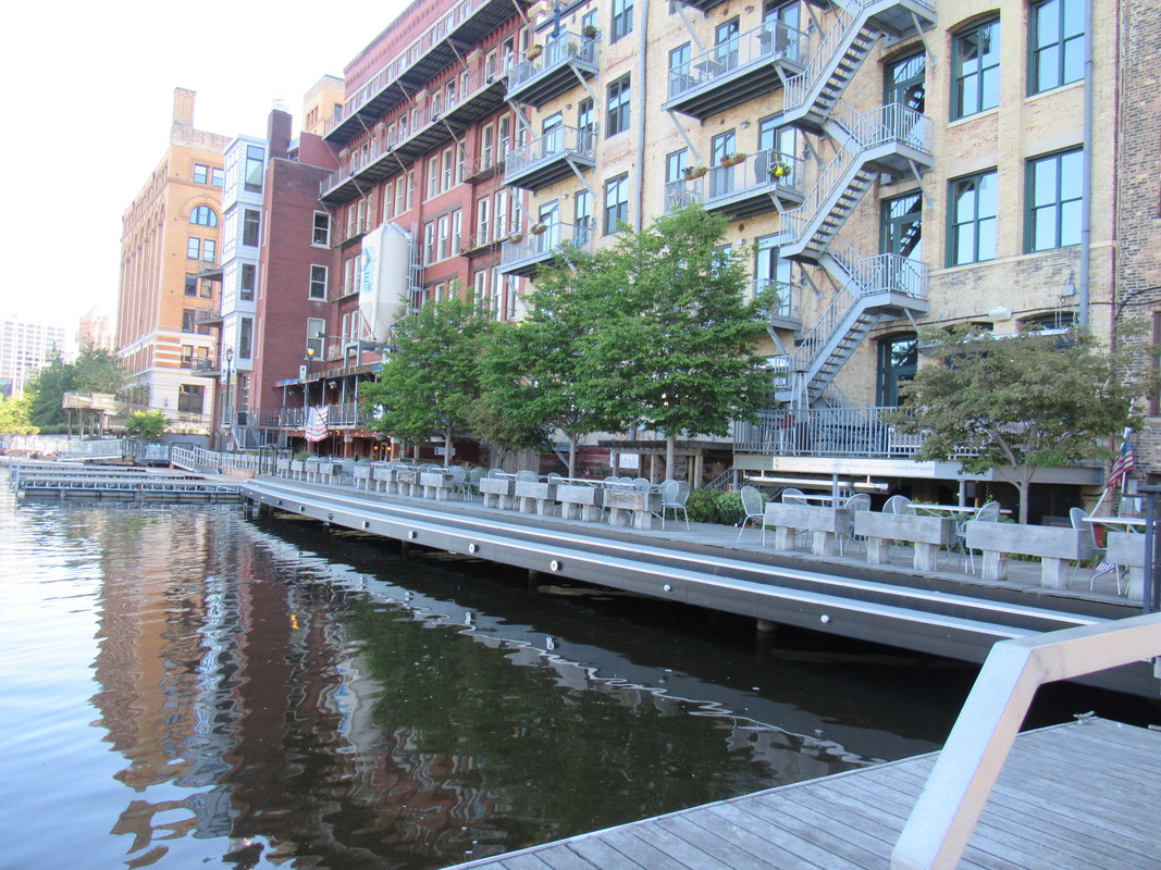
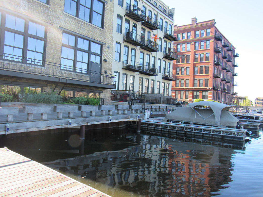
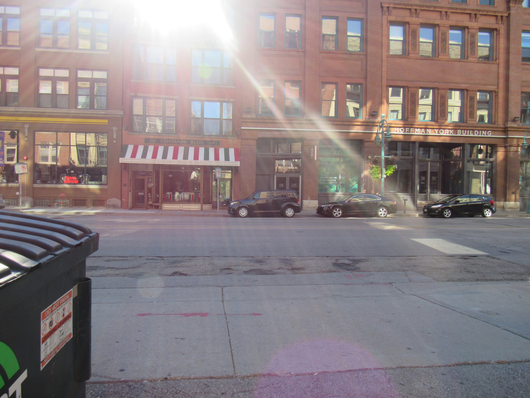
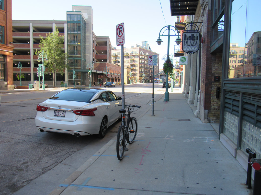
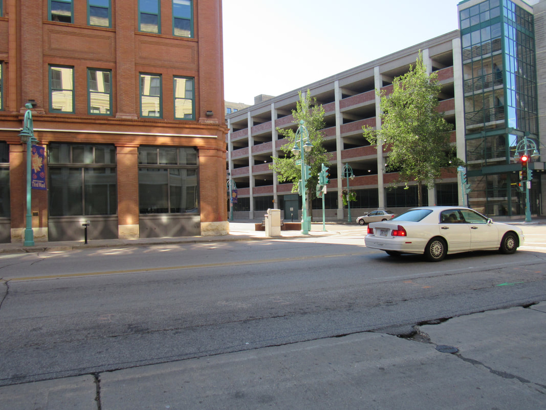
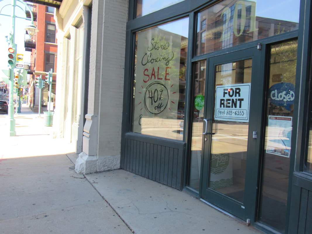
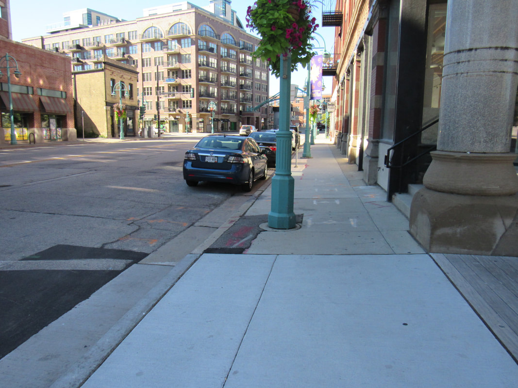
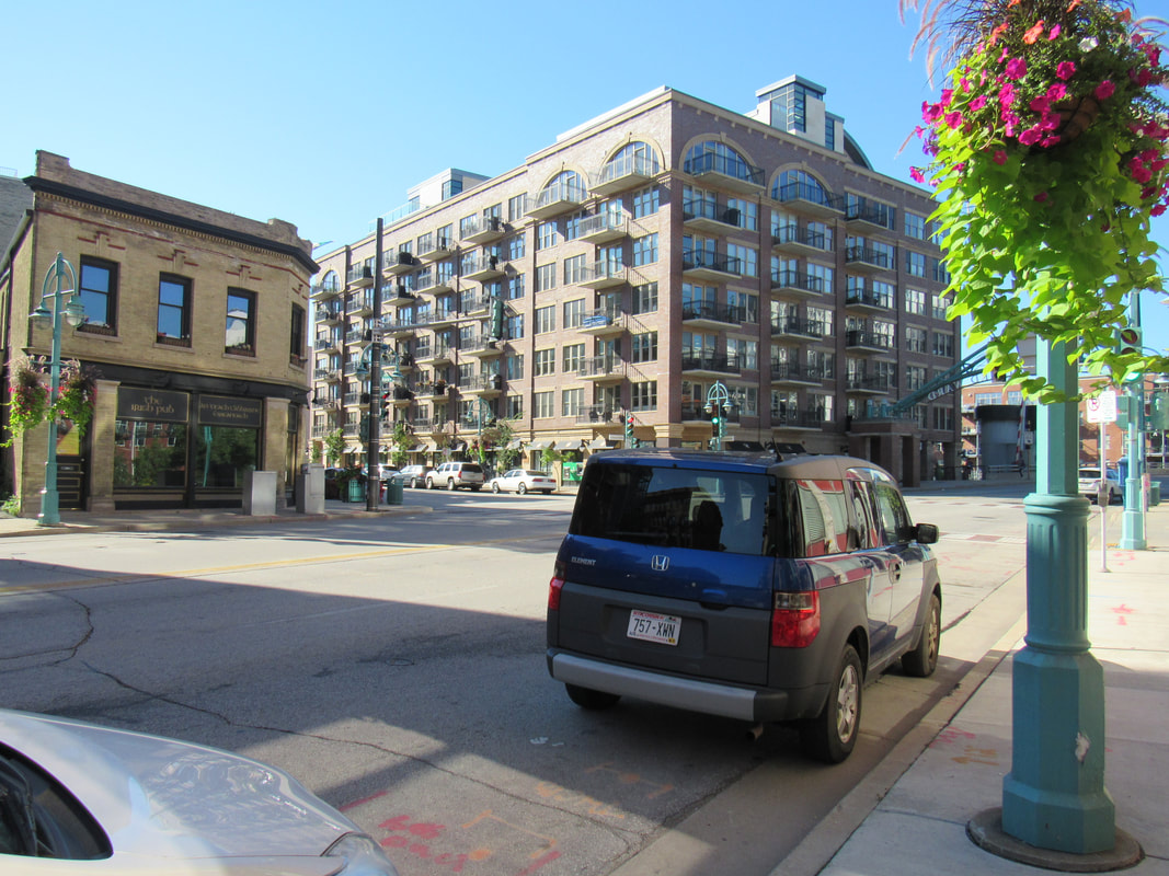
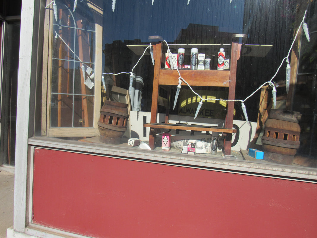
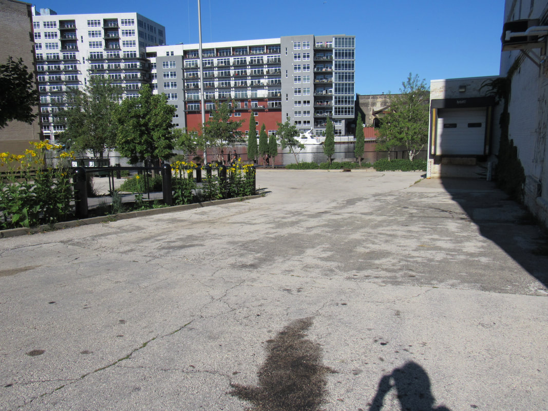
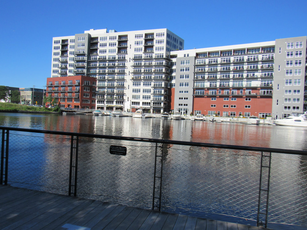
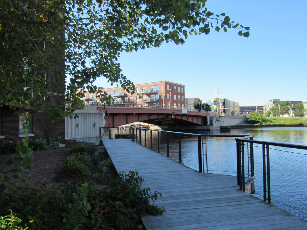
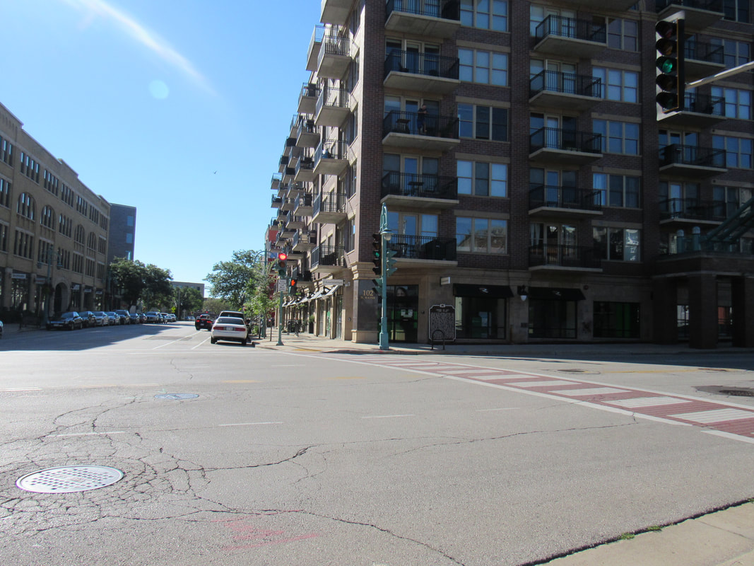
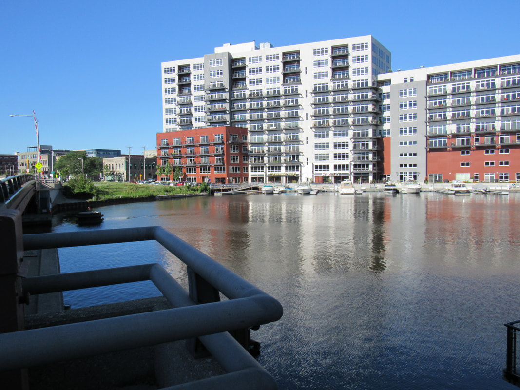
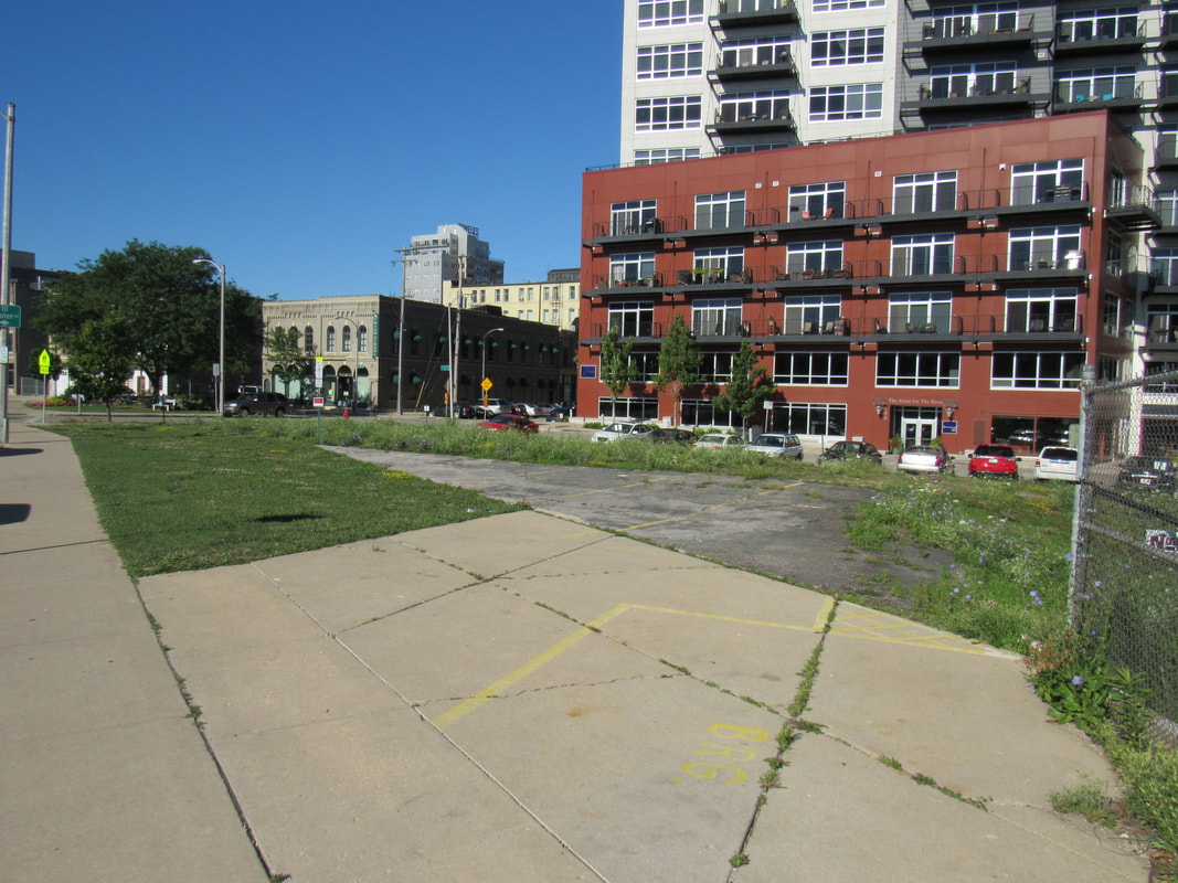
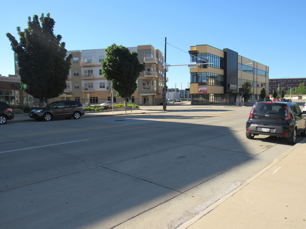
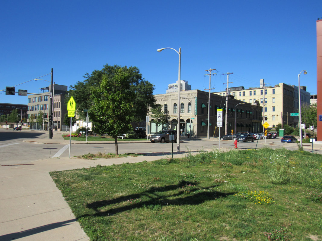
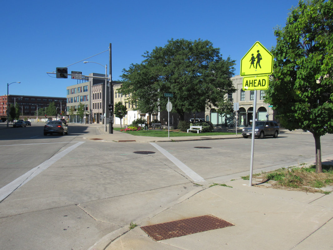
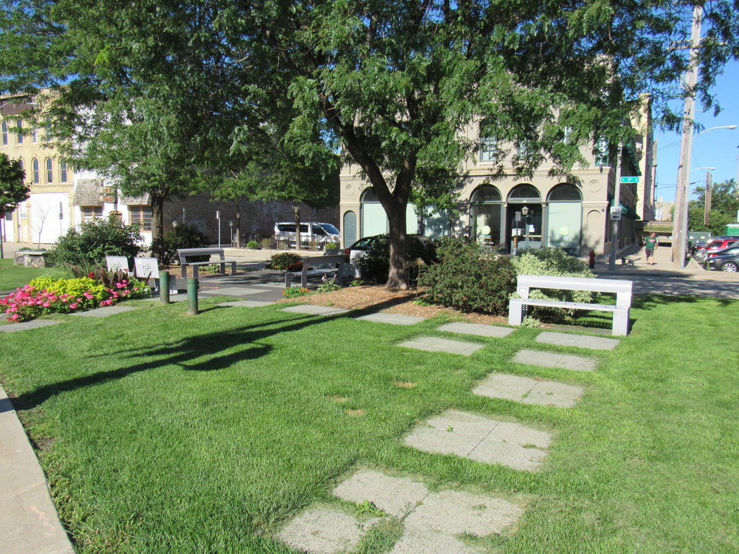
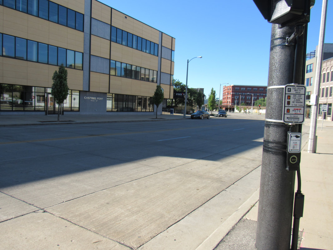
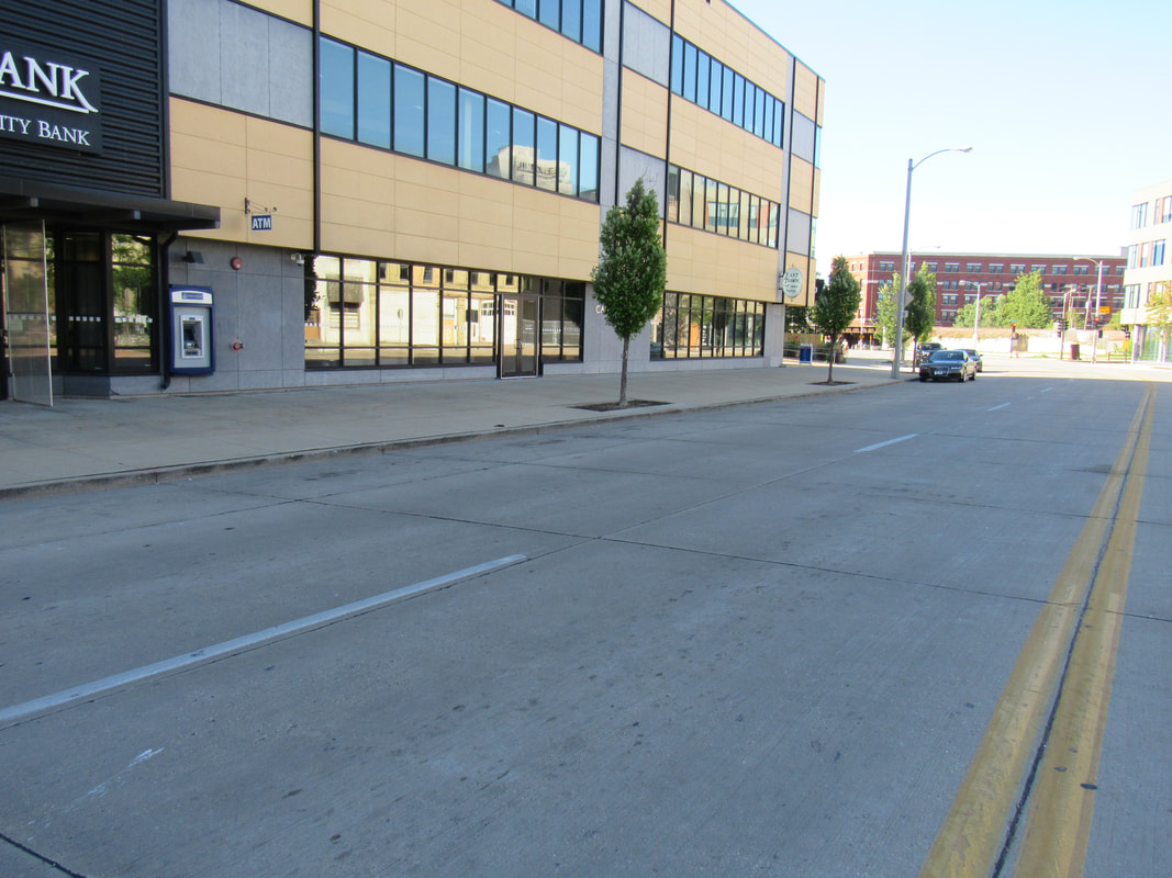
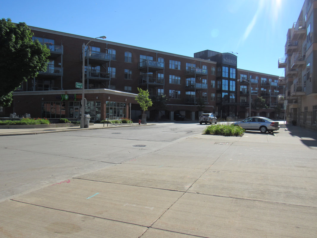
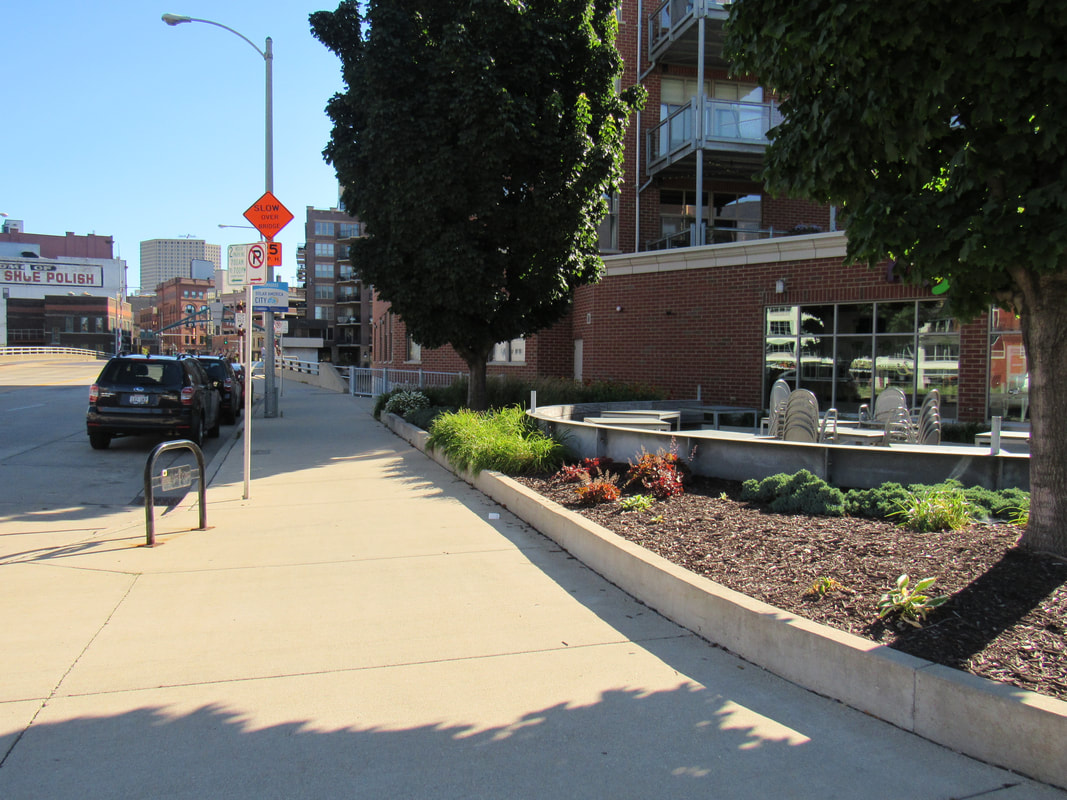
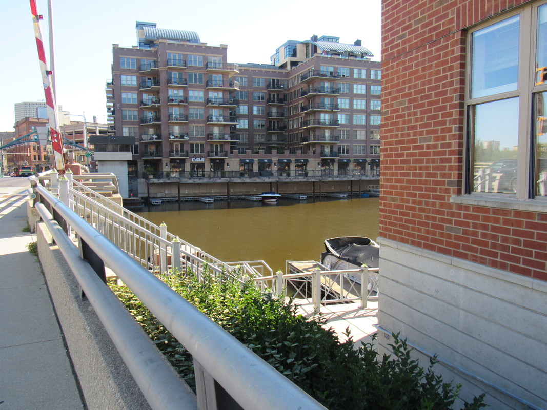
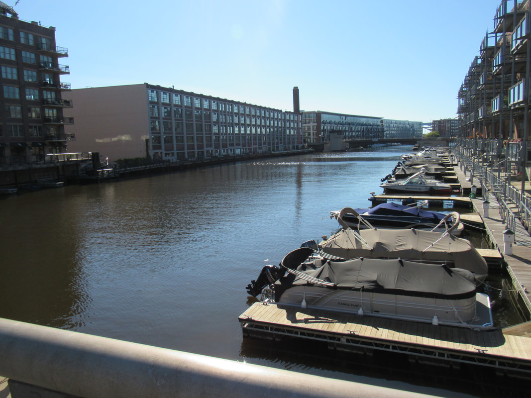
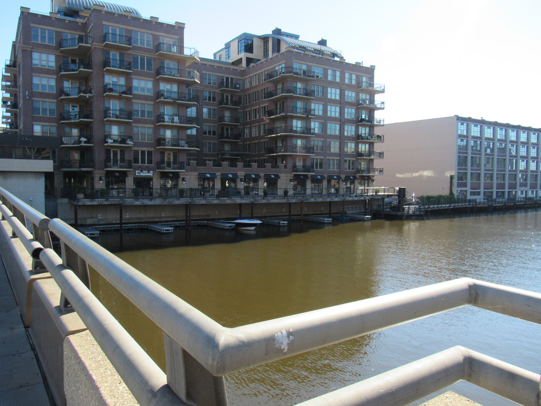
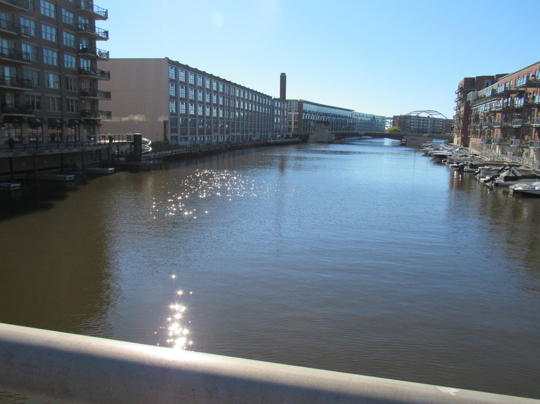
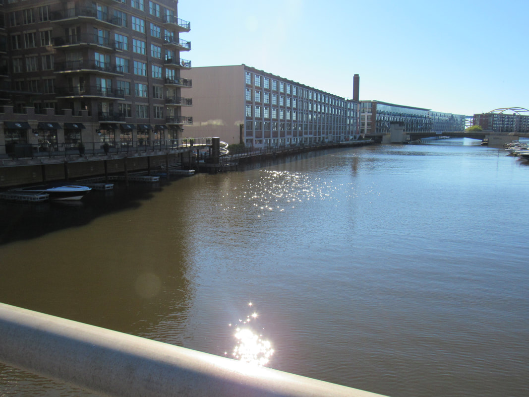
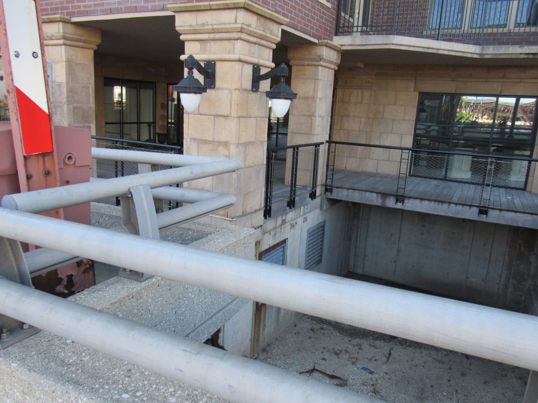
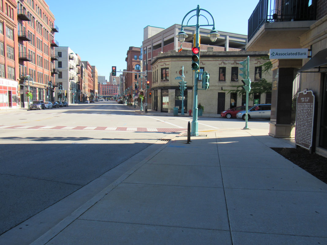
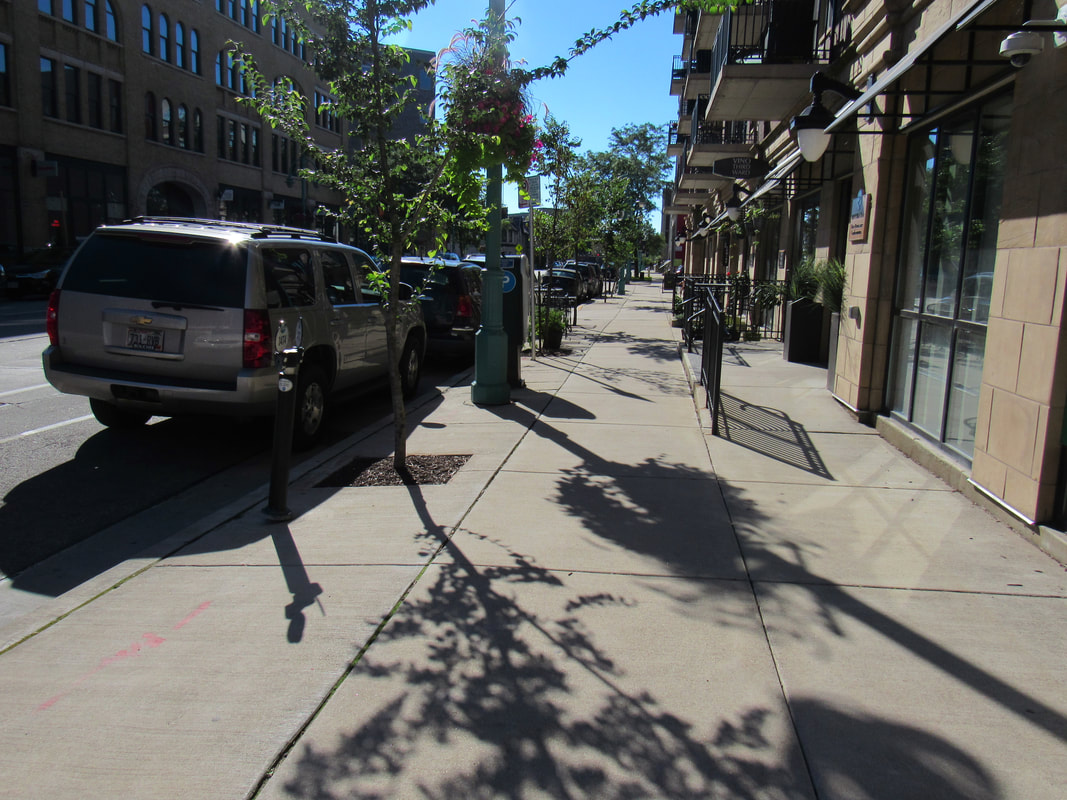
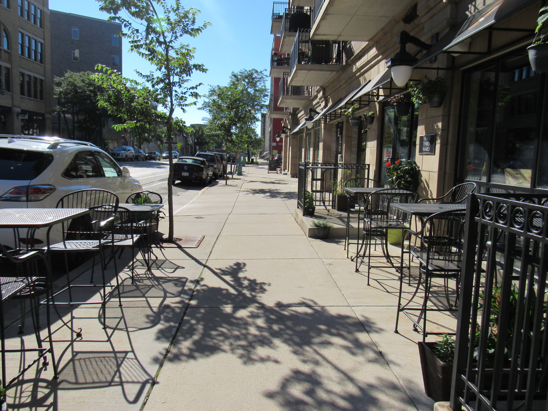
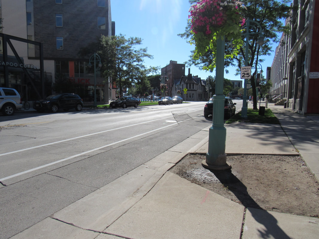
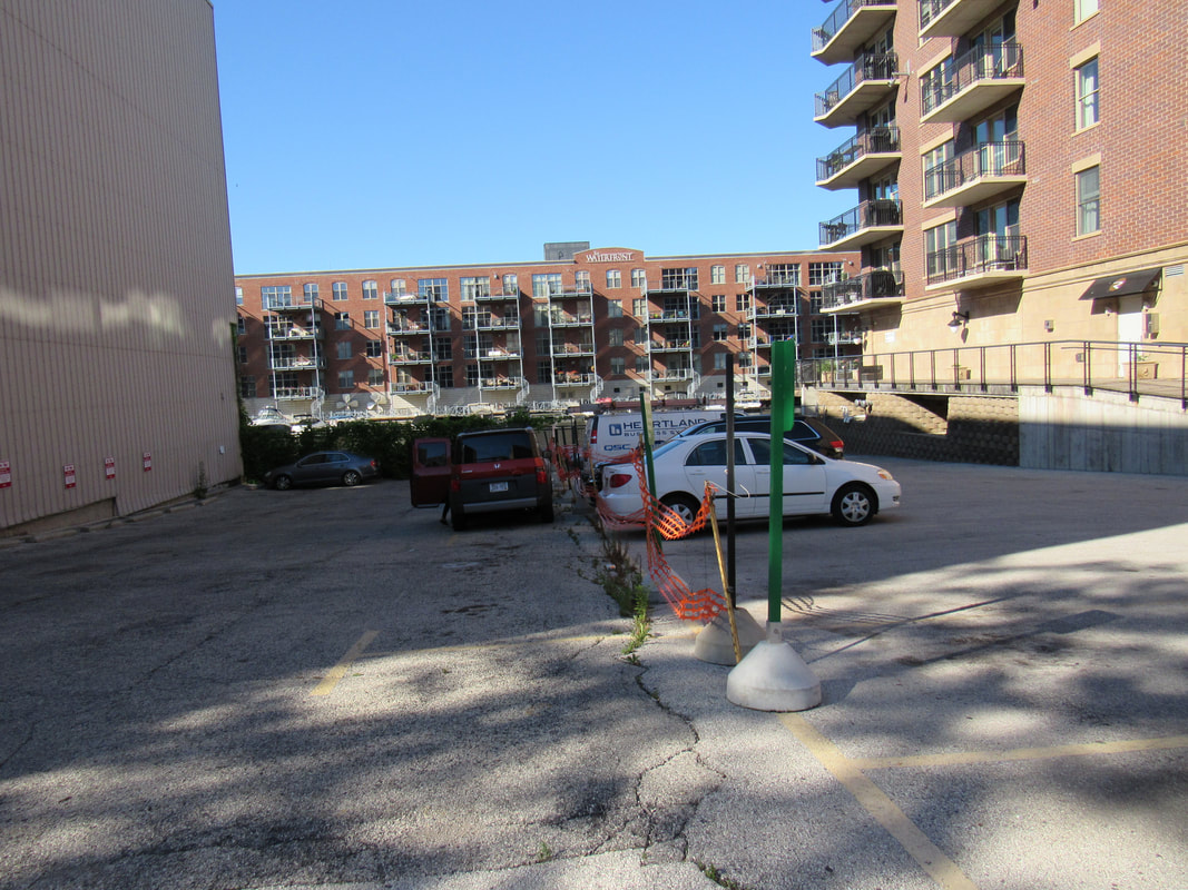
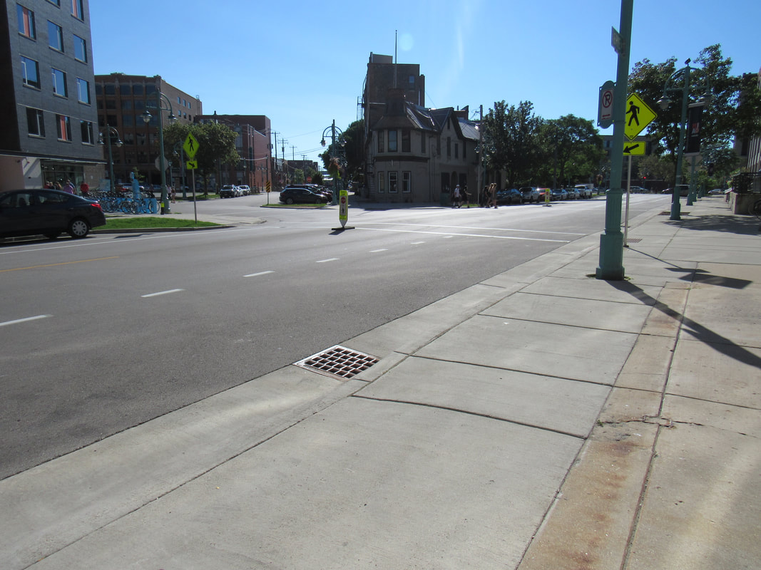
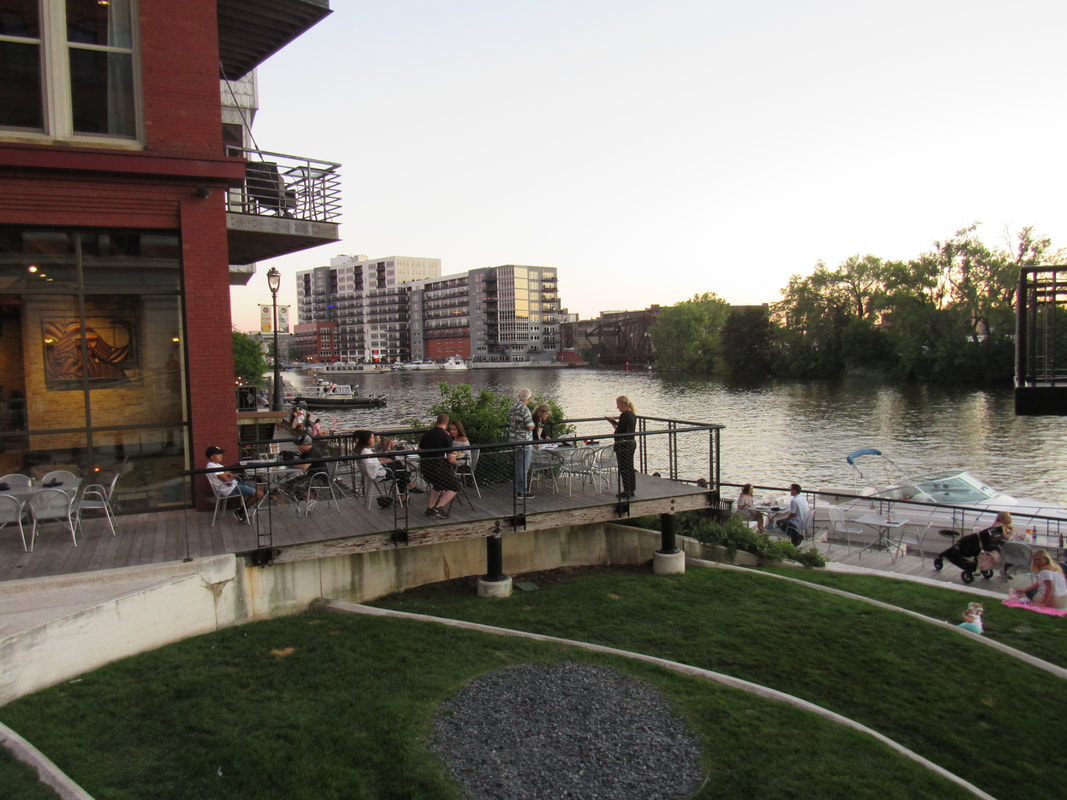
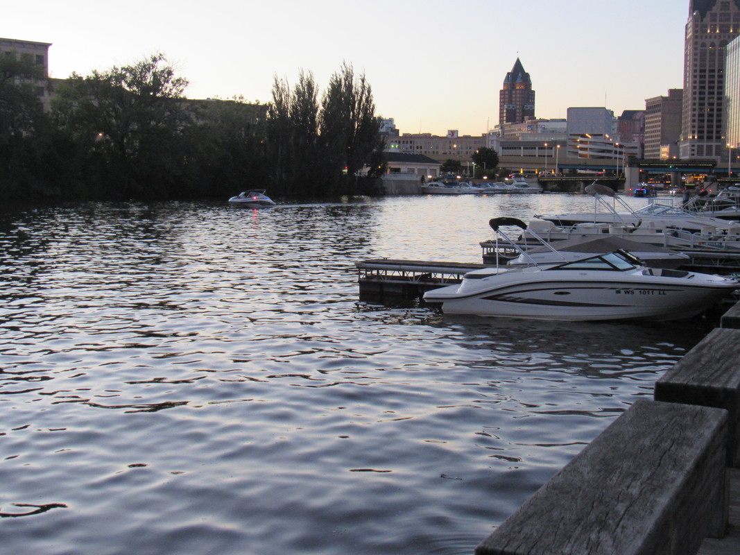
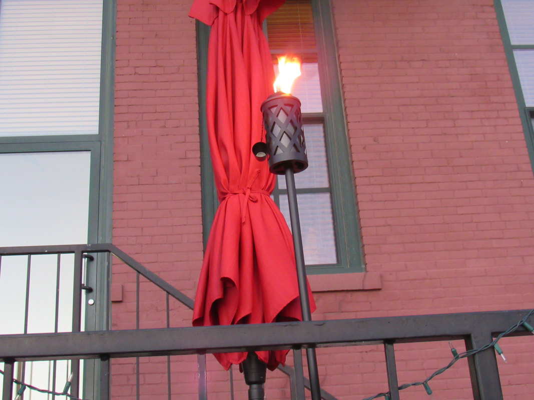
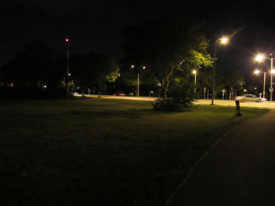
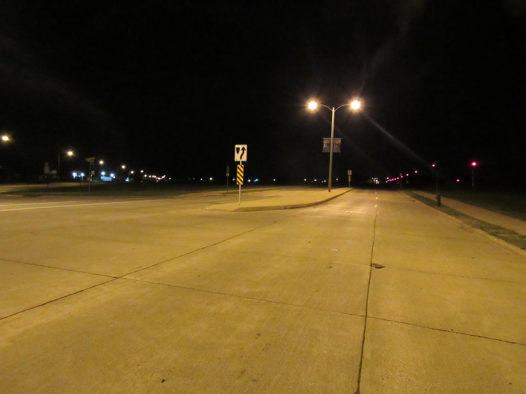
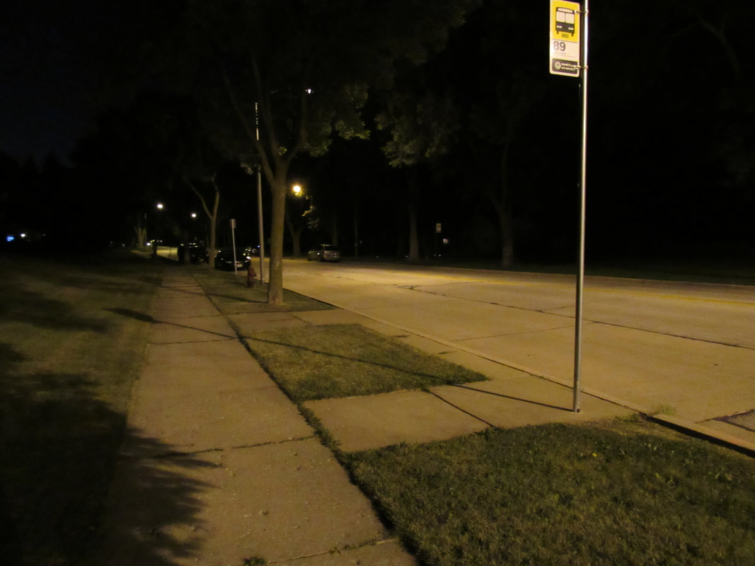
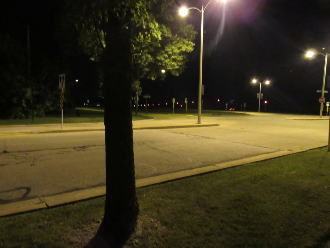
I set out for the city in the morning. I photographed areas I thought would express what I wanted to express, the artificial world we live in compared to the beautiful world we're losing. I first set out for urban areas during the day and during the night. Then I set out for rural-like areas (such as open fields or woodland areas)
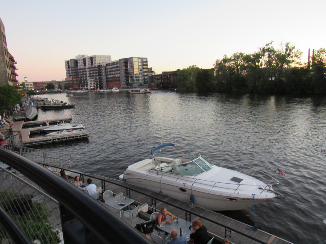
I am an ambivert who loves the night. The music of the crickets, fireflies teaching me to dance, the stars sparkling in the open sky, the moonlight illuminating the way home. I wanted to show the life of an ambivert. In the city by day, carrying about daily business and networking. What we often see in the day. And what I love the most, when I am most awake. The night. I could go without sleep for weeks, as the night is when I am naturally awake and active, as if I am nocturnal and merely trying to be a normal diurnal human. I wanted to show the artificial life other people know, and the natural life I desire.
And here's to hoping for success!
I had been searching for photographers who also captured the night, and I found one who captured Paris at night, and I thought it was beautiful. So, as a result, I wanted to capture it, too. The night in beautiful ways (not that it's hard or complicated)
And here's to hoping for success!
I had been searching for photographers who also captured the night, and I found one who captured Paris at night, and I thought it was beautiful. So, as a result, I wanted to capture it, too. The night in beautiful ways (not that it's hard or complicated)


Inspiration (citation)
Brassai, and Paul Morand. Brassai: Paris by Night. Boston: Little, Brown, 2001. Print.
