Part One: Shirt design
|
Title: Untitled
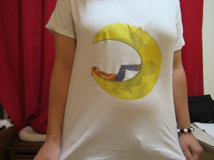
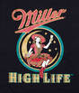
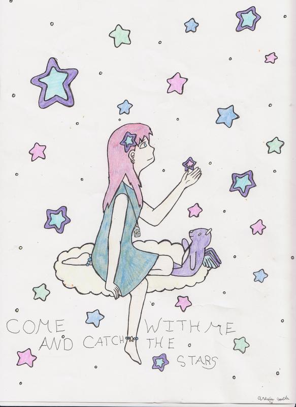
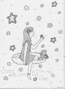
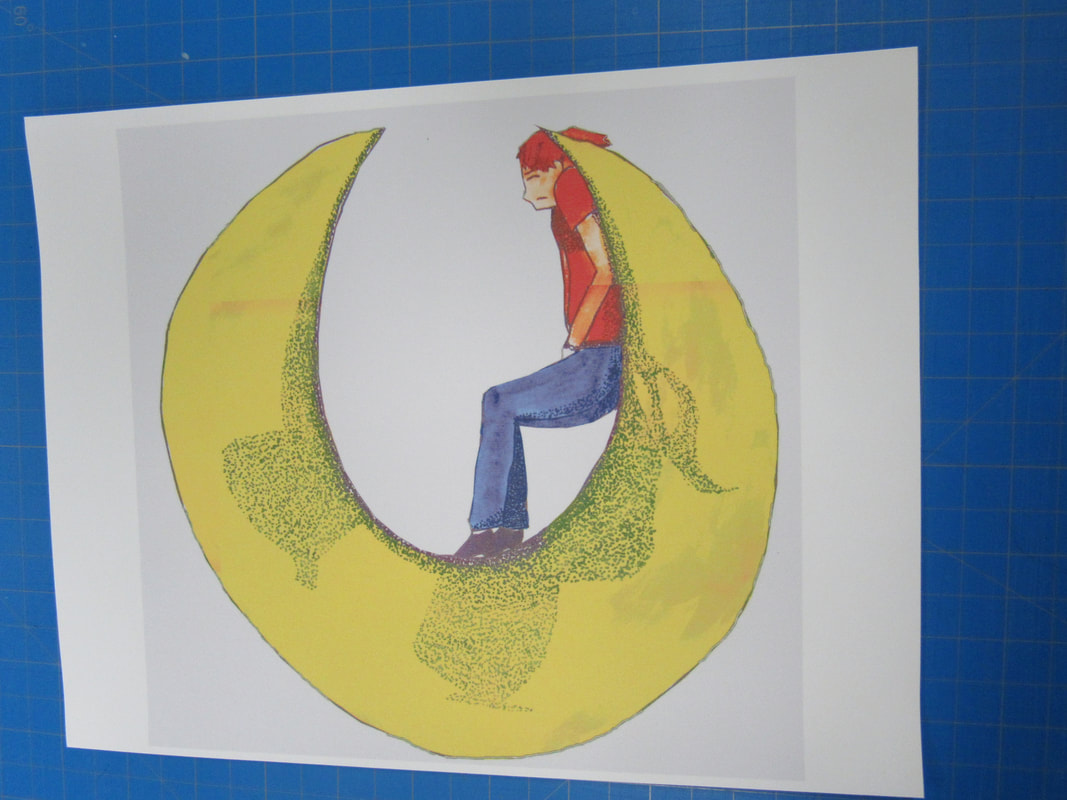
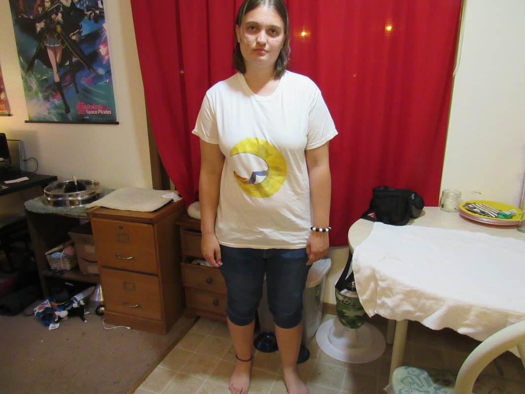
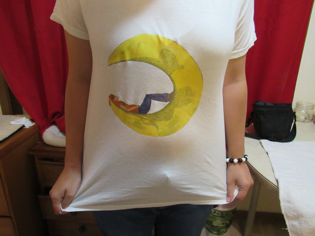
Size: Medium (Women's size) Medium: Design and Printing Date: 9/13/2017 I received a request to design a shirt for a walk-run in fall, where the theme was "Come With Me And Catch The Stars". I used the shirt designing idea for this project, using the same aspects and ideas from the original project/design and manipulating those ideas to this. To work with the design and idea, I focused on the advertising area. Using Miller Light's "Girl In The Moon" as a guide/inspiration for the new design. |
Inspiration
|
“Advice of the Day: This 110-Year-Old Woman Says She Owes Her Long Life to Beer and Whiskey.” Cheezburger, cheezburger.com/8546187520/advice-of-the-day-this-110-year-old-woman-says-owes-her-long-life-to-beer-and-whiskey. Accessed 21 Aug. 2017.
“Miller High Life.” Pinterest, www.pinterest.com/explore/miller-high-life/. Accessed 12 Sept. 2017.
|
|

|
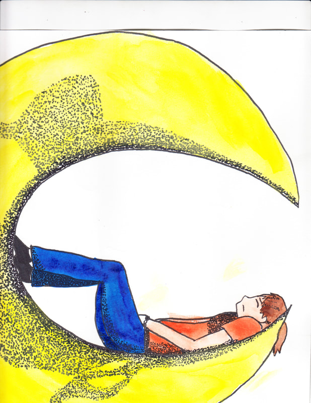
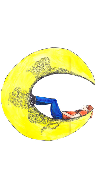
For this project, I went for more of an advertising concept, taking an inspiration from Miller's "Girl in the Moon." From the beginning, I wanted to start off the year with a lighter project. I decided to design a shirt. Originally, the idea came from a project I was doing outside of school, when I was asked to design a shirt for a walk/run, and the theme was "Come With Me and Catch The Stars". What I used was in that design too much in the anime style, so I did not use it for this project in particular. However, the idea itself could be used, so I redesigned the project using Miller's logo as that inspiration, and started planning from there.
I kept the female figure in the Miller logo and kept the crescent moon idea, but wanted the rest to be my own. The style itself is cartooned, a style familiar to me.
I also like to think the stars represent what a person sees when they're drunk, and also the time of day most people get drunk. Although research says otherwise, I find it a likely chance that that's what the stars mean. The girl and the moon, those are probably coming from a drunk guy wandering off in the woods at night, or an art piece the idea is taken from. In my case, the topic was originally focused on the stars, but the moon provides more support and is more commonly associated with the night, and the crescent moon is often used when adding a figure, like a person or animal, into that image. The moon is almost a metaphor for the night, and represents drinking at night, since the girl is holding a drink, too. The meaning of this is probably the same as the metaphor, the night and activities at night. This is also incorporated in my project. Some people stargaze at night, others cry at night, crying to the moon for help.
The sketch of the original shirt design will also be mentioned in this project, as well as how it was transformed into the final project here.
Research
From sketch designing to digital designing, this project was complex. I had to research many aspects, from other advertising styles, to how to create my project, and some experiments.
|
Klosowski, Thorin. “A Simple Guide to Screen Printing Your Own Shirts.” Lifehacker, Lifehacker.com, 20 Feb. 2012, lifehacker.com/5886483/simple-guide-to-screen-printing-your-own-shirts. Accessed 29 Aug. 2017.
|
|
This was how I was originally going to print the design. The supplies, however, were expensive. The process itself seemed simple enough for a beginner to understand, but between the lack of money for supplies and having no knowledge of printing, I had to ask for help. Someone familiar with this process suggested another method of printing. I could print the final design on to an iron-on sheet bought in stores or request a company to print. This was more familiar to me as well, so I ditched the first printing method entirely.
|
UpperEastRob. “Unraveling the Mystery of the Lady on the Miller High Life Bottle.” – Adweek, Adweek, 5 Apr. 2016, www.adweek.com/brand-marketing/unraveling-mystery-lady-miller-high-life-bottle-170568/. Accessed 29 Aug. 2017.
|
|
Actually, in this area, I wanted to see why "Girl In The Moon"/"Lady on the Moon" was, well, that design. There's a process and set of ideas behind every logo, so I looked into this one. Turns out there wasn't so much of a "process" as there was a "story" behind it.
"Still another theory holds that the Miller family simply acquired a piece of art showing a lady in the moon and used it for its beer—and it's this lackluster tale that makes the most sense."
"Another story goes that Miller's advertising man, A.C. Paul, cooked up the mascot after getting lost in the woods at night and having a vision of a young lady sitting on the moon. (Maybe he'd just downed a few too many High Lifes.)"
These held some very interesting ideas when it comes to that logo. The first theory actually relates to my project rather well, too. My original design focuses on a girl in the sky, then using "Girl In The Moon" as an inspiration for the new design. I had acquired an image of a beer company logo with a girl in a moon, and used that idea for my project. The second theory there would be the most entertaining one, though, and would even make sense, considering the girl is sitting on the moon during the night, and people can hallucinate or have a distorted vision that will make certain things look like other things (like in the woods, a tree looks like a pathway, or they seem to appear out of nowhere, etc).
|
Naveen Chopra Follow. “Presentation on advertising execution styles.” LinkedIn SlideShare, 27 Mar. 2014, www.slideshare.net/NaveenChopra2/presentation-on-advertising-execution-styles. Accessed 29 Aug. 2017.
|
Brandon Schuster, Advertising Student Follow. “Types of Advertising & Execution Styles - MAR 3023 Topic Talk Present...” LinkedIn SlideShare, 29 Nov. 2011, www.slideshare.net/brandonschuster/types-of-advertising-and-execution-styles. Accessed 29 Aug. 2017.
|
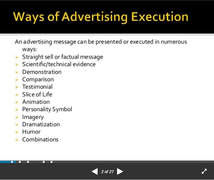
This research was to, more or less, figure out which "type" I am using-marketing or advertising-and go more in-depth into that type. Because I am doing advertising, I went a little more in-depth into that aspect. The way of advertising execution I attempted to use was more on the personality symbol end of it all. Since the original request was to make a design as an advertising symbol for my "group" in the walk/run, I would be remaking the original design, keeping the advertising aspect of the project.
One of two reasons I chose the Miller Logo is that it resembled the topic of my group in the walk/run, "Come With Me and Catch The Stars" and that the female figure will be easier to incorporate than other styles. Another reason is that the walk/run is in Milwaukee, and Miller is a common figure associated with Milwaukee.
Planning
This was difficult for me to draw, since I have practiced the anime style of drawing for 5 years. It's difficult to make a design that isn't in that style. Many times, it comes out sloppy when I try to make an anime style drawing more "realistic." Even on my own time, a single drawing can take days, inking and shading included. It takes weeks to even become close to such a realistic style. In reality, the planning stage to get to the final sketch was the hardest part of the project.
There was a level of "process" that connected the original shirt design to this one. The original design (first image) was completed weeks before the final image. I was working from my original project. I started from scratch one the image.
|
This is the gray scale version of the original color image. I really wanted to keep this image, but that just didn't happen. I wanted to add a moon. It's much easier to work with moons than stars. And based on suggestion, I went to advertising and actually worked with the idea of "Girl in the Moon." I had some other ideas as well, but they just didn't fit as well.
|
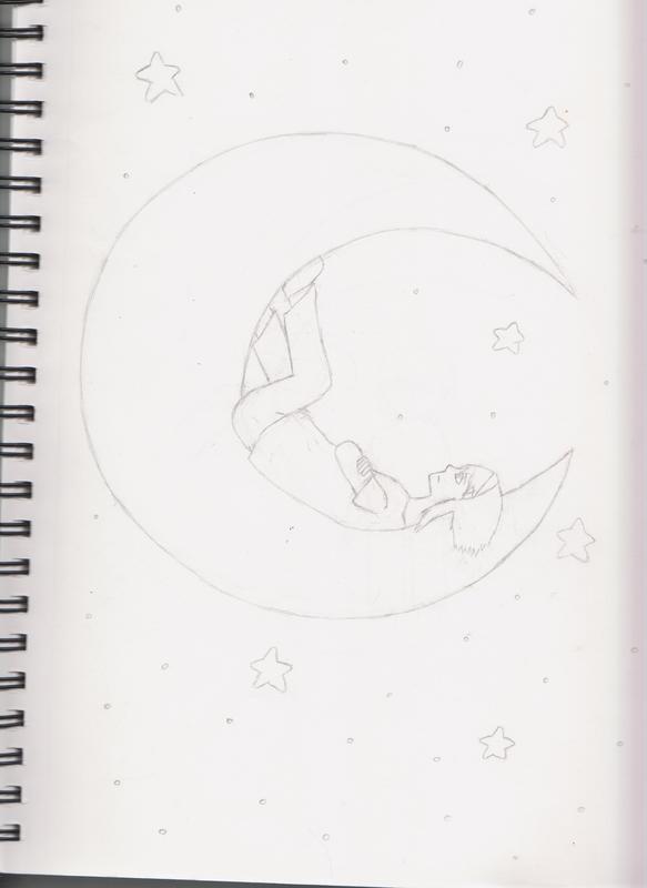
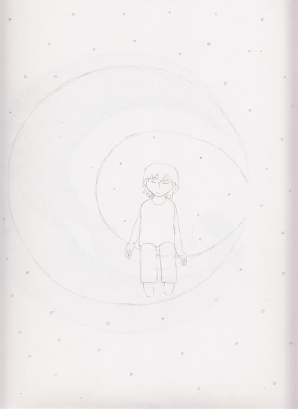
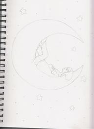
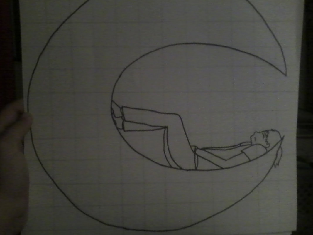
I had some other scribbles for sketches, but only a few of those scribbles worked well for this project, and I decided on one of them. That sketch was very difficult to get correct, as proportions and positions are not my strong area yet. It took a few weeks to get as far as a proper sketch.
|
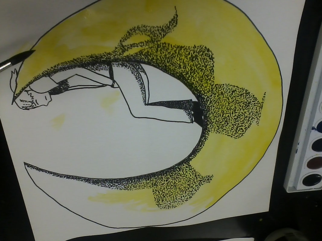
Here was the chosen sketch idea to work with. It took weeks to fix it up, and even then, I started over because it wasn't working with my still beginning skills. The sketch was no longer used, but redone with the idea the same.
|
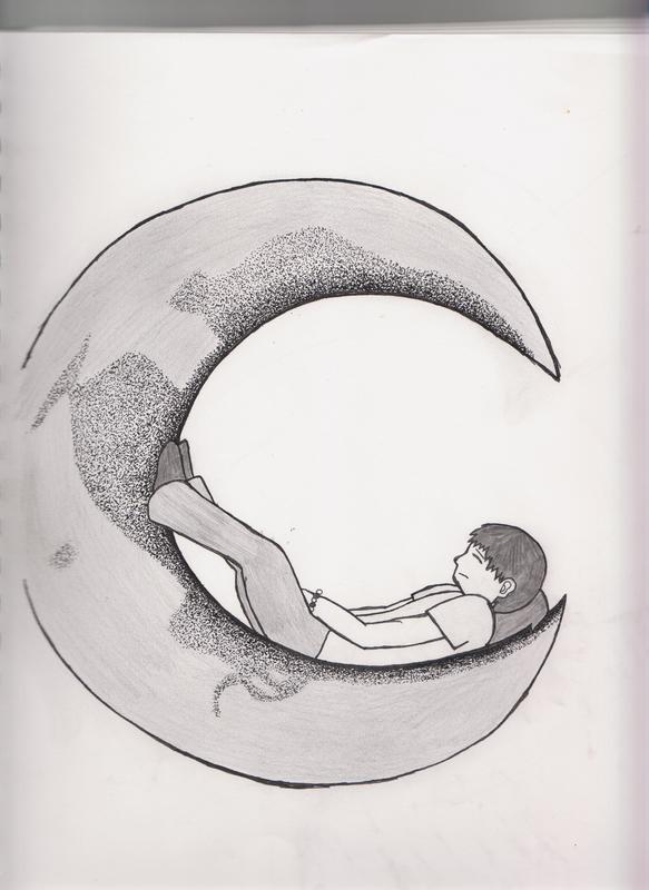
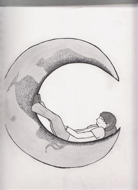
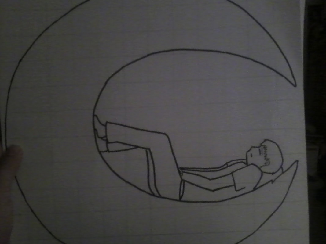
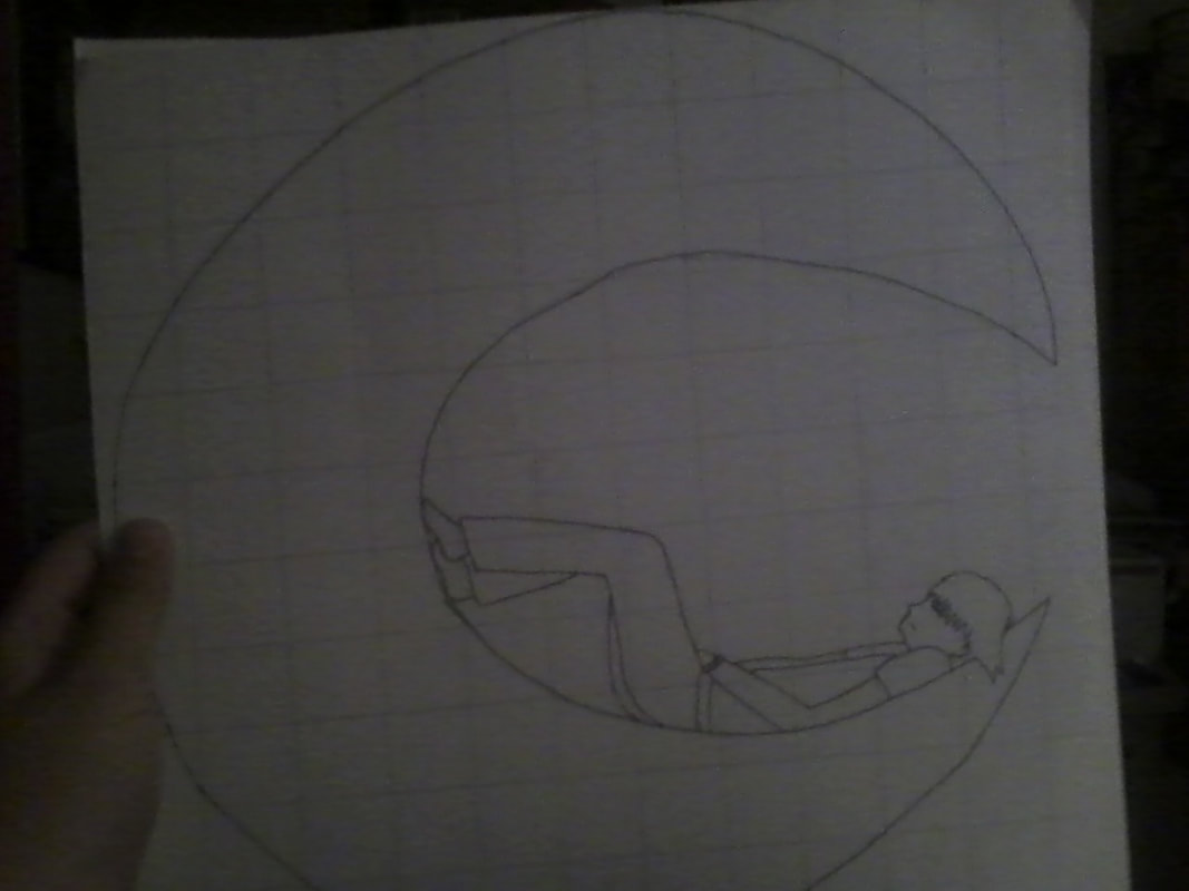
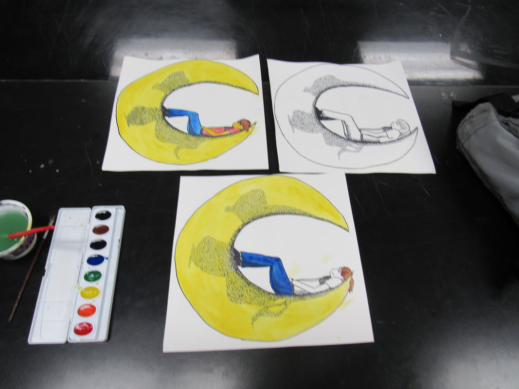
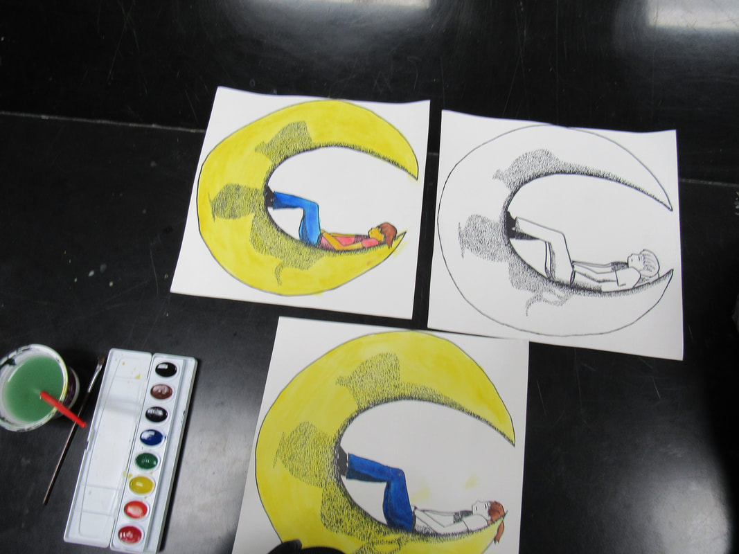
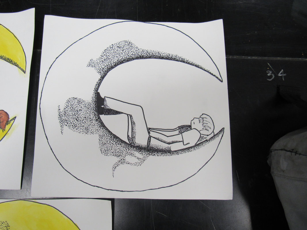
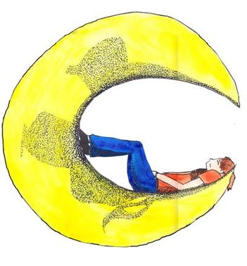
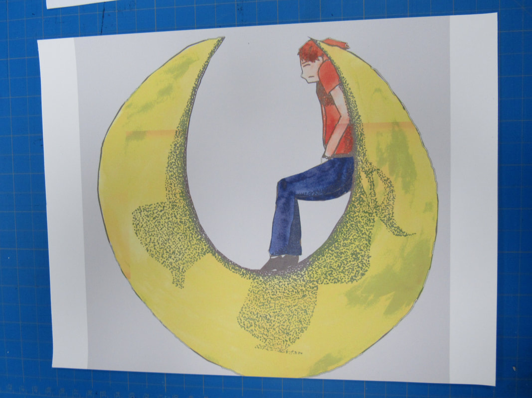
From there is where a real process begins. When the sketch finally came together, i inked it and did some shading, but the shading was not strong. I couldn't get it right no matter what I did, so I said "screw this" and went for stippling. I looked up examples of the moon, sketched some of the "shadows" on to my moon, and just stippled the...everything out of it. I used very small markers that I got when working in graphic design, and spent a couple hours stippling the moon. I saw something similar in my manga, where the darker shades had those little ink dots closer to one another, and lighter shades happened when the dots were further apart, so I used that idea. For my first attempt using stippling for detailed images, and my second or third time using it at all, I think it turned out well.
|
Here is how the stippled moon looked.
|
It took weeks to get this far, as this is not a drawing style I have practiced. I had a few different ideas, but I wanted the character in the image to have some sort of interaction with the moon. I experimented with that for a bit, finally ending at the final sketch above.
Experimentation
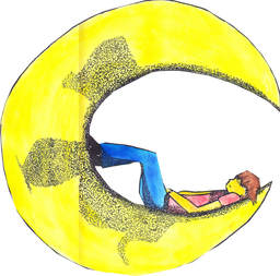
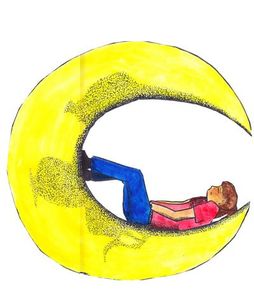
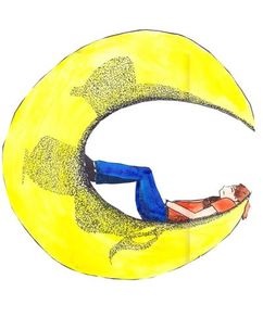
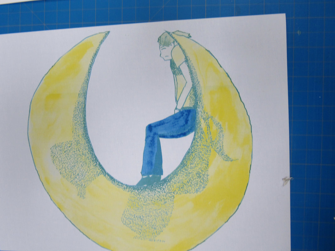
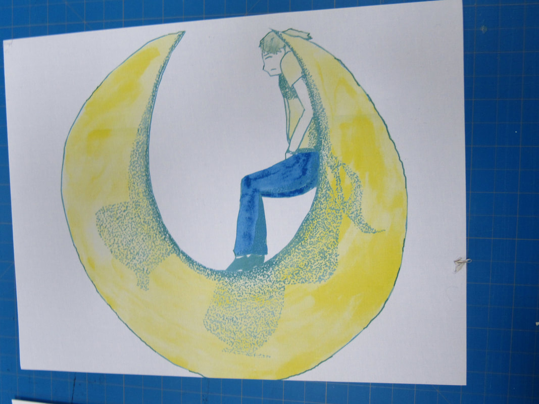
Plenty of experimentation on every stage with this one..Using the grid method isn't always perfectly accurate, so the images came out slightly different when I transferred them. Then I stippled again, all that.
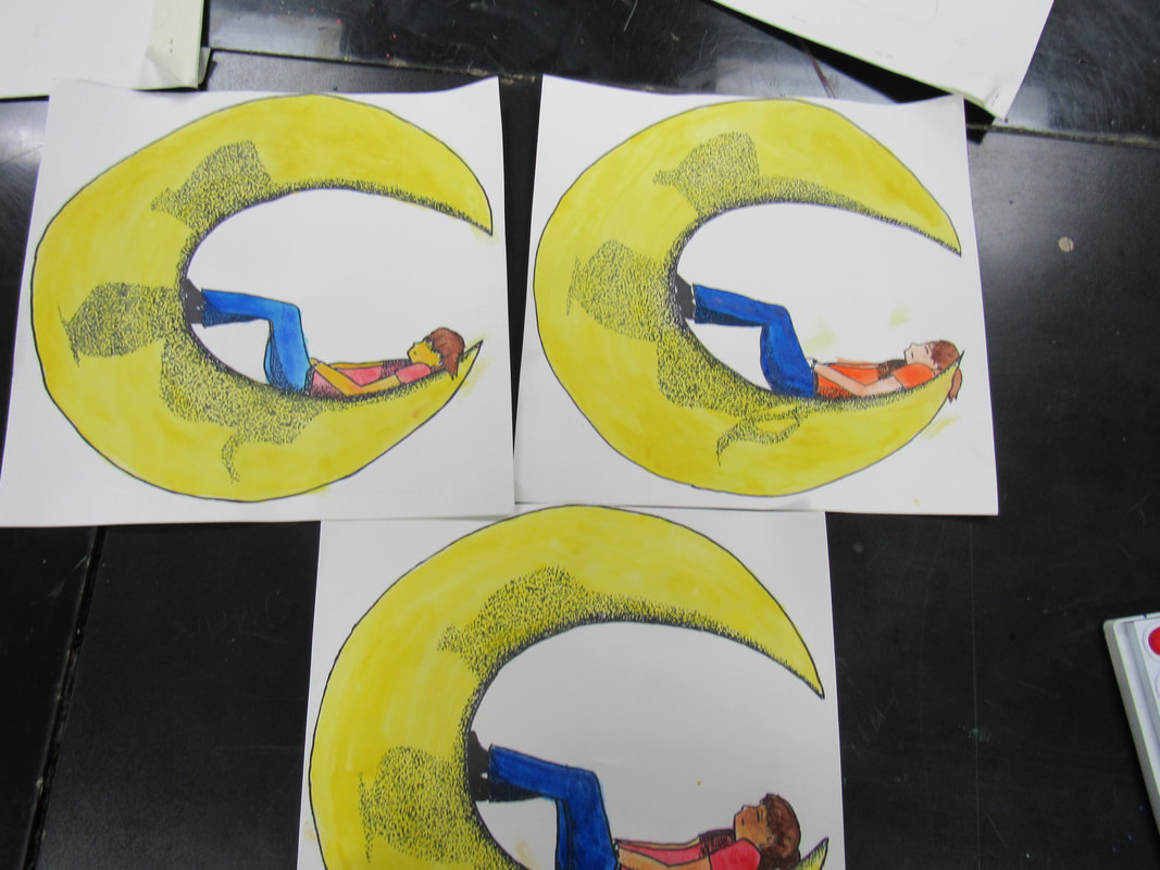
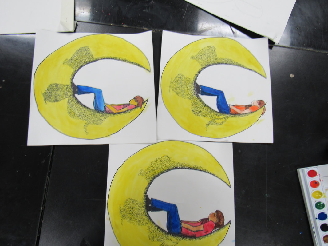
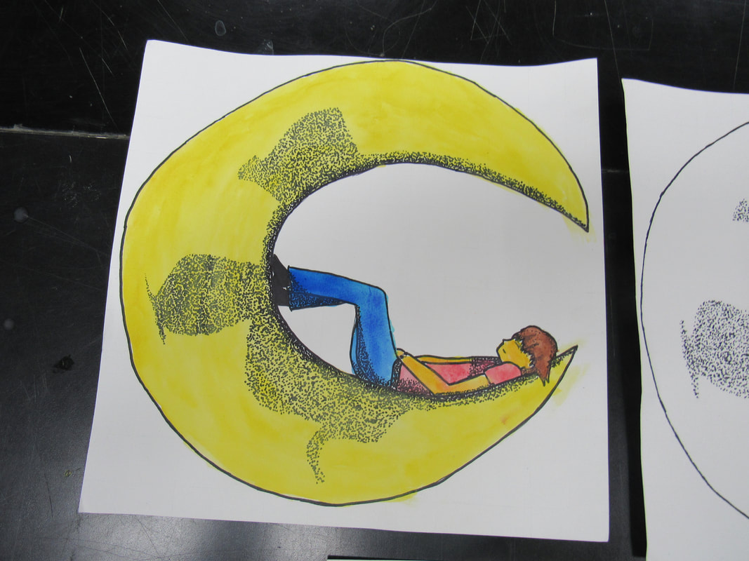
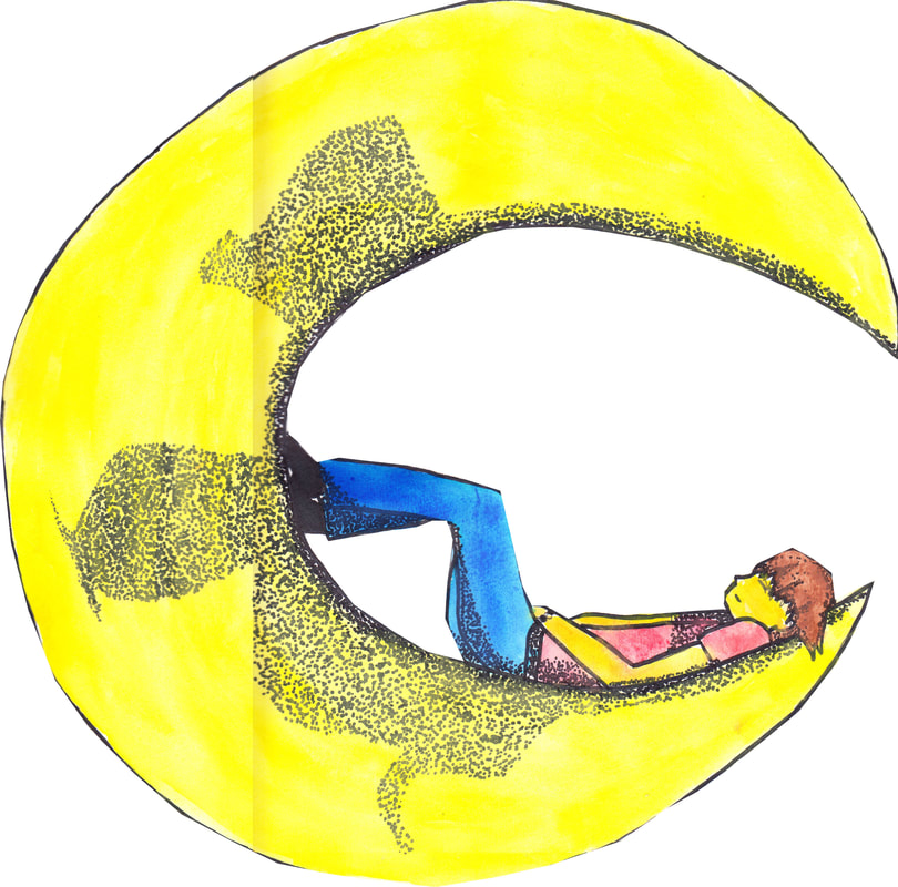
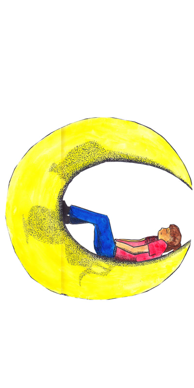
And after that, I went to watercolor paint it. I layered some yellow, trying to get a solid color at first, with success for the most part. A couple times, I dripped the paint to the middle of the paper, or put in too MUCH water.
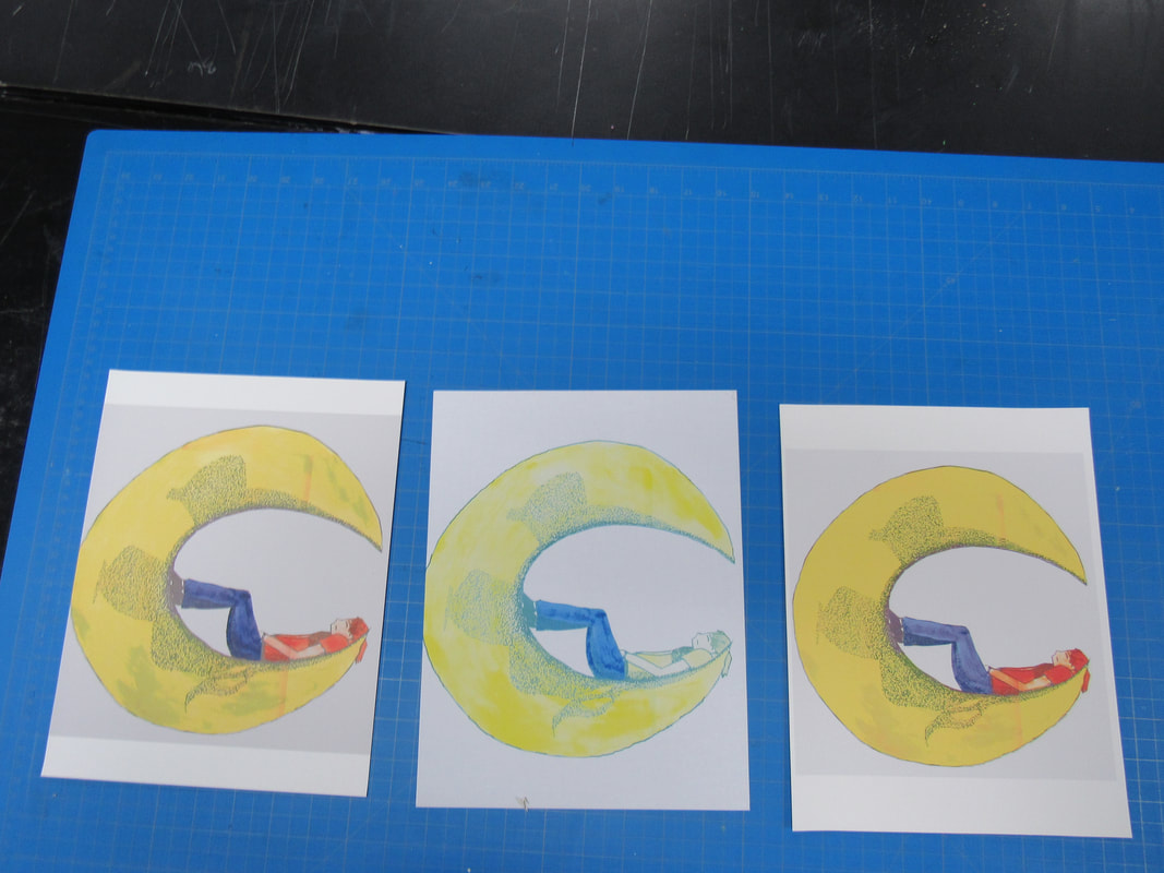
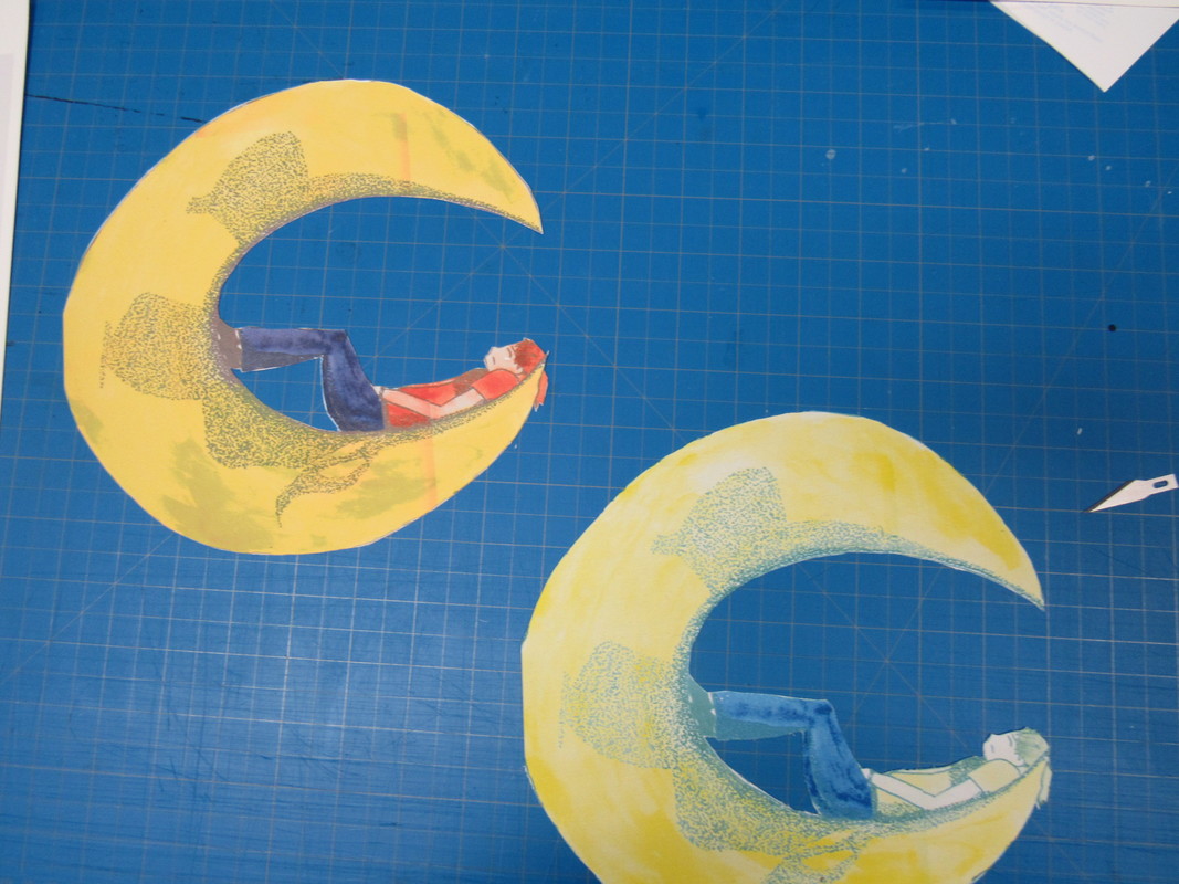
The skin tone and the shirt provided the most trouble, I only accidentally got the right shading on one of the three copies. When I finally got all three copies painted....I had to TRY to scan them. I messed up on the placement many times, and some edges were missing, the placement was off (as in slightly slanted or too far up on the scanner). I edited them all in Photoshop, sometimes having to use three different scans to make the full image on each scan/image.
And after that, I went to watercolor paint it. I layered some yellow, trying to get a solid color at first, with success for the most part. A couple times, I dripped the paint to the middle of the paper, or put in too MUCH water.
The skin tone and the shirt provided the most trouble, I only accidentally got the right shading on one of the three copies. When I finally got all three copies painted....I had to TRY to scan them. I messed up on the placement many times, and some edges were missing, the placement was off (as in slightly slanted or too far up on the scanner). I edited them all in Photoshop, sometimes having to use three different scans to make the full image on each scan/image.
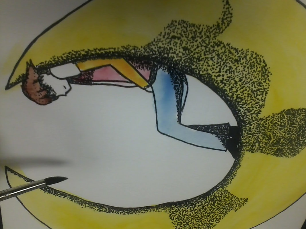

The biggest pain here was the watercolors. Since I cannot use the acrylic "formula" for skin tones, I had to experiment on this one to figure this out. Previously, when using colored pencils, I discovered orange and yellow make a color similar to skin tone. I thought to try to do something similar with watercolors.
|
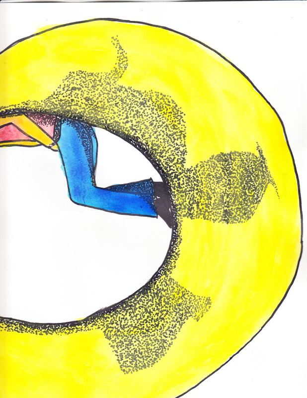
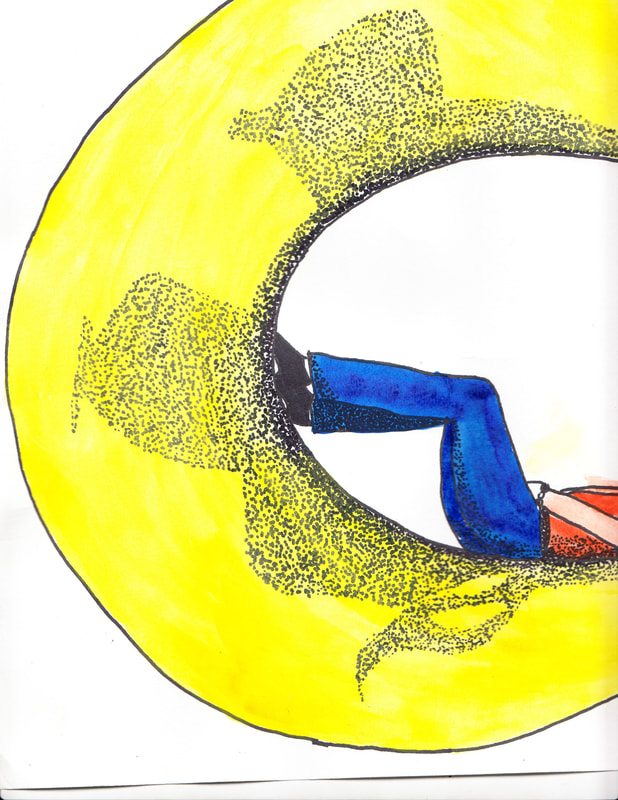
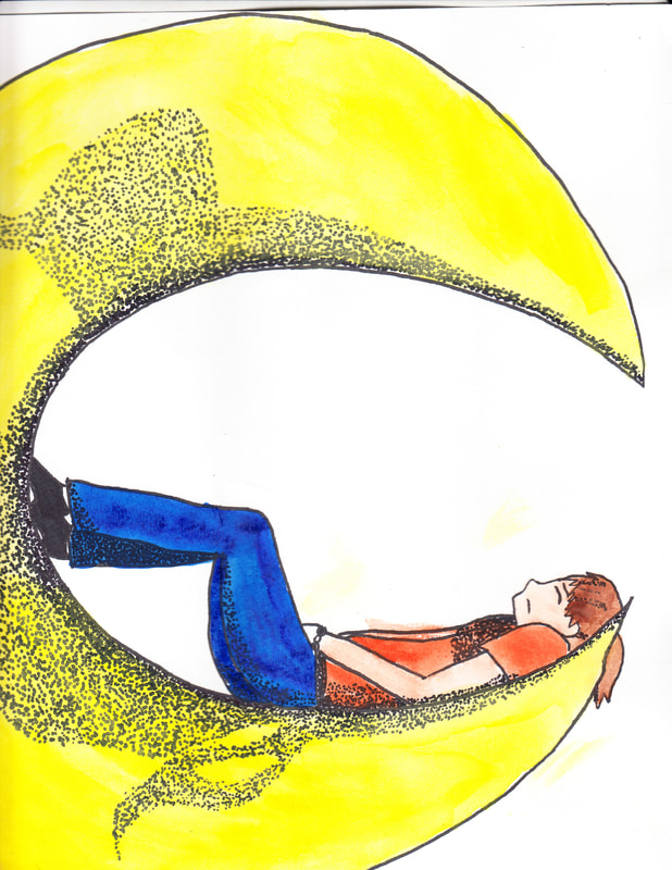
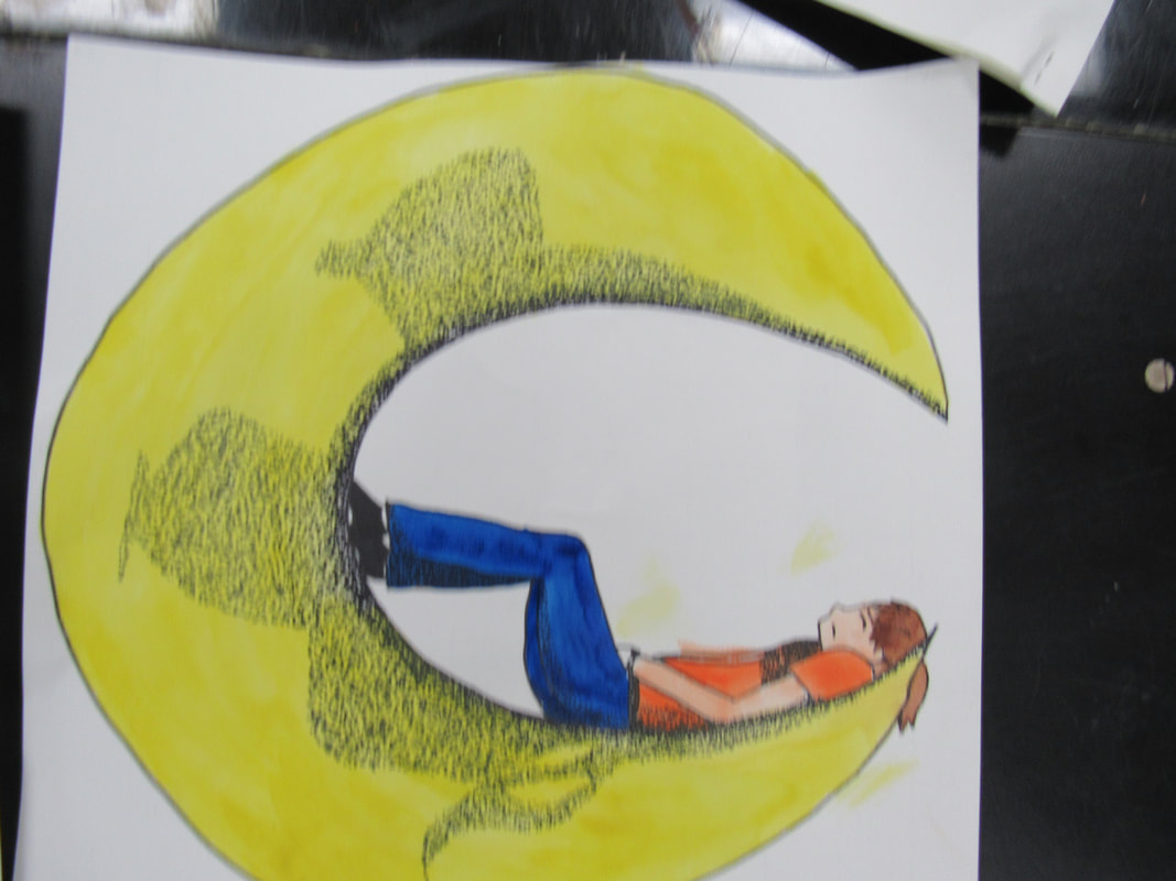
This one didn't turn out horrible, but I had used too much yellow on the skin, and not enough layers on the moon. The jeans were too light across the thighs, and the shirt was too splotchy.
|
|
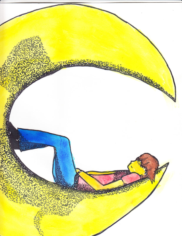
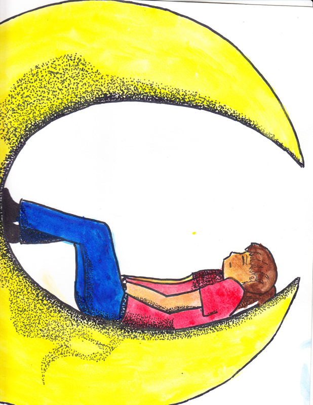
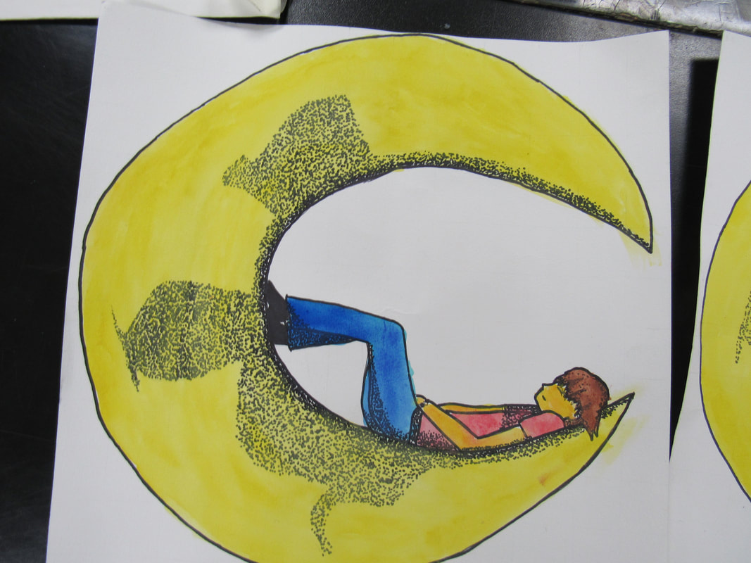
This was another failed attempt at skin tone. The jeans came out better, darkening to about the right tone, and had about 3 layers. The shirt was also darker, getting very close to looking like a shirt. The moon could have used a few more layers, though.
|
|
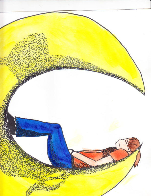
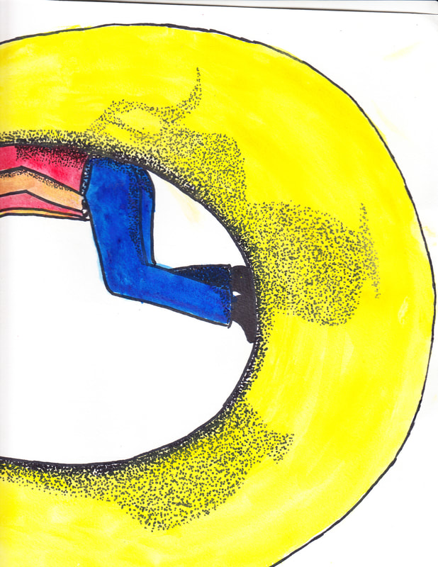
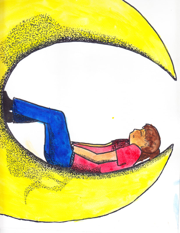
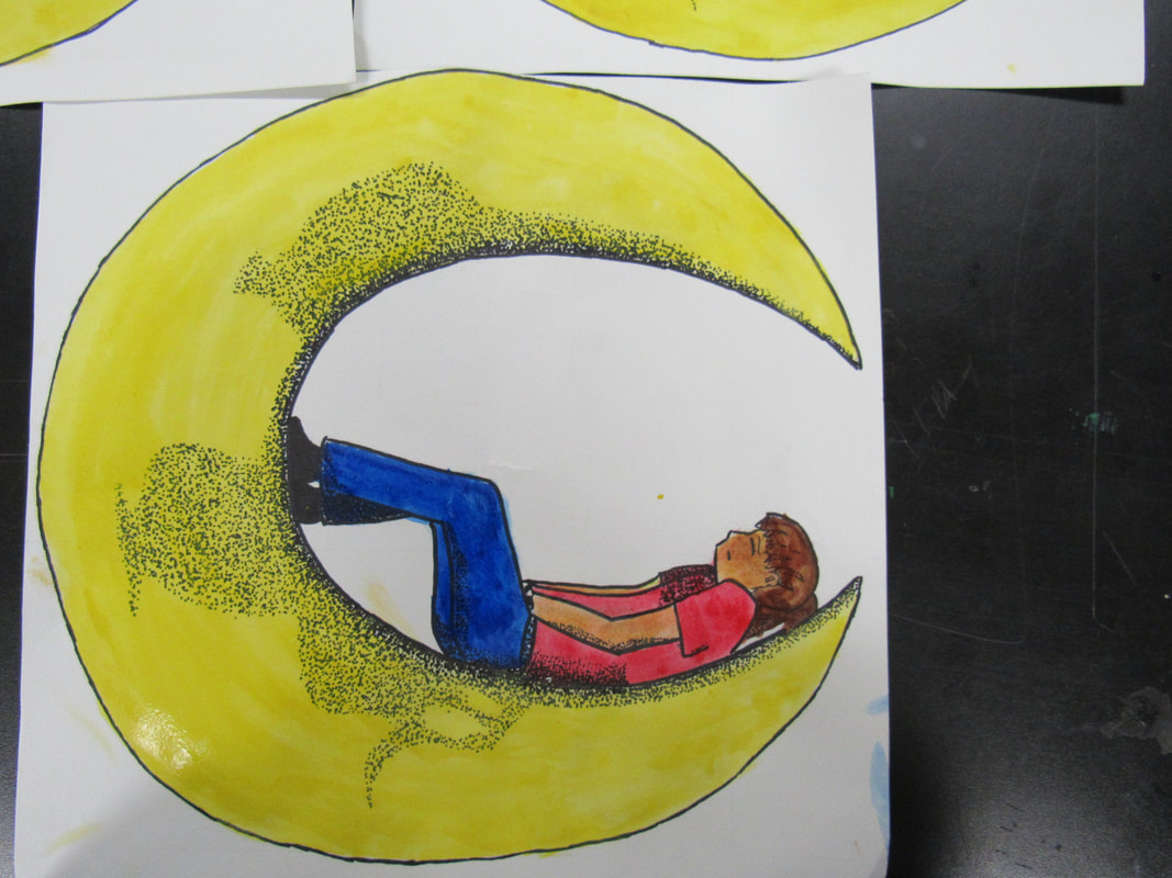
In this one, the skin tone came out almost perfect, the jeans did as well, the shirt was almost there, but the moon was once AGAIN too splotchy!!!!
|
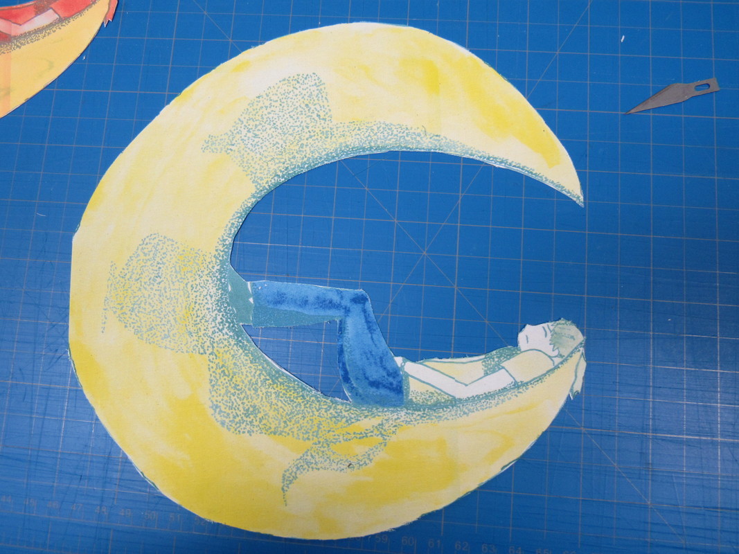

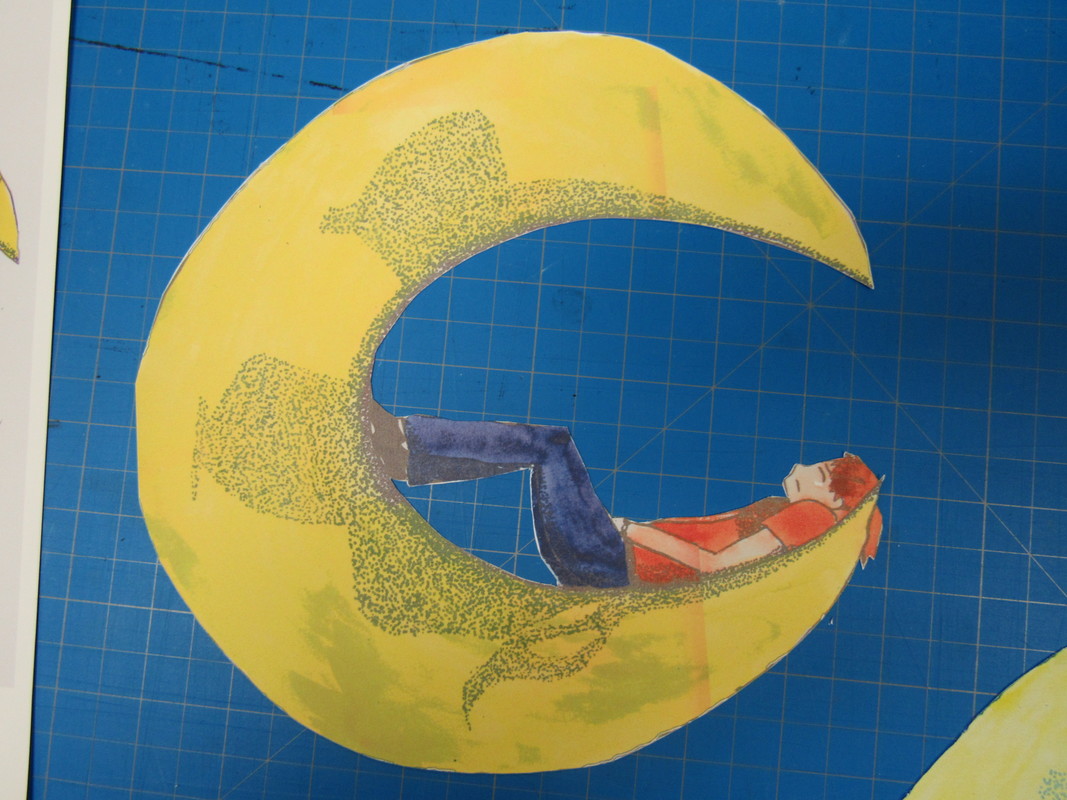
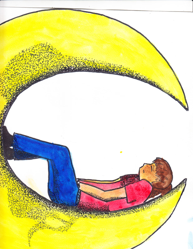
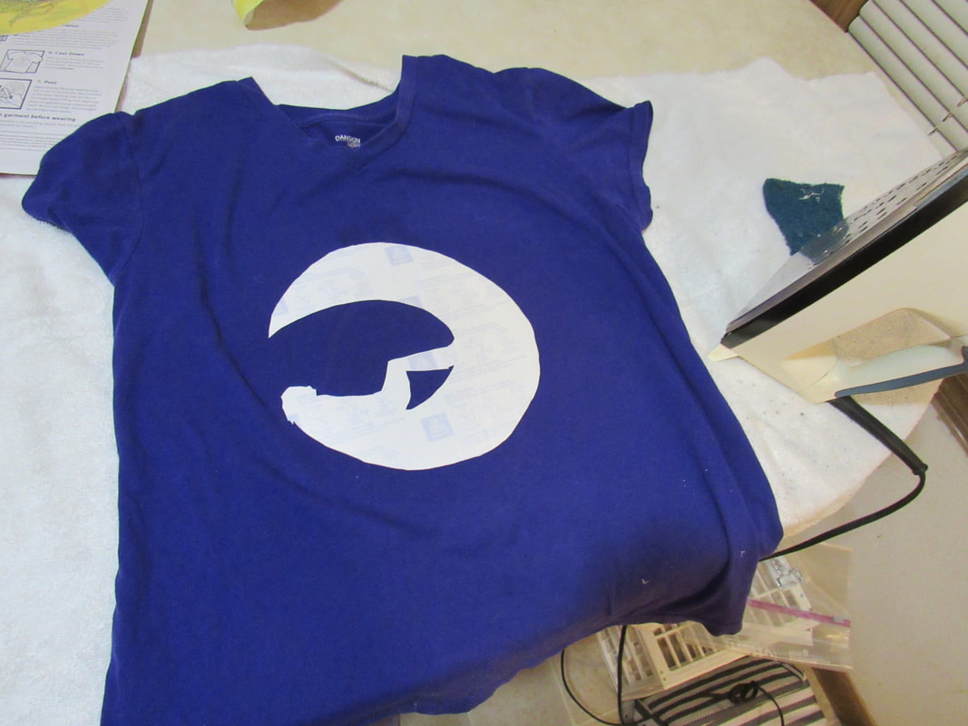
When they first printed, the colors and tone came out weird on the images. The first image had a green outline instead of a black one, and the coloring was overall too light and almost distorted. The second one came out better, but was still a bit light. And the third one came out the best. Afterwards, I took an X-acto knife and practiced cutting the images from the printable cloth, practicing on the two that didn't come out as well, using the one that best printed as my final.


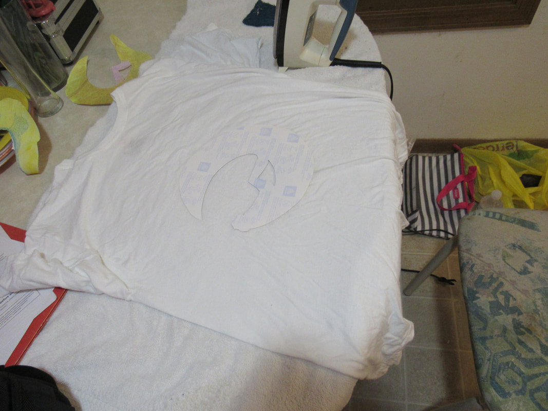
I actually had a serious epic fail on my first try ironing. I hadn't noticed the backing of the printable cloth was not there, so when I tried ironing on the design......the adhesive covered the span of the entire iron. I tried leaving the design there and replacing the backing with card stock, to no avail. I ended up having to scrap that one, sadly.
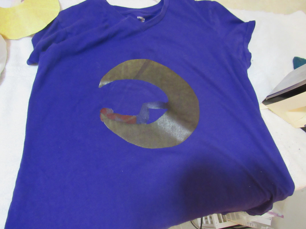
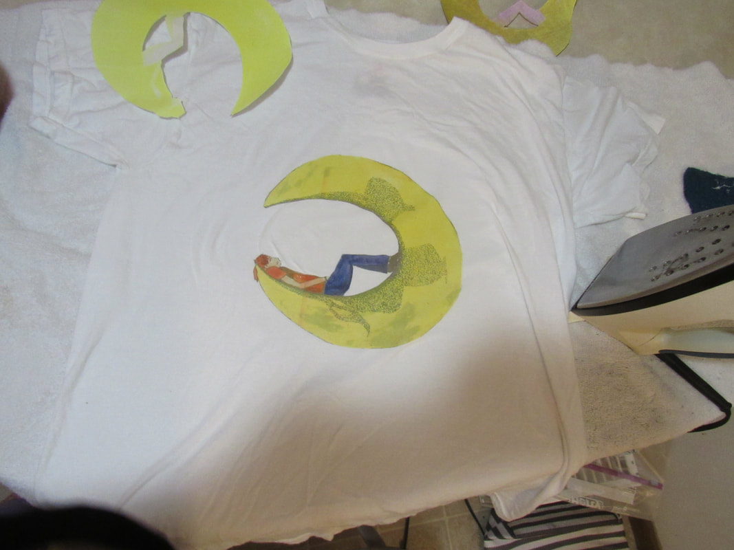
The second came out much better, starting with the fact that it had the backing to peel off. I took a couple minutes to iron it before peeling off the back to reveal the design. I actually liked this one. The dark gold on the moon looked almost natural with the purple, even though the rest of the colors on the design were almost drowned out entirely by the purple.
On my third print, and my final project design, I actually noticed as I was ironing that there was this tiny outline of ink along the edges of my design, like it was bleeding.
Process
After FINALLY making it to the planning sketch, it was on to printing it on a shirt. This process had more steps than I had anticipated. I basically thought that if I had the sketch done, I scan and upload that, and just print it to the shirt. Turns out there's a whole bunch of steps in between. Apparently the sketch I spent weeks on was NOT the final image. I transferred it to watercolor paper using the grid method, inked them again with a fine point sharpie, and then added the watercolors.
The first step was to redraw the ENTIRE design on watercolor paper. This was the most time-consuming part. It is difficult to recreate an entire image from scratch. To give myself room for error, I cut the large sheet of watercolor paper into six squares of 12inx12in. I can also get my preferred design size on shirts this way, not having to grow or shrink the paper, none of that. And having six of them really gives me that room for error. I redrew the image on the squares, stippled and shaded them differently on each one, see if I can find a preferred "type" of shading.
I then scanned all of the water colored images and put them together in Photoshop, to the best of my amateur abilities in Photoshop. I then "trimmed" out the design from the paper, again, to the best of my abilities. They weren't horrible, but they also did not turn out great, either. In this one, I couldn't seem to get rid of that weird line that looks like a crease on the ends of each one. That was caused by shadows during scanning, most likely. And if so, I was likely not paying enough attention to notice this early enough.
Nonetheless, I worked with what I had, editing each image and using the most accurate or satisfactory image.
In this stage, there were still lines missing on the clothing or on the moon.
Nonetheless, I worked with what I had, editing each image and using the most accurate or satisfactory image.
In this stage, there were still lines missing on the clothing or on the moon.
|
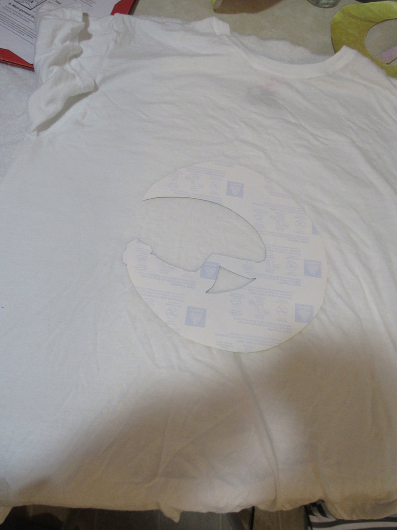
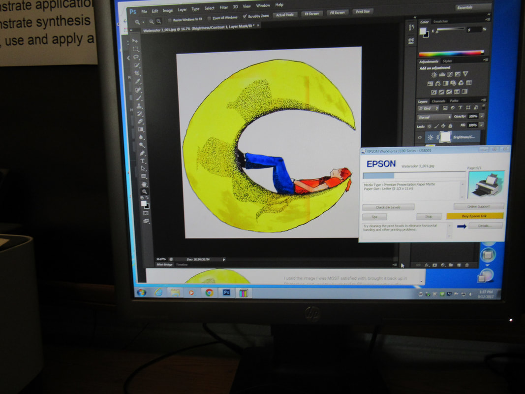
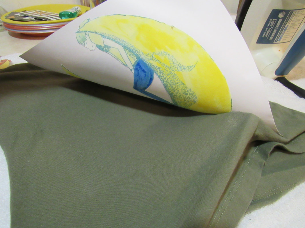
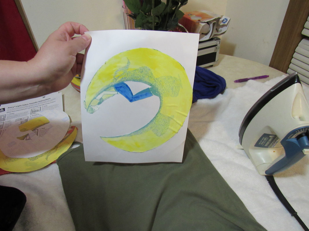
I used the image I was MOST satisfied with, brought it back up in Photoshop, and used the brush tool to fill in gaps on the outline that uploading the image created. With tremors, this was no easy task, but I did the best I could.
|
After that, I made a copy as a JPEG to print as. I got some printable fabric to print on, and experimented a couple times to get the print right. The first time, a couple of ink cartridges were extremely low or completely empty, which is likely what caused the severe discoloration on the first print. I had also been confident in how my work compared to my inspiration. It's by no means perfect, but trying to incorporate night activities. I didn't use a common activity like drinking, nor was I drunk in the woods when I came up with this idea. My colors may be too bright to be accurate like "Girl in the Moon," though. I had used the moon idea, with a girl on the moon, but that's where the visual comparisons stop. Girl in the Moon is more literal and more upbeat than my work was. Both in the mood of my piece, and as a piece inspired by Girl in the Moon, I should have used more dull colors, more calm colors than I used.
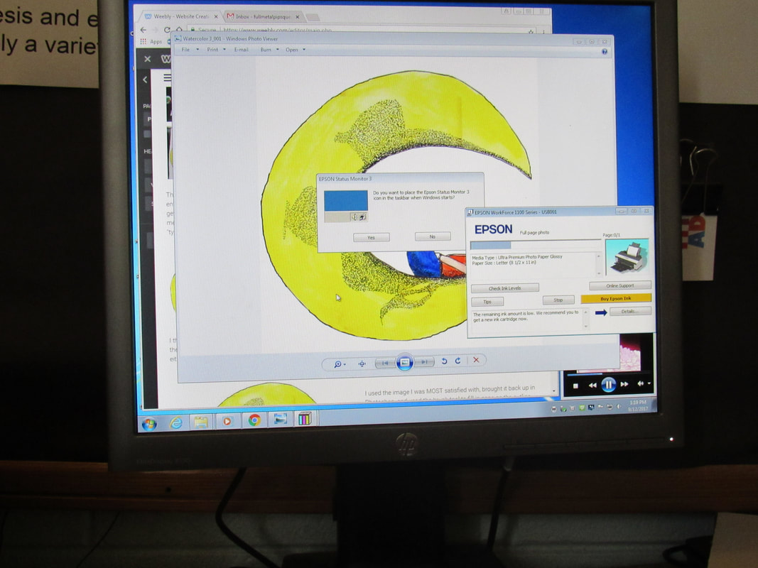
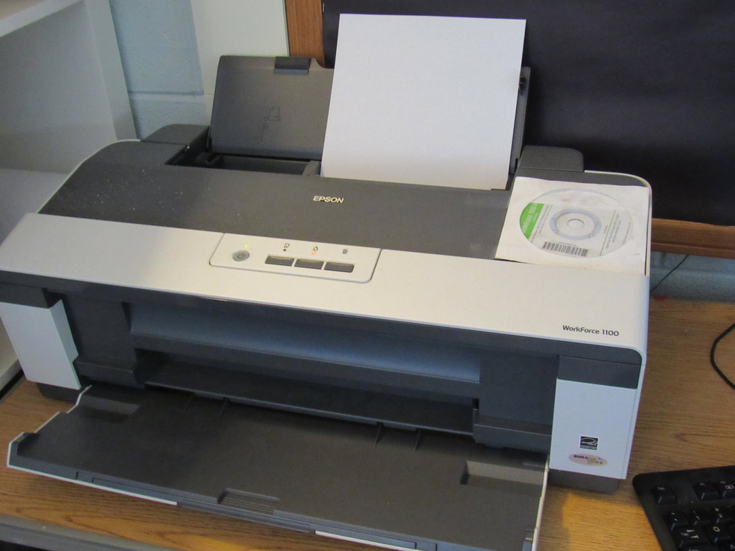
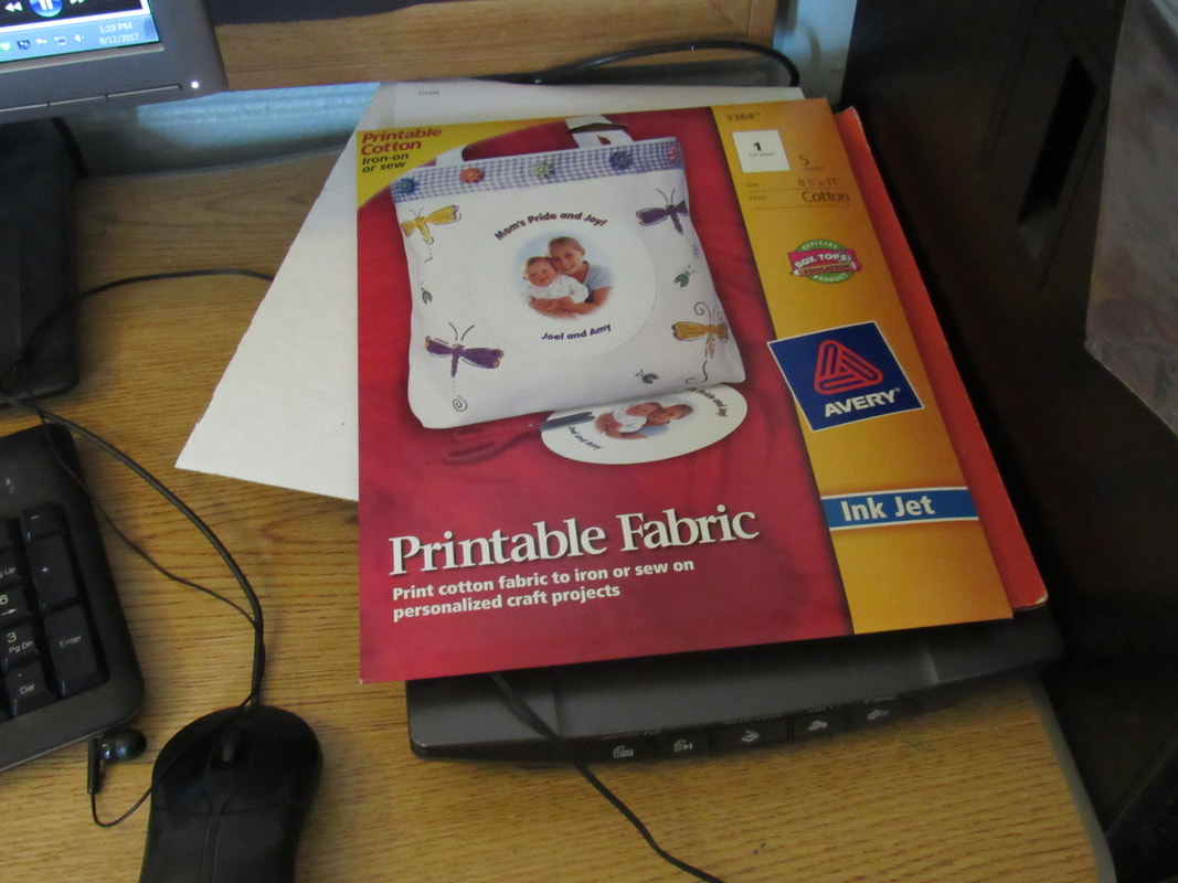
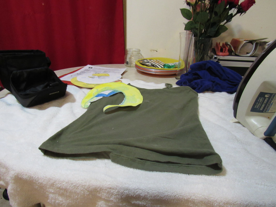
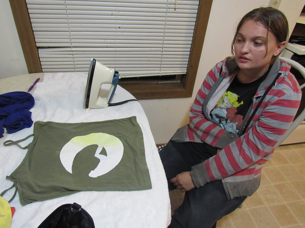
This is where I finally got to finalizing the image and printing it to an iron-on sheet, then ironing it to a shirt. The fun part was not knowing how to put paper in a printer. Once the printable cloth was in the paper slot, I could finally print. I ended up printing three different sheets, since the coloring or shading was off on the first two sheets.
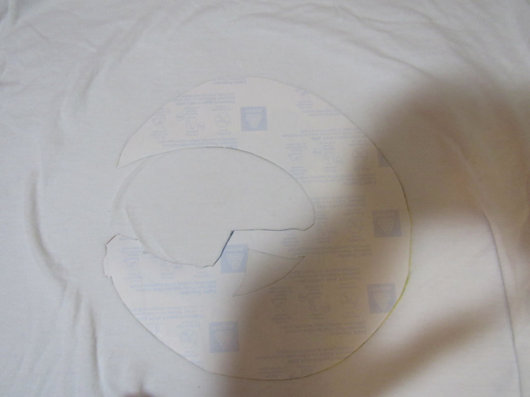
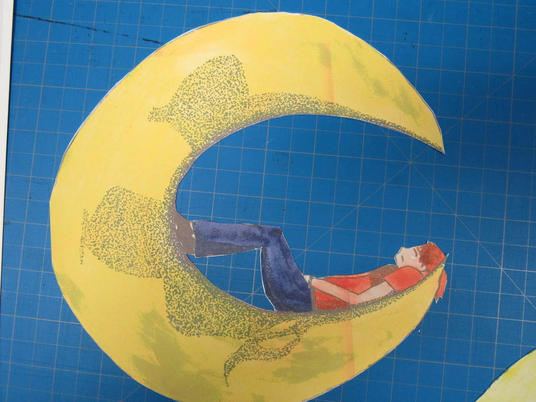
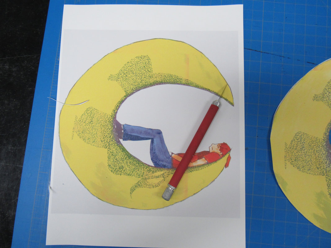
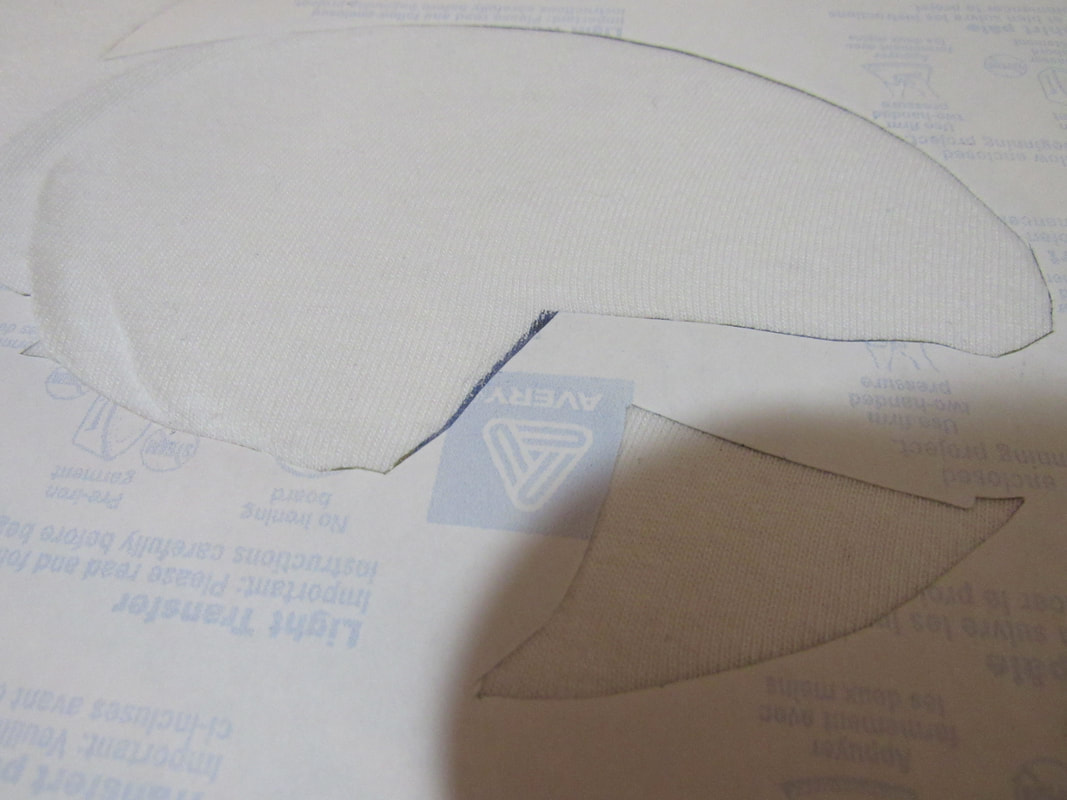
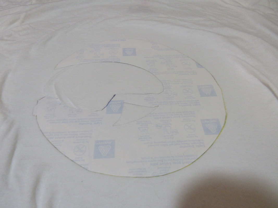
After all the prints were on the printable cloth, I experimented in cutting them out with an X-acto knife. One they were cut out, all that was left was to iron them to a shirt. I cut all 3 of them here. By the second experiment, I had become aware I had a dull blade and changed it out for a sharp one, which made cutting the cloth much easier. I was able to cut faster and much more accurately. In hindsight, I should have checked the blade in the first place.


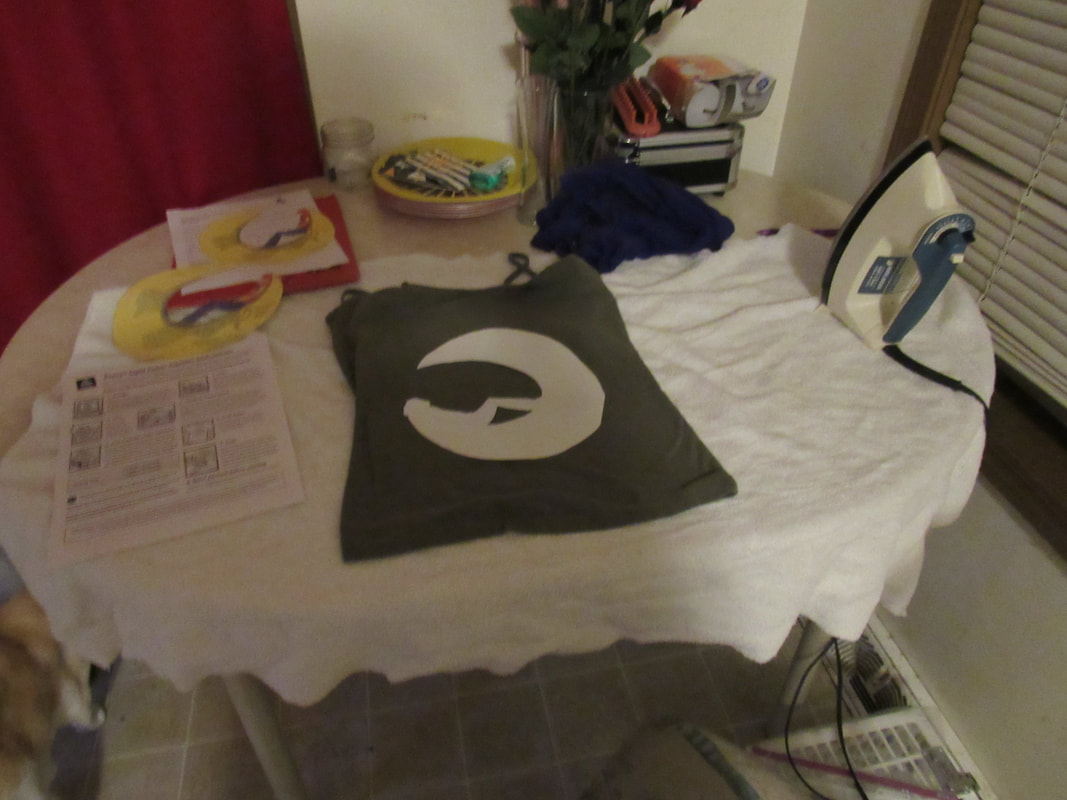
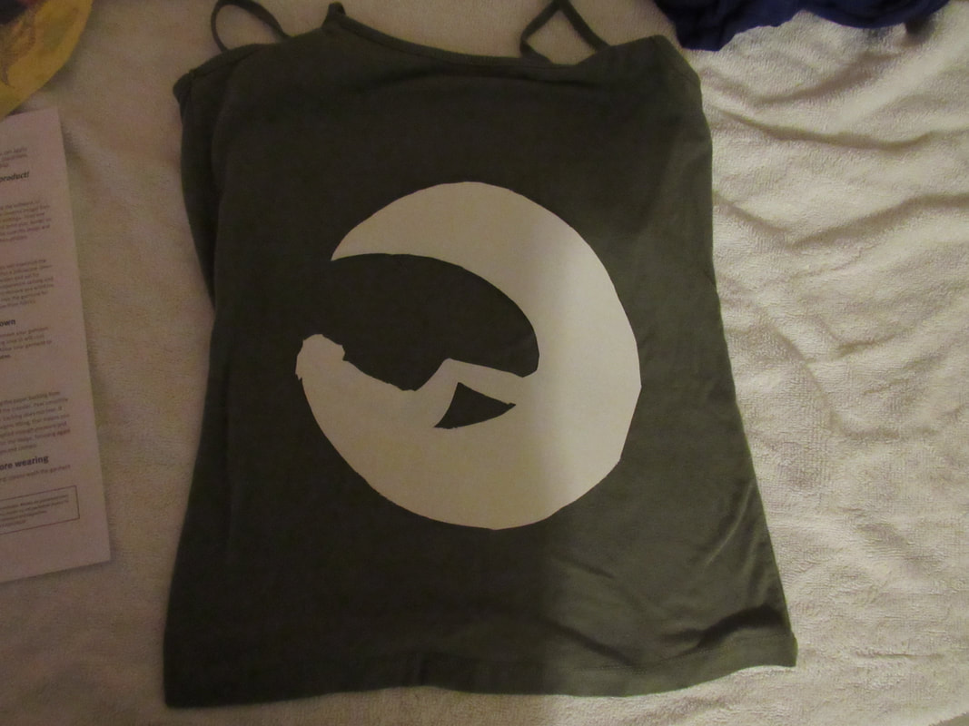
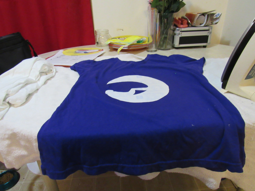
And after cutting all the designs out, I ironed them on to shirts. There was a failure on the first attempt where I hadn't noticed the peel-off backing was missing, and the adhesive melted to the iron-definitely cased the process to take more time, since I had to scrub the iron off. I had tried replacing the backing with card stock to try ironing it on again, with no success. The second had come out much better. After the first incident, I made sure the other two had their peel-off backings. I liked the golden on the second shirt (the purple one), and was especially careful to check coloring on the third one (white) before completely peeling off the backing and letting it cool.


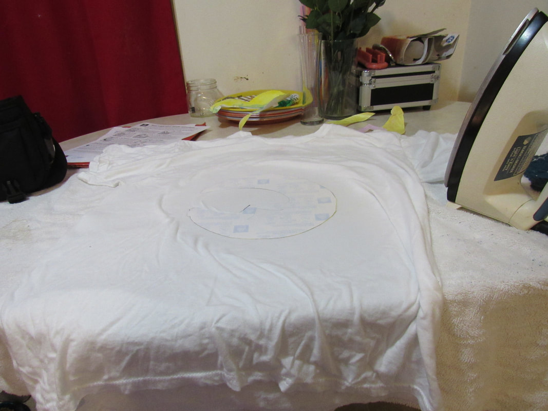

For the first two images, I used a separate cloth, shirt, pillowcase, whatever it may be. I used a simple iron to transfer the printed images to the cloth, taking note of how they looked when I took the printed cloth off. This allowed me the chance to experiment with how long the iron stays on, if there's any discoloration after print, any mistakes I could have made, and if I have a preferred placement of the design, like slanted or sideways. It also gives me room for trial and error instead of having to get it right the first time.
After the experiments were printed onto random cloth, I set up for the final, being very careful about placement, and made sure the cloth wouldn't move as I ironed it on.
After the experiments were printed onto random cloth, I set up for the final, being very careful about placement, and made sure the cloth wouldn't move as I ironed it on.
By the end of the project, I had become confident in this medium. My stippling skills had improved as well. I had also become more confident in Photoshop. Though my ability to create perfect lines will never improve because of a physical problem, I am more confident in using blades to fix the edges instead whenever possible.
