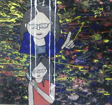
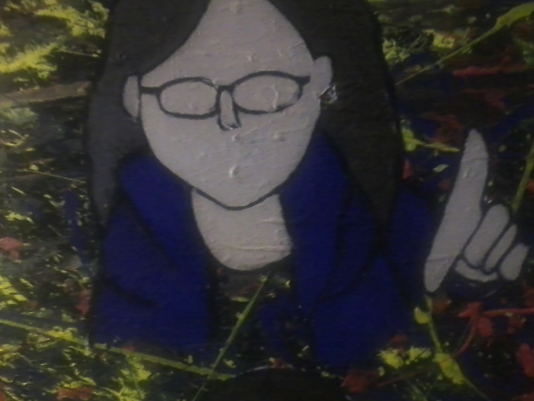
Self Portrait
|
Title: Control Yourself
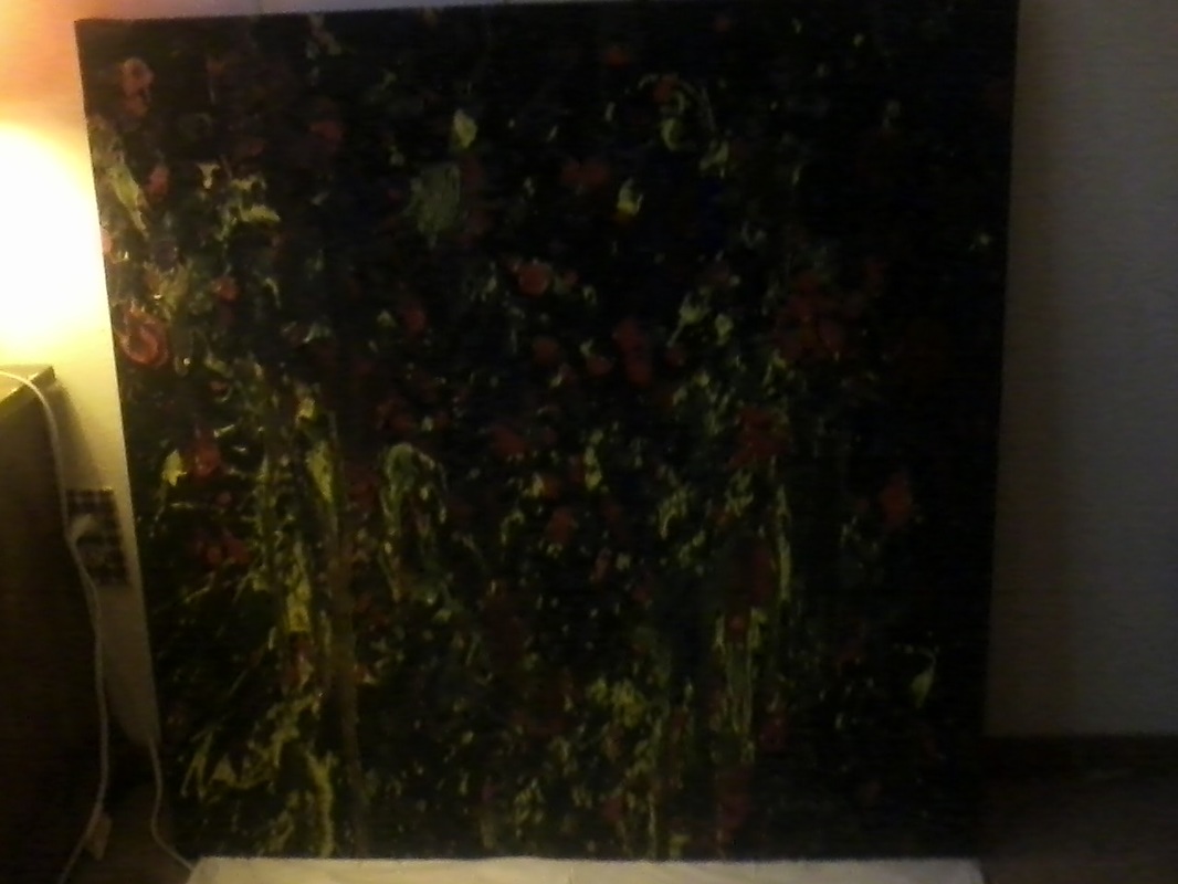
Size: 3ftx3ft Medium: Painting Date: December 9 , 2016 |
INSPIRATION
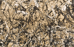
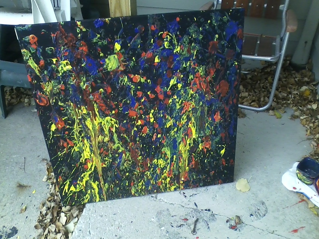
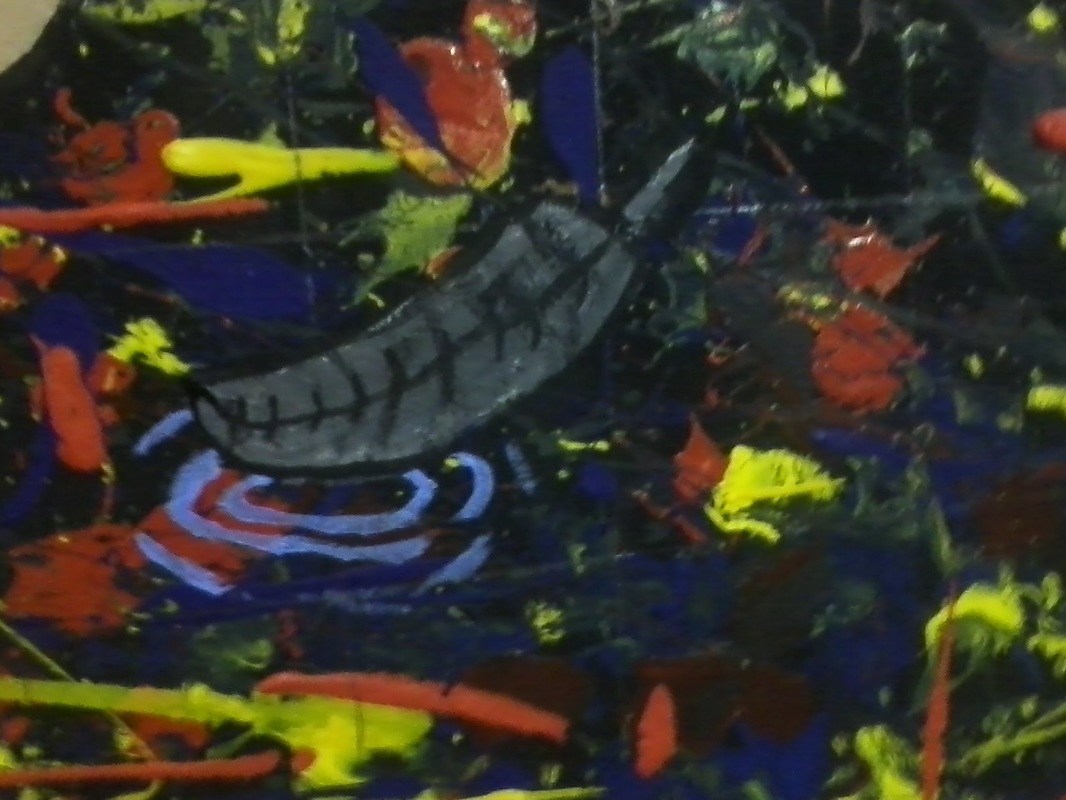
My artistic inspiration is Van Gogh. I like using his use of lines. His style of lines is actually perfect for creating and mixing energies. Cool colors represent the sadness and regret, the warm colors represent the anger and will to fight. Van Gogh's use of lines in his paintings work well for mixing the colors and energies from those colors. Eventually, I decided to have even more fun by painting the way Jackson Pollock did. Just abandoned the brush entirely. I set up outside, covered my hands in paint, and threw it at the canvas. I also did other ways Pollock used on canvas, dripping paint as well. I especially like his work Autumn Rhythm, and decided to use that as my biggest influence.
RESEARCH
I did some light research on Jackson Pollock's work. And because I am doing a Pop Art style for the figures in the image, I did light research on Pop Art as well.
JACKSON POLLOCK
|
Autumn Rhythm. Digital image. Gallery Intell. N.p., 2011. Web. 1 Dec. 2016.
|
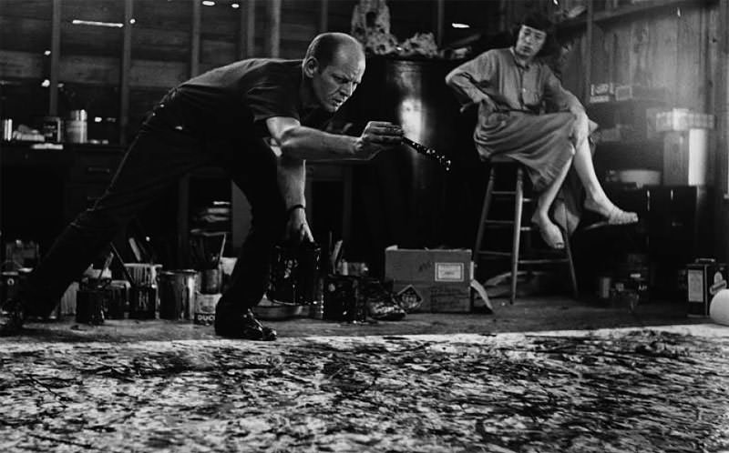
Jackson Pollock is a drip painter, he abandoned the brush entirely and painted with sticks, knives, or trowels. He either layed the canvas on the floor, or against a wall, not using an easel. This style of painting has similarities to Surrealism, in the way that it showcased the feeling behind the work, as well as having a direct relation to the artist's mood, expression, and emotions.
Pollock's methods and growing reputation had caught the attention of the media. In August 1949, Life magazine wrote a story asking the question "Jackson Pollock: Is he the greatest living painter in the United States?"
At the peak of fame, Jackson Pollock suddenly abandoned the drip style. Jackson Pollock's works became darker in color after 1951, including a collection painted with black on unprimed canvases. These paintings were referred to as his 'black pourings' and when he showcased them at Betty Parsons Gallery, none of them sold. But later on, Pollock moved to a more commercial style by using color and figurative pieces again.
In the 1960's, Jackson Pollock was seen as one of the most important people in art, and one of the inventors of the avant-garde styles that were starting to come out. Like other famous figures, the issues Jackson Pollock suffered from in his personal life, such as his problem with alcohol, added to his status. And, his early death, which happened when he died in a car crash, also added to what he is still known for in art today.
|
Jackson Pollock At Work. Digital image. Jackson Pollock. N.p., 2011. Web. 6 Dec. 2016.
|
POP ART
Pop art is known with the artists of the early 1960s like Andy Warhol, Roy Lichtenstein, James Rosenquist, and Claes Oldenburg, but artists who drew on popular images were part of an international phenomenon in lots cities from the1950s onwards. Following Abstract Expressionists, pop's reintroduction of identifiable imagery was a huge shift for the direction of modernism. The subject matter became far from traditional "high art" instead, pop artists celebrated common objects and everyday life, looking to raise popular culture to fine art. Pop art has become one of the most noticeable styles of modern art.
A lot of pop artists started their careers in commercial art. Andy Warhol was an illustrator for magazines and a graphic designer. Ed Ruscha was a graphic designer, too. James Rosenquist started working as a billboard painter. Their backgrounds in commercial art had trained them with techniques to combine high art and popular culture.
Research Citations:
Https://www.facebook.com/galleryIntell. "Autumn Rhythm, (Number 30) by Jackson Pollock on GalleryIntell." GalleryIntell. N.p., 2011. Web. 01 Dec. 2016.
"Jackson Pollock and His Paintings." Jackson Pollock - Biography, Paintings of Jackson Pollock. N.p., 2011. Web. 01 Dec. 2016.
"Pop Art Movement, Artists and Major Works." The Art Story. N.p., 2016. Web. 01 Dec. 2016.
PLANNING
I was planning multiple ideas, but there was one idea that I decided on.
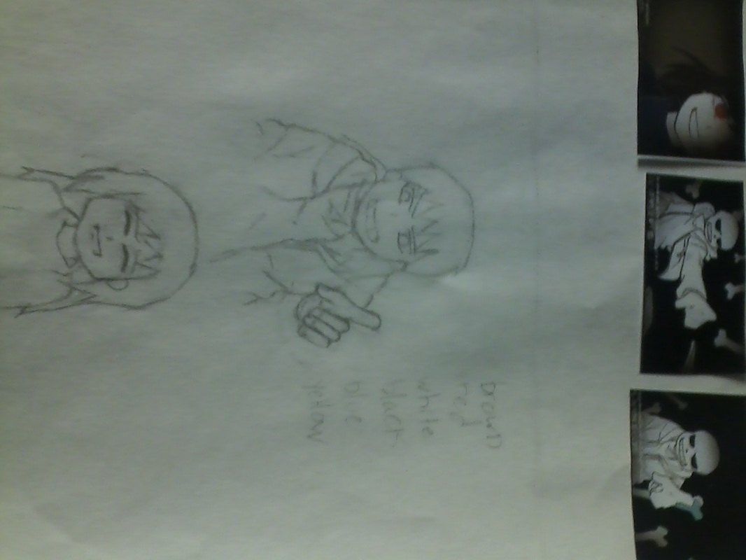
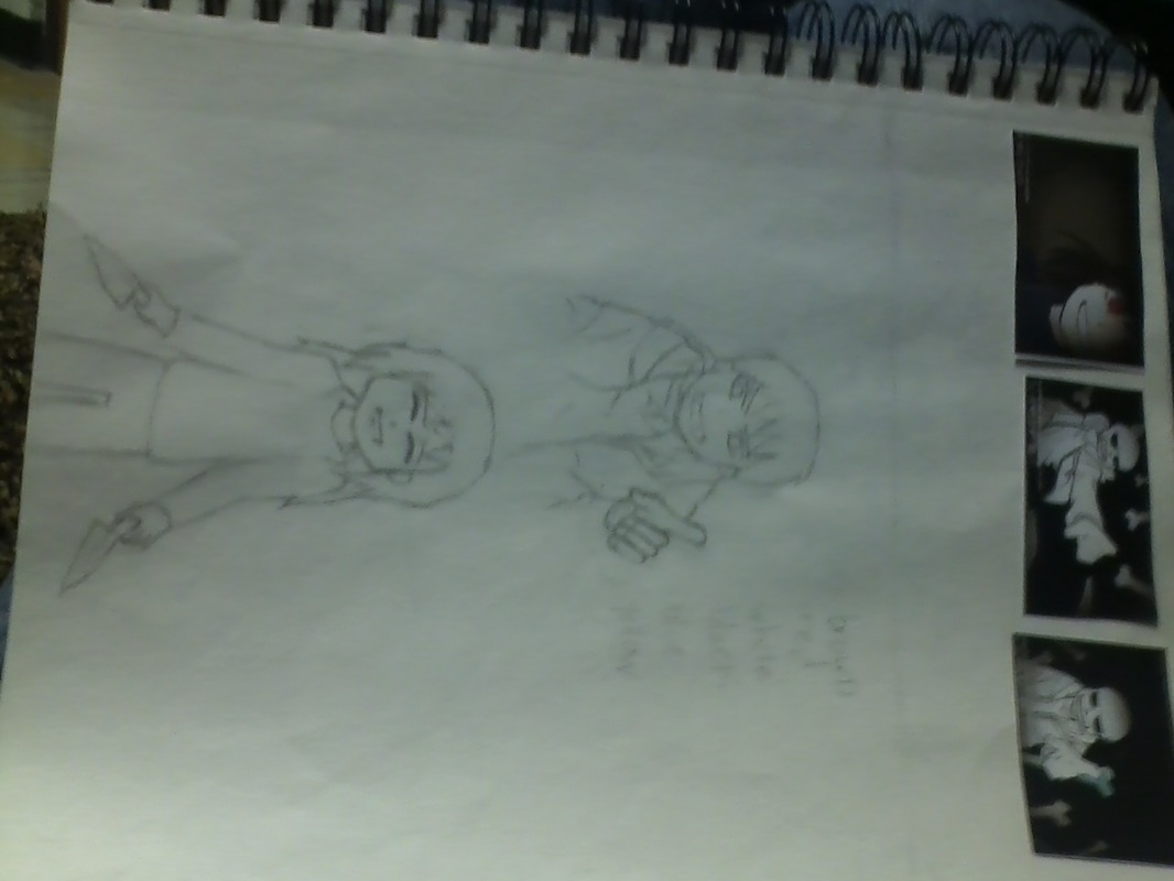
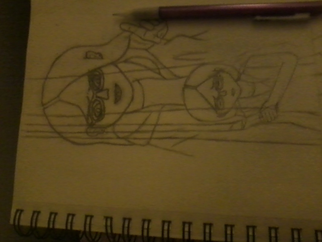
I usually make planning sketches in a very rough anime style, but I had to transfer one of the sketches to the canvas, so that sketch had to be exact. As a result, I had to edit it a lot, that way it's how it's going to be on the canvas.
I usually make planning sketches in a very rough anime style, but I had to transfer one of the sketches to the canvas, so that sketch had to be exact. As a result, I had to edit it a lot, that way it's how it's going to be on the canvas.
EXPERIMENTAION
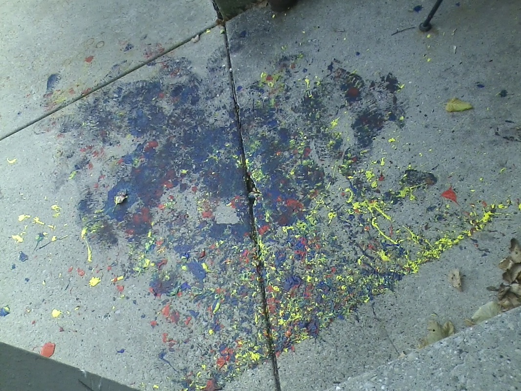
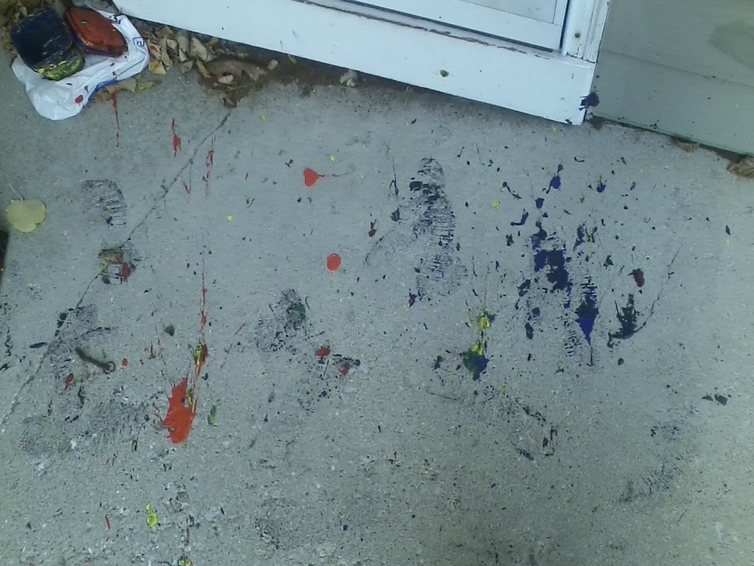
Well, I made quite a mess doing this. Outside is a mess, so were my clothes, and my biggest fail came from the stupidest move I ever made. I did not take my paint-covered shoes off at the door. I walked from the front door, across the carpet, to the bathroom to wash my hands, then to the kitchen to get some paper towel, then turned around to see the trail of paint.
I had also opened both doors with paint-covered hands. Everything was a mess, and that was the biggest failure. I somehow managed to get blue paint in my hair, and somehow all over my jacket.
I guess I experimented how fast I can get the paint out of the carpet and tiles. Apparently, very fast.
I also had to take paint remover chemicals and a wire brush outside, because the property manager is not going to like how I messed up right outside the apartment on the cement. Set-up took a few minutes, throwing the paint took about 10 minutes, and cleaning up the mess took about 3 hours total. That is the result of taking no precautions whatsoever.
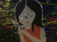
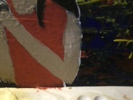
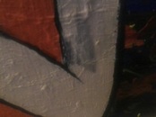
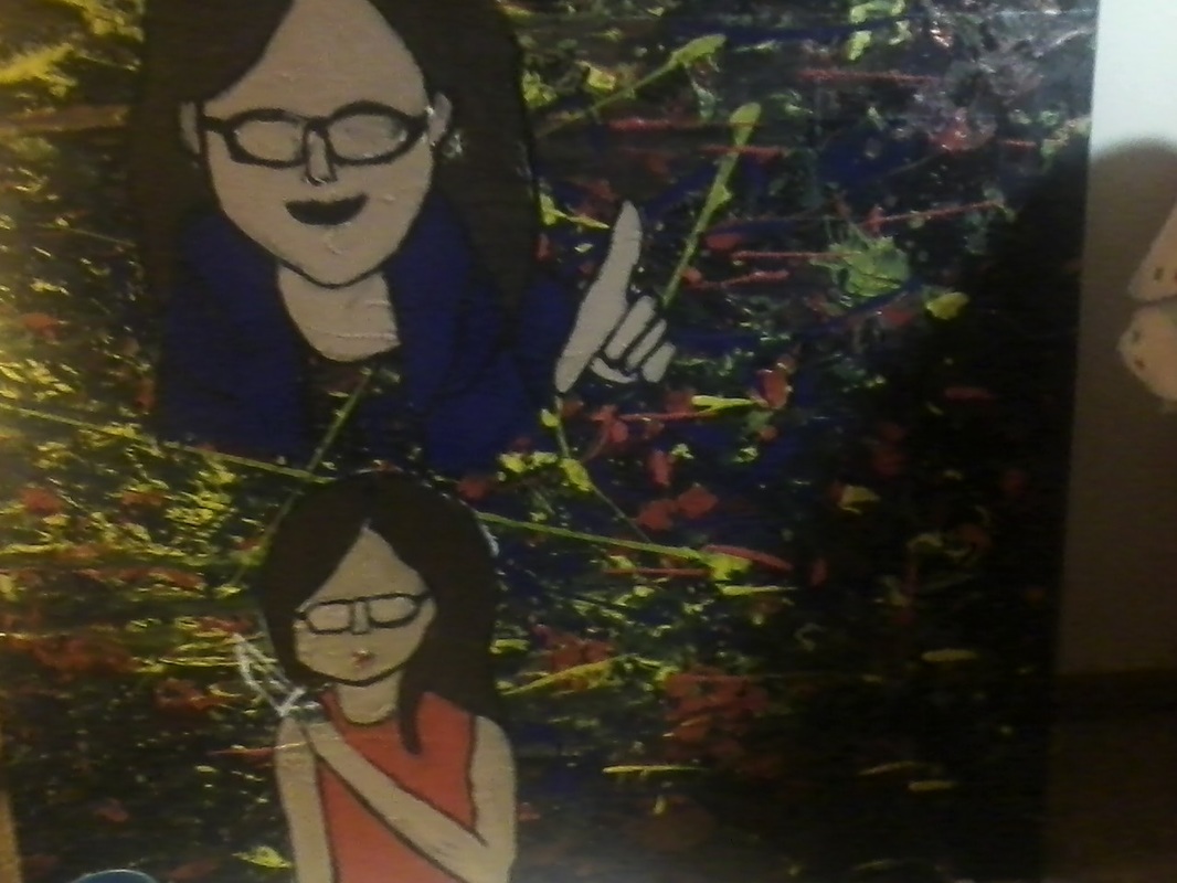
Something else, which I discovered later, was that the transferred image was not centered, so I thought of a solution; making rose petals falling from the top, and as they fell, they turned to ashes, representing the gentle sadness turning into a burning anger. A lot of people have a different personality they hide, which could be the opposite of what's showing, so the petals burning at the bottom, where sadness is being controlled, and the full petals from a gentle flower, where anger is controlling sadness, that would make better sense. It also fills the open space.
I had also opened both doors with paint-covered hands. Everything was a mess, and that was the biggest failure. I somehow managed to get blue paint in my hair, and somehow all over my jacket.
I guess I experimented how fast I can get the paint out of the carpet and tiles. Apparently, very fast.
I also had to take paint remover chemicals and a wire brush outside, because the property manager is not going to like how I messed up right outside the apartment on the cement. Set-up took a few minutes, throwing the paint took about 10 minutes, and cleaning up the mess took about 3 hours total. That is the result of taking no precautions whatsoever.
Something else, which I discovered later, was that the transferred image was not centered, so I thought of a solution; making rose petals falling from the top, and as they fell, they turned to ashes, representing the gentle sadness turning into a burning anger. A lot of people have a different personality they hide, which could be the opposite of what's showing, so the petals burning at the bottom, where sadness is being controlled, and the full petals from a gentle flower, where anger is controlling sadness, that would make better sense. It also fills the open space.
|
|
Adjusting skin tone was also a challenge on its own.
|
|
|
|
I threw in some of the colors, with proportions out of place, random basic idea. So many points were flawed and I kept messing with the paint to adjust the proportions multiple times, trying to get it right.
|
|
I had to keep layering the skin all the time because I couldn't get the same skin tone every single time!!! This was the most frustrating part of the process and experimentation.
|
|
|
PROCESS
First thing was to set up the painting materials outside. That was to make sure I didn't get paint on the carpet. I could not get photos of the painting process without covering the camera with paint, but I covered my hands in paint and throwing different colors at the canvas. Although I did not use the same tools he did, I used a similar process, throwing and dripping paint, even if I did not use knives or sticks.
It made a mess outside, and took 10 minutes to do, but it was fun. Then I had to take everything inside and clean up the carpet and paint containers.
I finished my planning sketches after that.
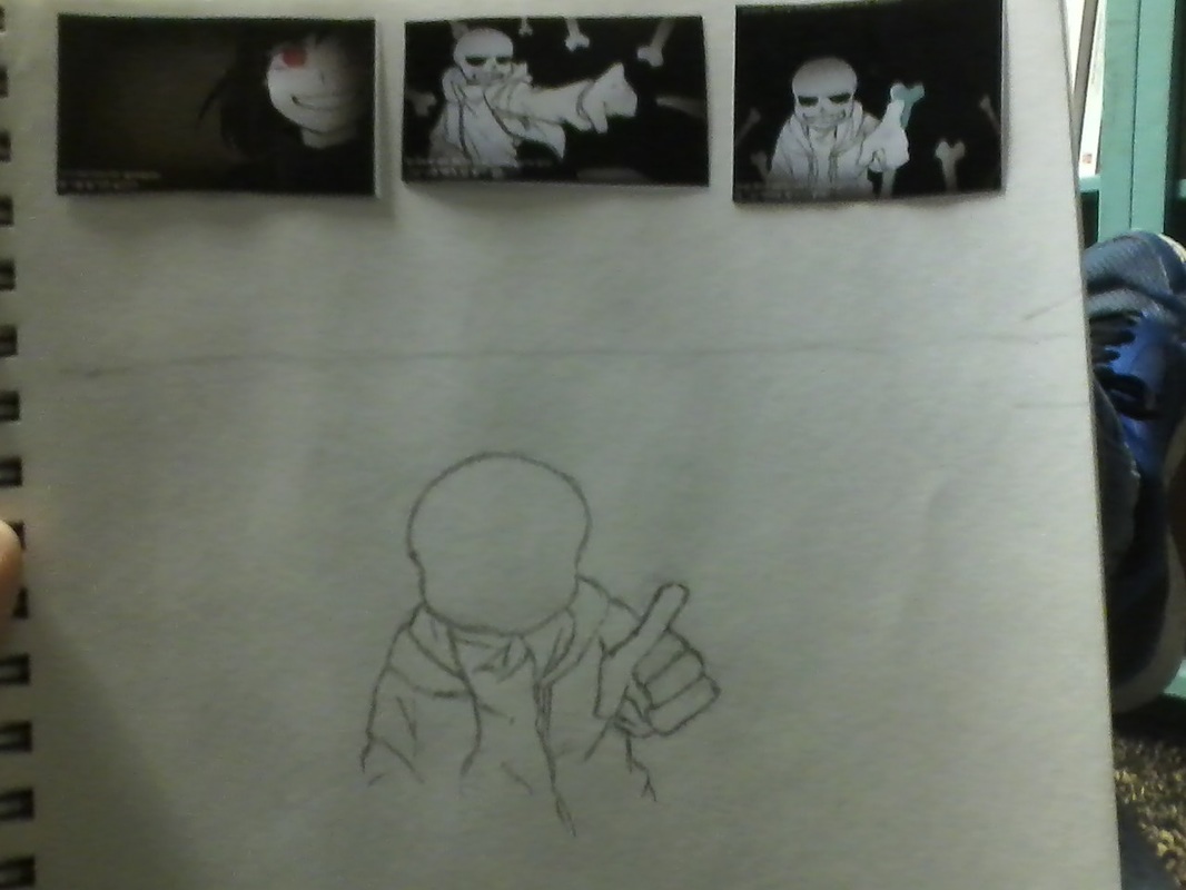
I took guides from a parody video for Undertale called "Stronger Than You" for Frisk, because there were image parts I had wanted to do, so I used them as guides, especially since hands are so hard to do, and I needed the basic "skeleton" of the human body.
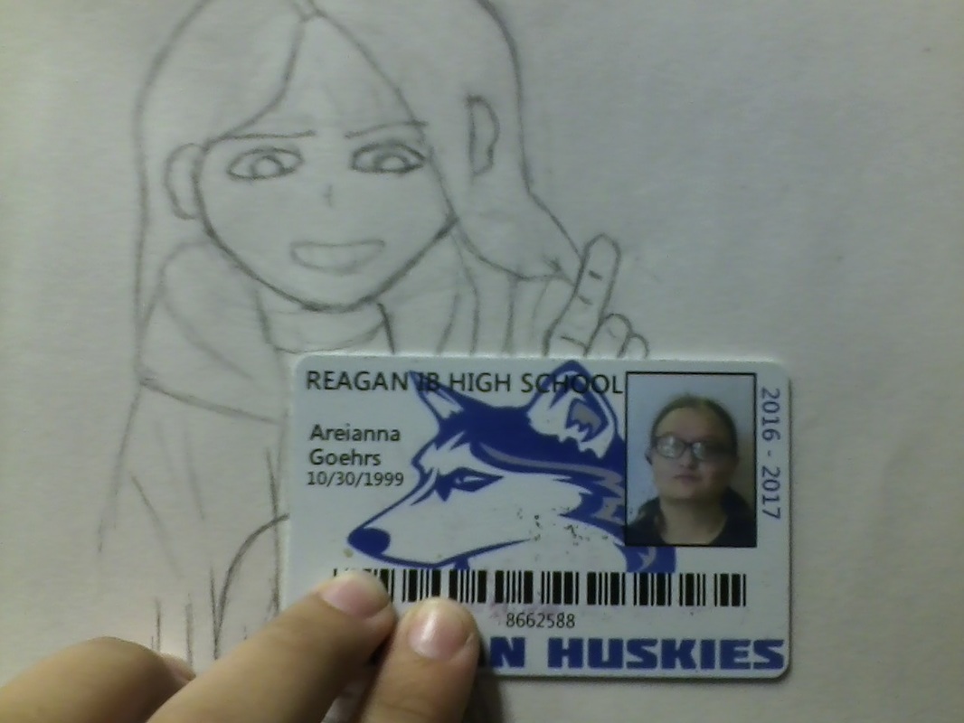
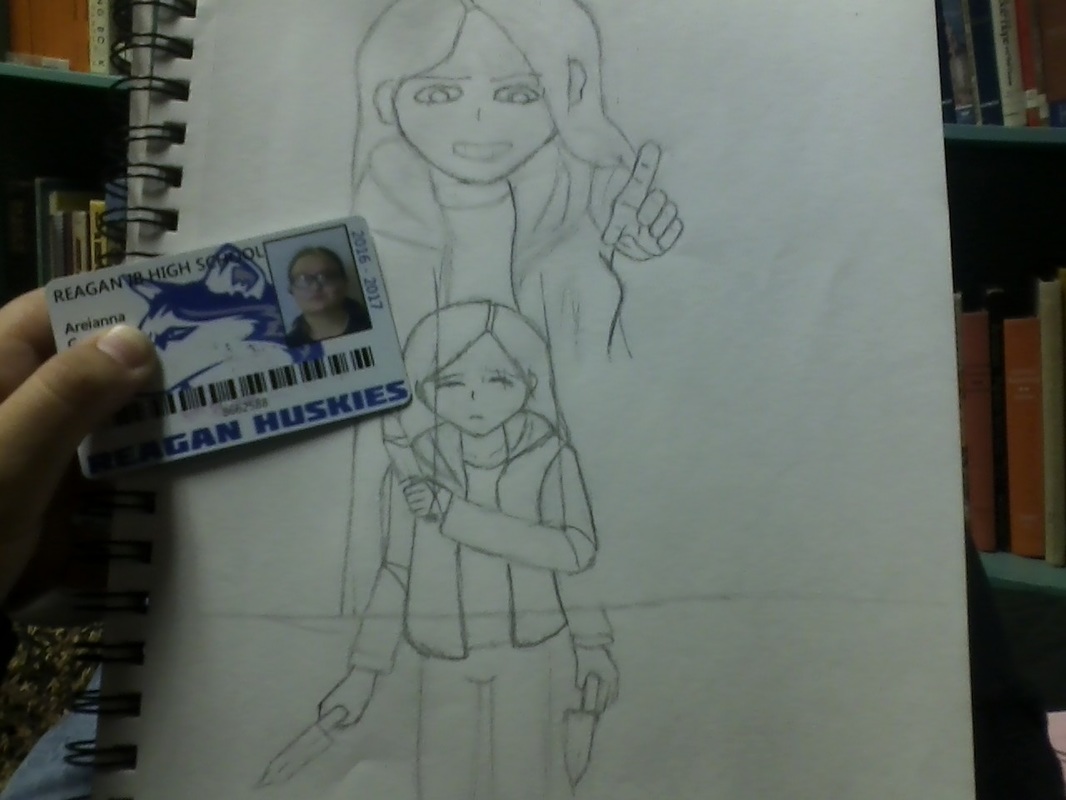
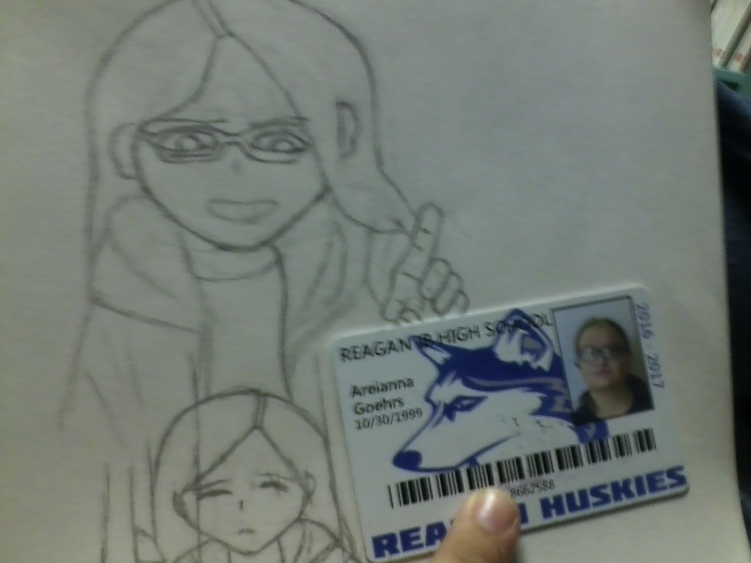
I have only practiced anime drawing for the past 4 or 5 years, so I actually took my student ID to edit my sketch, erasing the anime from it, while keeping those positions. This was one of the longest parts of the process, having to start with what's familiar, then slide into the new.
I also wanted to use the grid method to transfer the images, so I did some math on proportions. I had to transfer an 8.5x8.5 sketch to a 3ftx3ft canvas. Obviously, the figures in the sketch cannot be that small on the canvas. So I did my math, and found that 0.7"x0.7" grid squares on the planning sketch make the 3"x3" grid squares on the canvas. I wanted them to be small so that I can get the details right.
It made a mess outside, and took 10 minutes to do, but it was fun. Then I had to take everything inside and clean up the carpet and paint containers.
I finished my planning sketches after that.
I took guides from a parody video for Undertale called "Stronger Than You" for Frisk, because there were image parts I had wanted to do, so I used them as guides, especially since hands are so hard to do, and I needed the basic "skeleton" of the human body.
I have only practiced anime drawing for the past 4 or 5 years, so I actually took my student ID to edit my sketch, erasing the anime from it, while keeping those positions. This was one of the longest parts of the process, having to start with what's familiar, then slide into the new.
I also wanted to use the grid method to transfer the images, so I did some math on proportions. I had to transfer an 8.5x8.5 sketch to a 3ftx3ft canvas. Obviously, the figures in the sketch cannot be that small on the canvas. So I did my math, and found that 0.7"x0.7" grid squares on the planning sketch make the 3"x3" grid squares on the canvas. I wanted them to be small so that I can get the details right.


Once that was finished, I used the grid method to transfer everything to the canvas. It was easier said than done when the background was already on there, making the graphite hard to see. After that, I made rough outlines with white paint so that I could see the lines when I paint. Using other paints, I neatened the lines as I went along, adjusting neatness and proportions as needed.
I also did some basic painting, which I adjusted later with the shadows and shading.
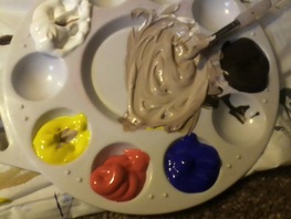
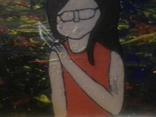
Once the white paint dried, I got my pallete and mixed some flesh tone, covered the skin of the figures with it, and sloppily put some other colors, such as red and blue, in different places, colored in the hair with brown. I did that sloppy enough to fill the spaces, and neatened the colors, propotions, placement, and details as I went along. I gave myself at least 2 hours per day to work, plenty of time. Day by day, the project came along.
I also did some basic painting, which I adjusted later with the shadows and shading.
Once the white paint dried, I got my pallete and mixed some flesh tone, covered the skin of the figures with it, and sloppily put some other colors, such as red and blue, in different places, colored in the hair with brown. I did that sloppy enough to fill the spaces, and neatened the colors, propotions, placement, and details as I went along. I gave myself at least 2 hours per day to work, plenty of time. Day by day, the project came along.
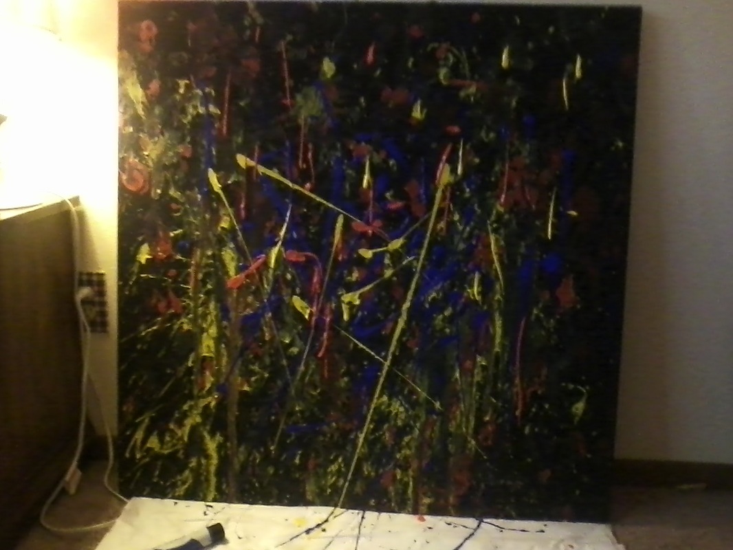
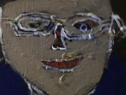
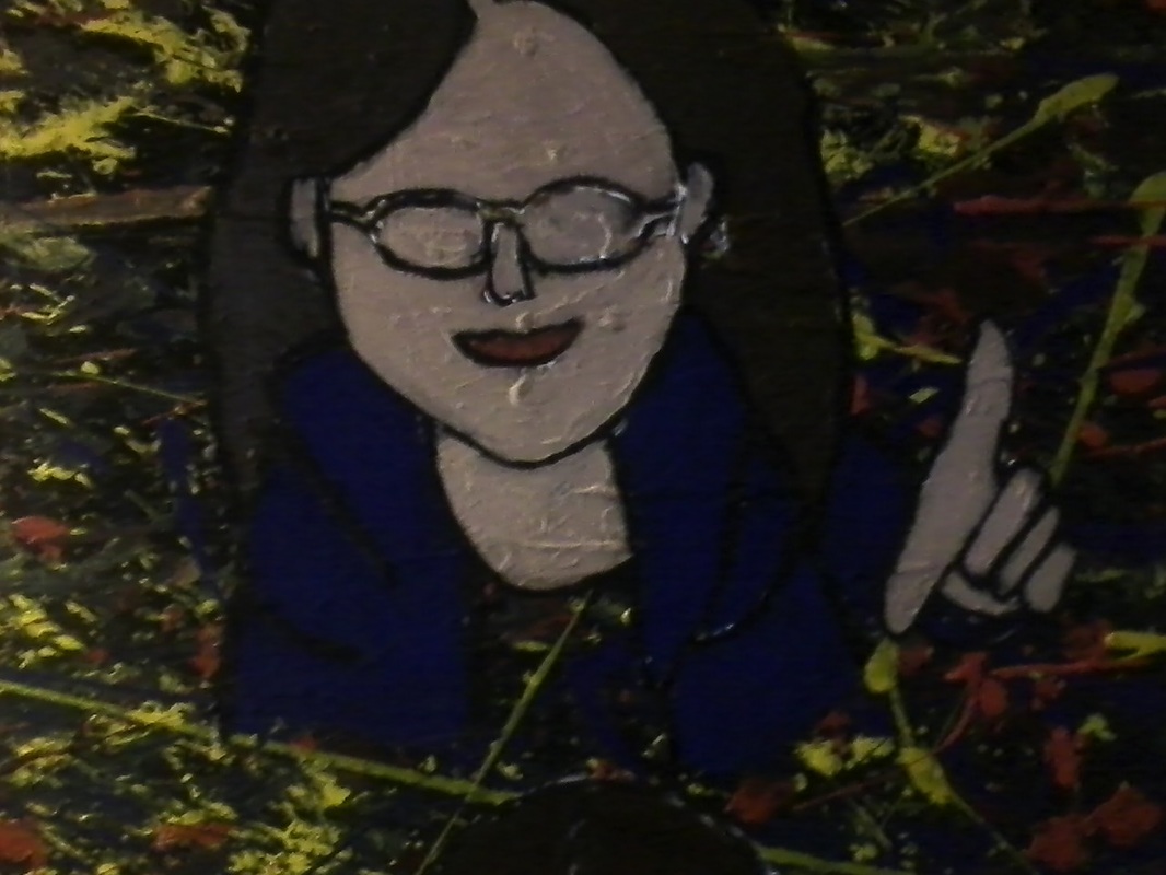
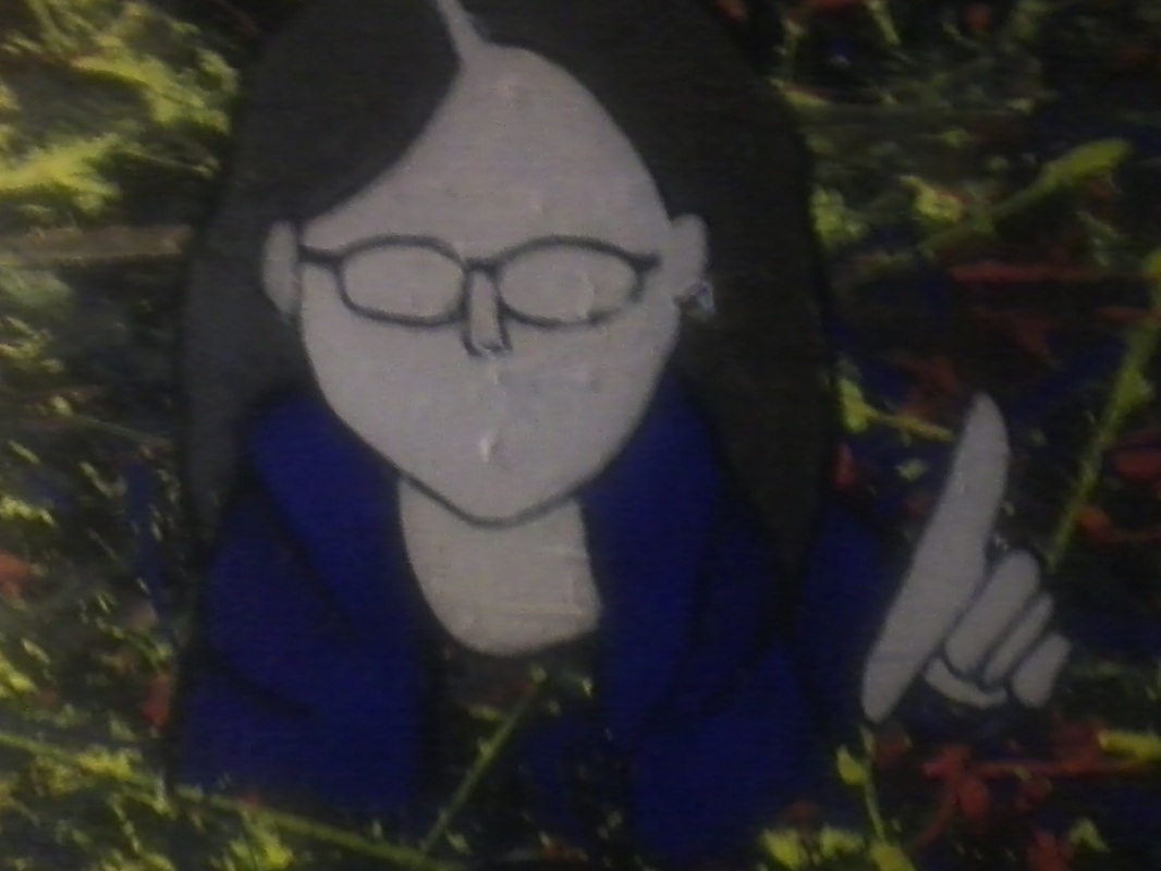
I had then turned the white lines into black lines. In Pop Art, I see the outlines of the figures painted in black, so I outlined mine in black as well. I layered the colors, neatened lines.
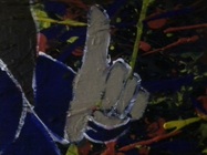
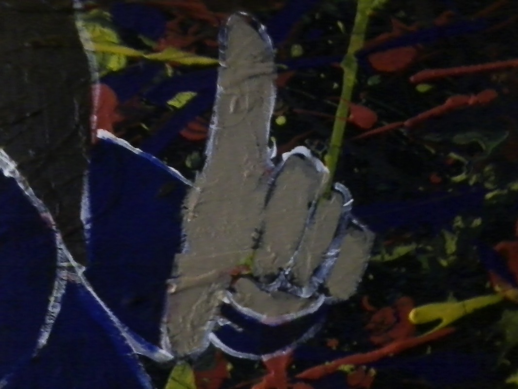
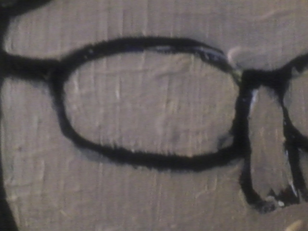
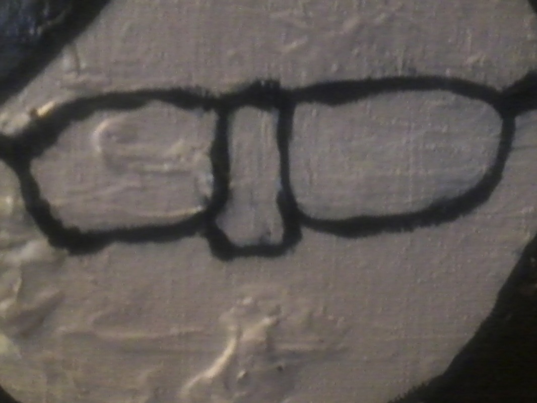
I used different color paints to thin or thicken the lines on the figure. At one point, the mouth on the larger figure was so far off that I took skin tone and painted over it, erasing it entirely, and did the same for the smaller figure, and both sets of eyes, trying to start over. It started coming along much better as I erased lines, thinned or thickened them, places them differently, continued to layer, fix the outlines, fill empty spaces, and start to paint the details. I had to reposition the glasses a bit, because glasses do not go THROUGH the ears. I started resizing and reshaping parts, like the ears, hands (especilly the fingers), adding the details, like the lines on the palm of the hand. I also repositioned the hand around the knife, and started to plan for the puppet strings as well.
I used different color paints to thin or thicken the lines on the figure. At one point, the mouth on the larger figure was so far off that I took skin tone and painted over it, erasing it entirely, and did the same for the smaller figure, and both sets of eyes, trying to start over. It started coming along much better as I erased lines, thinned or thickened them, places them differently, continued to layer, fix the outlines, fill empty spaces, and start to paint the details. I had to reposition the glasses a bit, because glasses do not go THROUGH the ears. I started resizing and reshaping parts, like the ears, hands (especilly the fingers), adding the details, like the lines on the palm of the hand. I also repositioned the hand around the knife, and started to plan for the puppet strings as well.


I also outlined the flower petals in graphite, and actually changed my design idea a bit, too. There was much more I could do for the background.
I used a separate sheet from my sketchbook to draw the design and plan the colors I wish to use on the trampled roses, it's hard to decide when the flowers have no fragrance. I want something that stands out, but still light enough to stay in the background, and won't change too much about it. But I also want them to give a certain energy, one of strength and a fighter, and started thinking of some different shades of red, maybe even darker orange, perhaps even black and blue. I have scrapped so many experiments in just mixing the colors for thr flowers ALONE, placing them will be another challenge.
I used a separate sheet from my sketchbook to draw the design and plan the colors I wish to use on the trampled roses, it's hard to decide when the flowers have no fragrance. I want something that stands out, but still light enough to stay in the background, and won't change too much about it. But I also want them to give a certain energy, one of strength and a fighter, and started thinking of some different shades of red, maybe even darker orange, perhaps even black and blue. I have scrapped so many experiments in just mixing the colors for thr flowers ALONE, placing them will be another challenge.
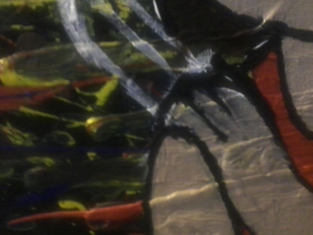
Those are the experiments with the paint on drawings of flowers, trying to see which works best. Eventually, I chose one and started putting it into the painting. The flowers were the final touch on the painting.
